Skip to content
 Fall is hard to plan well. The weather shifts fast, layering becomes important, and buyers need tops that feel current but still reorder safely. If I choose the wrong mix, I get slow sell-through and too many risky styles.
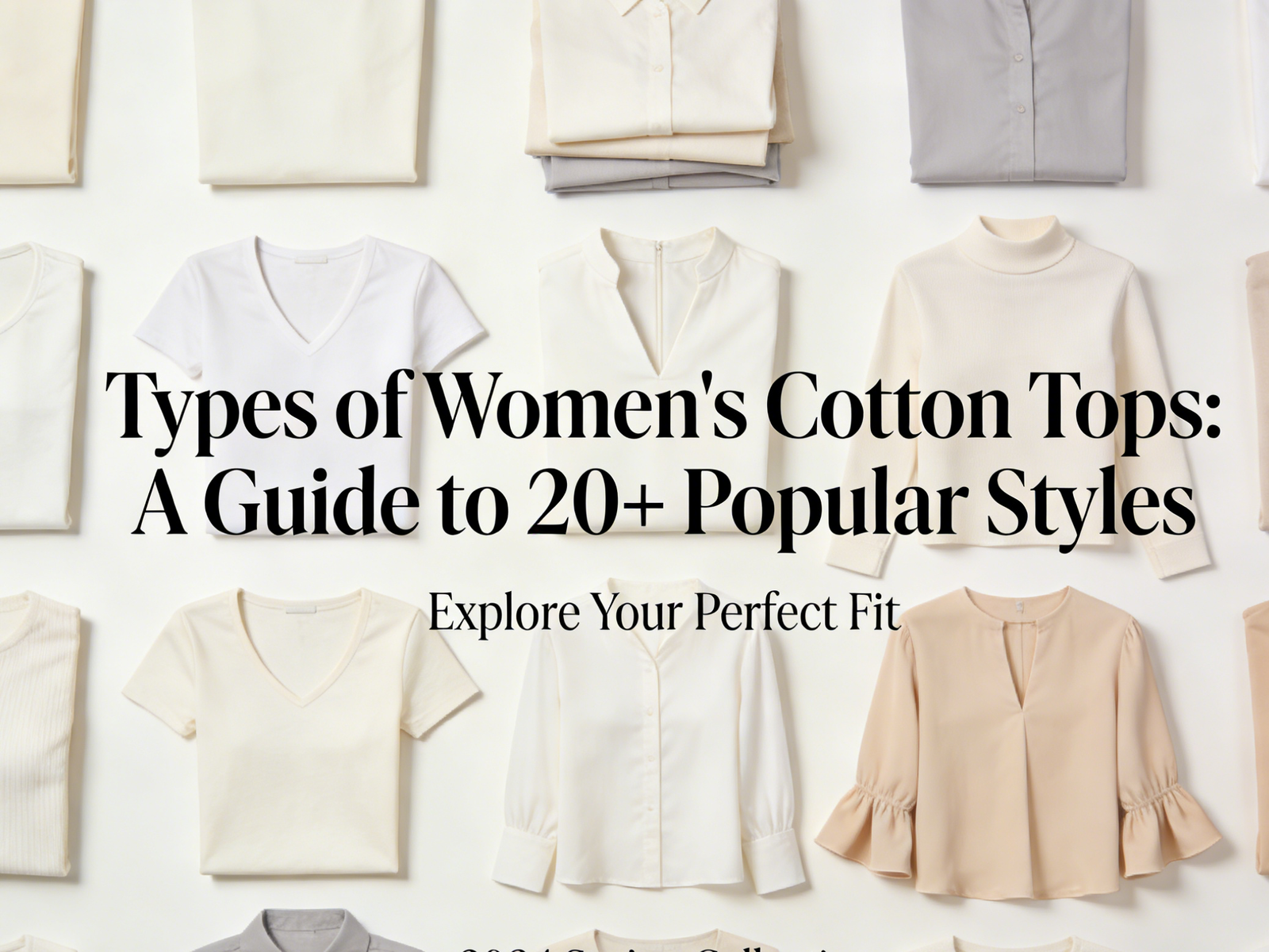
The most practical Types of Fall Tops include 20 core styles that balance layering, warmth, texture, and trend appeal: T-shirt, long sleeve tee, rib-knit top, mock neck top, turtleneck top, Henley top, blouse, button-down shirt, flannel shirt, knit polo, lightweight sweater top, cardigan top, sweatshirt, hoodie, bodysuit, wrap top, peplum top, denim shirt, thermal top, and shacket-style top.
I learned this after seeing fall orders fail for a simple reason. The styles looked right on a mood board, but they did not match real layering habits. After that, I started planning fall tops by warmth level, fabric behavior, and how each style works under jackets or on its own.
How do I build the right mix of Types of Fall Tops for weather changes and real customer demand?
Fall tops work best when I build them around temperature shifts, outfit layering, and customer routine. I do not treat fall like a colder version of summer. I treat it like a transition season with more technical demands.
I build a fall tops assortment by dividing styles into layering basics, polished daily tops, and texture-driven trend pieces. Then I match them to early fall, mid fall, and late fall use. This helps me avoid a top-heavy assortment that looks fashionable but does not cover daily wear needs.
Why fall assortment planning is more complex than spring or summer
In fall, the customer usually wants one top to do more jobs. A top may need to work:
- alone indoors
- under a jacket
- under knitwear
- for warm afternoons and cool mornings
That creates more pressure on:
- fabric thickness
- neckline shape
- sleeve fit
- bulk under layers
- surface texture
A top that looks good on a hanger may fail once it is layered under a blazer or puffer vest. This is why I always review tops in full outfit use, not just as single items.
The three role system I use for fall tops
| Role | Main Job | Target % | Best Style Types | Risk Level |
|---|---|---|---|---|
| Layering basics | daily wear and reorder | 40–55% | long sleeve tees, rib tops, thermals, bodysuits | Low |
| Polished daily tops | office and smart casual | 20–30% | blouses, button-downs, knit polos, wrap tops | Medium |
| Texture and trend tops | fashion update and margin | 15–25% | mock necks, flannels, peplums, shackets | Higher |
How I map tops by fall timing
Early fall
This stage still has heat in many markets. I keep breathable but layer-friendly options.
- T-shirt
- lightweight rib-knit top
- blouse
- denim shirt
- button-down shirt
Mid fall
This is the core commercial window in many regions.
- long sleeve tee
- Henley
- mock neck top
- knit polo
- bodysuit
- wrap top
- cardigan top
Late fall
This stage needs more warmth and richer texture.
- turtleneck top
- thermal top
- sweatshirt
- hoodie
- shacket-style top
- lightweight sweater top
- flannel shirt
The mistake I see most often
Many buyers over-order statement tops and under-order layering tops. The result is simple:
- the collection looks strong in photos
- the reorder rate is weak
- styling becomes too narrow
- customers cannot build repeat outfits
In my experience, the best fall programs are not the loudest. They are the ones that create easy outfit combinations.
How do I choose fabrics for Types of Fall Tops so they feel warm enough but still layer well?
Fabric selection is where fall tops become technical. A top can look right and still fail if it is too bulky, too rough, or too unstable after washing.
For fall tops, I choose fabric by balancing warmth, layering bulk, surface texture, and recovery. Knits are best for daily comfort and close fit, while wovens add structure and polish. Textured fall fabrics must also pass pilling, shrinkage, and seam comfort checks before bulk.
The four fabric questions I ask before I approve any fall top
- Does it add warmth without too much bulk?
- Does it feel comfortable on bare skin?
- Can it layer under outerwear without friction problems?
- Will it stay stable after wash and wear?
If a fabric fails one of these, it may still look good in sampling, but it will not behave well in real use.
Knit vs woven in fall: how I decide
Knits
Common uses:
- long sleeve tees
- rib-knit tops
- mock necks
- bodysuits
- thermals
- sweater tops
Main strengths:
- comfort
- stretch
- body-hugging fit
- strong reorder potential
Main risks:
- pilling
- neckline wave
- bagging
- shrink or twist
Wovens
Common uses:
- blouses
- button-down shirts
- flannel shirts
- denim shirts
- some peplum and wrap tops
Main strengths:
- cleaner shape
- better structure
- more polished appearance
Main risks:
- stiffness
- wrinkling
- seam puckering
- less fit forgiveness
Fabric-to-style matching table
| Style | Best Fabric Options | Main Risk | My QC Focus |
|---|---|---|---|
| Long sleeve tee | cotton jersey, modal blend, cotton-spandex | twist, neckline wave | wash test + recovery |
| Rib-knit top | cotton rib, rayon-nylon rib, stretch rib | bagging | stretch return |
| Mock neck / turtleneck | fine rib, jersey knit, brushed knit | neck collapse or itch | neck tension + hand-feel |
| Flannel shirt | brushed cotton, cotton blend flannel | shrinkage, surface pills | brushing and wash test |
| Lightweight sweater top | viscose blend knit, cotton knit, fine gauge knit | pilling, snagging | pilling test |
| Thermal top | waffle knit, brushed waffle, cotton blend thermal | shrinkage, seam irritation | shrink control + seam comfort |
| Denim shirt | lightweight denim, chambray | shade shift, stiffness | wash consistency |
Why texture matters more in fall
Texture becomes a selling tool in fall. That is good for visual interest, but it also creates more risk.
For example:
- brushed fabrics can feel warm but pill faster
- waffle knits look seasonal but can shrink more
- rib fabrics fit well but may bag out if recovery is weak
- soft sweater yarns can snag easily during wear
This is why I never choose fall fabric on hand-feel alone. I look at how texture performs over time.
How do I stop the most common quality problems in fall tops before they become returns?
Fall tops face more friction than summer tops. They rub against jackets, scarves, bags, and outerwear. That means small quality issues show up fast.
The most common fall top complaints are pilling, shrinkage, neckline stretching, layering bulk, itchy fabric, and shape loss after repeated wear. I reduce these issues by setting stricter fabric tests, stabilizing key construction points, and checking how each top behaves inside a layered outfit.
The 6 most common complaint areas I see in fall
1) Pilling
This is one of the biggest fall problems, especially with:
- brushed knits
- sweater tops
- rib knits
- cardigan styles
Why it happens:
- soft yarn surface
- repeated friction from coats or bags
- low-quality blended fibers
What I do:
- test pilling before bulk
- avoid overly fuzzy surfaces for core basics
- choose better yarn quality for reorder styles
2) Shrinkage
This shows up a lot in:
- thermals
- flannels
- jersey knits
- waffle structures
Why it happens:
- loose structure
- poor finishing
- cotton-rich fabrics without shrink control
What I do:
- wash test early
- set shrink allowance in specs
- pre-control fabric finishing before cutting
3) Neckline stretching
This is common in:
- long sleeve tees
- mock necks
- knit polos
- sweatshirts
Why it happens:
- weak rib
- poor binding method
- stress during wear and washing
What I do:
- add neckline stabilization
- improve rib quality
- test recovery after repeated stretch
4) Too much layering bulk
This problem does not always show in fitting, but it shows in styling.
It happens when:
- armholes are too bulky
- sleeves are too wide
- seams are heavy
- fabric thickness is not controlled
What I do:
- test tops under jackets
- reduce seam bulk where possible
- keep layering tops cleaner in silhouette
5) Itchy or rough hand-feel
This matters more in fall because more tops touch the neck and arms.
High-risk styles:
- mock necks
- turtlenecks
- sweater tops
- thermals
What I do:
- review hand-feel after finishing
- avoid scratchy yarns for neck-contact styles
- line or soften where needed
6) Shape loss
This is common in rib tops, sweater tops, and cardigans.
What causes it:
- weak recovery
- unstable shoulder seams
- hanging distortion
- over-soft finishing
What I do:
- test stretch return
- support shoulder seams
- hang test after wash
A practical movement and wear test I like to use
Before I approve a fall top, I do more than a static fit review.
I ask the fit sample to go through:
- arm raises
- sitting and standing
- jacket-on and jacket-off wear
- bag strap contact on shoulder
- short wear time for heat comfort
This helps me catch:
- hem lift
- armhole restriction
- neck discomfort
- seam rubbing
- shoulder distortion
How do I plan MOQ and production for Types of Fall Tops without losing the season?
Fall is one of the most timing-sensitive seasons. It starts warm in many regions, then turns cooler fast. If the assortment arrives too late, the customer moves on to outerwear.
I plan fall tops with an early-core and late-texture strategy. I run basic layering tops first with stable fabrics and repeat blocks, then I add textured and trend-driven styles later in smaller quantities. This protects cash flow and keeps the collection relevant across the full fall window.
The production logic I use
Core early program
These are the tops I usually lock first:
- long sleeve tees
- rib-knit tops
- button-down shirts
- bodysuits
- lightweight sweater tops
Why I run them early:
- they are reorder-friendly
- they use proven blocks
- they support wide outfit use
Mid-season fashion program
These are styles I often run with more caution:
- peplum tops
- wrap tops
- flannel shirts
- mock necks
- knit polos
Why I control MOQ:
- trend risk is higher
- texture and trims can slow development
- fit comments may be more specific
Late-season warmth program
These styles need careful timing:
- thermal tops
- sweatshirts
- hoodies
- turtlenecks
- shacket-style tops
Why timing matters:
- too early and they feel heavy
- too late and the market is already on markdown
MOQ planning table
| Program Type | MOQ Strategy | Best Styles | Main Goal | Main Risk |
|---|---|---|---|---|
| Core reorder tops | medium to higher MOQ | long sleeve tees, rib tops, bodysuits | stable repeat sales | shade or fit drift |
| Fashion update tops | lower MOQ | mock necks, flannels, peplums, wrap tops | trend relevance | slower sell-through |
| Late warmth tops | controlled MOQ | thermals, hoodies, shackets | seasonal transition | timing miss |
The production risks I watch most in fall
- brushed fabric delays
- shade variation on garment wash items
- unstable recovery in rib knits
- collar and placket issues on polos and shirts
- late trim arrival for layered tops
My safest planning rule
I do not let the collection depend too much on one fabric family or one silhouette. If all the tops are brushed knits, the risk becomes too concentrated. If all the tops are oversized shirts, styling becomes narrow. I always want balance.
How do I make Types of Fall Tops feel custom for a buyer without creating too much development risk?
Most buyers want a fall collection that looks specific to their brand. At the same time, they do not want too many fit changes or late sample rounds.
I make fall tops feel custom by changing visible design elements like neckline shape, placket detail, fabric texture, trims, wash effect, and color story while keeping the core fit blocks stable. This gives the buyer a stronger brand identity without making production too fragile.
Low-risk ways I customize fall tops
- neckline changes on rib tops and long sleeve tees
- custom buttons on shirts and cardigans
- contrast stitching on denim and thermals
- special brushing or wash look on flannels
- embroidery or small logo details on sweatshirts
- seasonal color palettes across core blocks
Higher-risk changes I manage carefully
- changing neck height on mock necks or turtlenecks
- altering rib stretch ratio
- moving wrap tie positions
- changing shoulder width on shackets
- using new brushed fabrics without test history
The fall brand-DNA system I prefer
Visual identity
- one or two key necklines
- one main texture direction
- repeat trims
- repeat brand colors
Fit identity
- one fitted block
- one relaxed block
- one polished shirt block
Commercial identity
- safe reorder basics
- a few higher-margin fashion styles
- one or two stronger trend pieces
This structure helps the buyer look consistent without creating unnecessary complexity.
Turtleneck Top

Fall looks simple from the outside. The weather cools down, and turtlenecks come back. But one wrong fabric or one tight neck can turn a strong style into slow stock.
A good fall turtleneck top needs the right balance of neck height, fabric recovery, body fit, and layering value. I do not treat it as one basic item. I treat it as a technical fall top that must solve warmth, comfort, styling, and reorder stability at the same time.
I learned this after I worked on a fall program that looked perfect on the rack but got mixed feedback after launch. Some customers liked the clean shape. Some said the neck felt tight. Some said the body stretched out after wear. That was when I started breaking the turtleneck top down like a real category, not just a seasonal basic.
What makes a turtleneck top such an important fall style in the first place?
A turtleneck top does more than keep the neck warm. In fall, it helps bridge the gap between light tops and heavy sweaters. That makes it more useful than many people think.
A turtleneck top matters in fall because it works as both a base layer and a visible styling piece. It adds warmth without bulk, gives outfits a sharper shape, and fits many retail directions, from minimal basics to trend-led fashion collections.
Why I see turtleneck tops as a fall category, not a single item
A turtleneck top sits in a very useful middle space. It is not as light as a summer tee. It is not as heavy as outerwear. That gives it strong commercial value.
I usually look at it in three roles:
- Base-layer role
- worn under blazers
- worn under jackets
- worn under knitwear or slip dresses
- Standalone role
- fitted rib turtleneck with denim
- sleek knit turtleneck with trousers
- lightweight jersey turtleneck for daily wear
- Fashion role
- sheer turtleneck for layered styling
- cropped turtleneck for younger customers
- draped or relaxed turtleneck for a softer silhouette
Why this style performs well in fall
Fall dressing is built around layering. That is why the turtleneck top stays relevant year after year. It solves several real wardrobe needs at once.
| Function | Why It Matters in Fall | Commercial Value |
|---|---|---|
| Warmth | Covers neck without a scarf | Good for early cold weather |
| Layering | Fits under jackets and coats | High repeat styling use |
| Shape | Frames face and upper body | Strong visual effect online |
| Range | Can be basic or elevated | Works across price levels |
A turtleneck top is easy to style into many looks. That matters a lot for boutique buyers and brand buyers. When one top can work across office, casual, and evening outfits, the sell-through chance gets stronger.
I also like turtlenecks because they create a more finished look without adding many trims or complicated construction details. In wholesale, that matters. It means I can often build a product that looks elevated without turning it into a high-risk development project.
How do I choose the best fabric for a fall turtleneck top?
Fabric is where most turtleneck problems start. A bad turtleneck fabric may look fine on a hanger, but the customer feels the problem as soon as it touches the neck.
The best fabric for a fall turtleneck top depends on the target use. Rib knit and cotton-spandex jersey are safest for fitted daily styles. Viscose blends can feel softer and drape better. Sweater knits create more warmth, but they need stronger recovery and pilling control.
Why fabric matters more on a turtleneck than on many other tops
The turtleneck covers one of the most sensitive areas of the body. That means the fabric cannot just “look right.” It must also behave well in direct skin contact.
I judge fall turtleneck fabric through five filters:
- softness
- stretch and recovery
- warmth level
- opacity
- surface durability
My main fabric options and how I use them
| Fabric Type | Strength | Weakness | Best Turtleneck Use |
|---|---|---|---|
| Cotton-spandex jersey | soft, breathable, stable | may lose shape if low quality | daily fitted basics |
| Rib cotton knit | flexible, textured | may bag out | fitted core styles |
| Viscose blend knit | smooth, soft drape | can be less stable | elevated fitted tops |
| Polyester-spandex knit | recovery, cost control | may trap heat | lower-cost basics if balanced well |
| Sweater knit | warm, rich look | pilling, bulk | colder fall assortments |
| Mesh / sheer knit | visual layering effect | snag and transparency | fashion styles |
The fabric mistakes I try to avoid
Using overly stiff fabric for fitted turtlenecks
A fitted turtleneck needs to move with the body. If the fabric is too stiff, the neckline feels restrictive and the body fit becomes harsh.
Using cheap synthetic-heavy fabric for close-to-neck use
Some lower-cost blends solve price problems but create wear problems. The fabric may feel hot, slightly rough, or static-heavy. On a crew neck, that is already bad. On a turtleneck, it becomes worse.
Choosing fabric based only on weight
Many people think a heavier fabric is always better for fall. I do not agree. A heavy turtleneck can become bulky under jackets. It can also create an unbalanced neck roll. I care more about useful warmth than raw thickness.
My fabric testing checklist
- neck stretch and recovery test
- wash test for shrink and spiral movement
- pilling check after rubbing
- light test for opacity
- wear test on neck comfort for at least one full day
How do I make sure the turtleneck neckline feels comfortable and keeps its shape?
The neckline is the heart of the product. If the neck fails, the whole top fails. That is true even when the body fit is good.
A comfortable turtleneck neckline needs the right neck circumference, height, fold depth, and recovery. I do not want it too loose, because it looks weak. I do not want it too tight, because customers complain fast. The best result comes from balancing stretch, pressure, and visual structure.
The four neckline variables I always study
1. Neck circumference
This decides whether the customer feels pressure. If the opening is too small, the top feels restrictive. If it is too large, the neck falls away and loses the clean turtleneck effect.
2. Neck height
A higher neck gives more warmth and drama. But higher is not always better. Some customers want coverage. Others want a lower and easier feel.
I usually think in three ranges:
- low turtleneck: easier daily wear
- classic folded turtleneck: most commercial
- high dramatic turtleneck: more fashion, less mass-safe
3. Fold behavior
A turtleneck can be self-folding, softly rolled, or structured. This depends on knit density, height, and seam finish.
4. Recovery after wear
A neckline must return close to its original shape. If it grows after a few hours, the top looks tired.
Problems I see most often at the neckline
- neck feels choking
- fold collapses unevenly
- seam scratches skin
- neckline waves after wash
- front neck pulls because of poor body balance
My technical approach to neckline comfort
Pattern balance
I do not isolate the neck from the body. If the chest or shoulder fit is wrong, the neckline often gets blamed for a larger balance issue.
Fabric recovery
A turtleneck neckline needs enough recovery to hold shape. But too much power can make it harsh. I usually test several neckband ratios, not just one.
Seam choice
The inside seam matters because it touches skin. I prefer clean finishes and stable seam construction. A rough seam allowance can ruin a soft fabric.
A practical decision table for neck design
| Neck Style | Comfort Level | Visual Effect | Best Use |
|---|---|---|---|
| Low turtleneck | High | relaxed clean look | mainstream daily wear |
| Classic fold | Medium to high | timeless polished look | broad fall assortment |
| High dramatic neck | Medium | strong fashion look | editorial or premium styles |
| Soft slouch neck | High | casual relaxed look | cozy fall styling |
How should I fit and grade a turtleneck top so it works across sizes?
Turtleneck fit is more sensitive than many buyers expect. A small fit issue becomes more visible because the garment sits close to the neck, shoulders, bust, and arms.
To fit and grade a turtleneck top well, I control shoulder balance, bust ease, sleeve shape, body length, and neck proportion together. I do not treat grading like a simple width increase, because neck pressure and upper-body balance can change fast across sizes.
Why grading often goes wrong on turtlenecks
Many suppliers grade the body but do not think deeply enough about the neckline and upper chest. That creates a common problem: the larger size has enough width, but the neck still feels too tight or sits too high in an uncomfortable way.
What I focus on in fit approval
Shoulder line
If the shoulder is off, the whole top shifts. That affects the neckline, sleeve pitch, and underarm comfort.
Bust ease
A fitted turtleneck does not need much ease, but it still needs the right amount. Too little ease causes pull lines and upward drag. Too much ease destroys the clean line.
Sleeve pitch and width
The arm moves a lot in daily wear. A tight sleeve combined with a close neck can make the garment feel restrictive even if the measurements seem correct on paper.
Body length
A turtleneck top used for layering usually needs stable body length. If it rides up under a blazer or coat, customers notice.
My grading concerns by area
| Area | Why It Matters | Common Mistake |
|---|---|---|
| Neck | comfort and shape | grading too little |
| Shoulder | garment balance | ignoring shoulder slope |
| Bust | movement and appearance | over-tight fit |
| Sleeve | comfort in layering | arm too narrow |
| Body length | tuck and layering use | length jump too large |
Fit block strategy I prefer
I usually separate turtlenecks into at least two fit blocks:
- fitted block
- relaxed block
For some brands, I may use a third:
- fashion block for cropped or sheer styles
This reduces confusion. It also makes repeat development easier. I do not like forcing every turtleneck into one standard block. That usually creates weak product outcomes.
How do I reduce quality complaints on turtleneck tops before bulk production?
Most quality complaints can be predicted early. I do not wait for bulk problems to “teach” me what is wrong.
The most common turtleneck top complaints are neck tightness, shape loss, pilling, transparency, seam irritation, and body ride-up. I reduce these by testing wear comfort, choosing stable fabrics, refining neck construction, and building clear QC standards before production starts.
The top complaint areas I watch closely
1. “The neck feels too tight”
This often comes from poor neck ratio, wrong fabric recovery, or an unbalanced upper-body fit.
2. “It stretched out after one wear”
This is common in low-quality rib and soft knits with weak recovery.
3. “It pills too fast”
This often happens in brushed or soft-blend fabrics that were chosen for hand-feel but not for durability.
4. “It feels itchy at the neck”
This can come from fiber quality, seam finish, or the wrong fabric choice for a close-contact style.
5. “It is too thin”
This issue appears often in light jersey styles sold for fall without enough opacity testing.
My pre-bulk QC routine
Wear trial
I like to have the sample worn for real movement, not just fitted on a static body.
Wash test
I check shrink, twist, neckline recovery, and surface feel after wash.
Rub test
I do this especially for sweater-knit and brushed fabrics to evaluate pilling risk.
Layering test
I place the turtleneck under a blazer or jacket to see if the neckline bunches or the sleeves catch.
A simple QC table I use
| Risk Area | Test | What I Want to See |
|---|---|---|
| Neck recovery | stretch and return | neckline holds shape |
| Pilling | rub test | low surface fuzz |
| Opacity | light check | no unwanted show-through |
| Fit stability | movement test | no major ride-up |
| Seam comfort | wear test | no scratch or irritation |
A turtleneck top can look basic very fast. The challenge is to upgrade it in a way that still protects fit, cost, and lead time.
I make a turtleneck top feel more premium by improving fabric hand-feel, neckline finish, rib texture, color depth, and subtle design details. I prefer small visible upgrades over unstable pattern changes because they create a stronger result with less production risk.
Better fabric hand-feel
A smoother, denser, or more refined knit changes the whole perception of the style.
Cleaner neckline finish
A better neck finish makes the top look more polished right away.
Richer texture
Rib structure, pointelle details, or fine-gauge knit texture can create a more expensive look without extreme pattern changes.
Better color direction
Fall turtlenecks do well in deep neutrals and rich seasonal shades:
- black
- cream
- charcoal
- chocolate
- olive
- burgundy
- navy
- contrast tipping at neck edge
- refined rib structure
- clean label and branding details
- better button or trim on layered versions
- soft-touch finishing
Higher-risk changes I control more carefully
- extreme cropped proportions
- complex cut-out neck designs
- unstable sheer and opaque fabric mixing
- over-tight fashion fits without enough wear testing
Mock Neck Top

Fall weather changes all day. A normal tee feels too light. A full turtleneck feels too warm. I need one top that fills that gap without creating fit problems.
A mock neck top is one of the most practical fall tops because it gives light neck coverage, clean structure, and easy layering without the bulk of a full turtleneck. I can use it for casual outfits, polished looks, and wholesale collections with lower seasonal risk than many trend-driven tops.
I did not always treat the mock neck top as a core style. At first, I saw it as a simple basic. Later, I realized it solves several fall problems at the same time, especially for styling, fit balance, and repeat sales.
What makes a mock neck top different from other fall top styles?
Many people confuse mock neck tops with turtlenecks, crewnecks, and high-neck tops. In real buying and production, those differences matter a lot.
A mock neck top has a short standing collar that sits close to the neck without folding over. That small difference changes heat level, face framing, layering ease, and production risk. For fall, it often gives a better balance than both standard crewneck tops and heavy turtlenecks.
Why the neckline shape matters more than people think
The neckline is not just a style detail. I see it as a functional decision. In fall, the neck area affects warmth, proportion, and outfit polish very fast.
A crewneck leaves the neck open. That feels casual and easy. But it can look too plain in a fall assortment when I need more visual structure.
A full turtleneck gives stronger coverage. That works in colder weather. But it also adds heat, bulk, and folding behavior that can create fit complaints.
A mock neck sits between those two. That is why I see it as a transitional neckline, not just a fashion choice.
How I compare mock neck tops with similar fall necklines
| Style | Neck Coverage | Warmth Level | Layering Ease | Common Risk | Best Use |
|---|---|---|---|---|---|
| Crewneck top | Low | Low | High | Looks too basic | Casual basics |
| Scoop neck top | Low | Low | Medium | Too open for cool weather | Early fall |
| High neck top | Medium | Medium | Medium | Can feel vague in shape | Fashion basics |
| Mock neck top | Medium | Medium | High | Neck tension if pattern is poor | Core fall range |
| Turtleneck top | High | High | Lower | Bulk and overheating | Cold-weather dressing |
The key technical difference I watch
The most important detail is collar height and tension.
A mock neck usually works best when:
- the collar stands up without folding
- the collar does not press too tightly on the throat
- the neckline opening still allows easy head entry
- the seam joins cleanly without rippling
If one of these points fails, the whole garment feels wrong, even when the body fit looks fine.
Why mock neck tops work well in fall specifically
Fall is a season of in-between needs. I often need:
- some warmth, but not too much
- a polished look, but not a formal shirt
- a clean base layer, but not a bulky knit
The mock neck top answers those needs better than many other fall tops. That is why I place it in the practical category, not only the fashion category.
Which mock neck top styles are the most useful for a fall collection?
Mock neck is not just one product. I treat it like a family of sub-styles. This helps me build a smarter range.
The most useful fall mock neck top styles are fitted rib mock necks, slim jersey mock necks, sleeveless mock necks, long sleeve basics, knit mock necks, cropped mock necks, and dressier mock neck tops in satin or mesh. Each serves a different customer need, price point, and styling purpose.
The core mock neck styles I would include first
I usually build from the safest commercial versions before I move into more trend-led options.
1. Fitted rib mock neck top
This is often the strongest reorder style.
Why it works:
- easy to wear under jackets
- body-hugging but flexible
- looks clean on product pages
- works across many age groups
Main risk:
- collar stretch-out
- body bagging after wash
- too much cling if fabric recovery is weak
2. Slim jersey mock neck top
This is softer and easier than rib.
Why it works:
- broad customer appeal
- clean shape without heavy texture
- easier for prints and solids
Main risk:
- neckline wave
- twisting after wash
- thin fabric becoming too revealing
3. Long sleeve mock neck top
This is one of the most practical fall basics.
Why it works:
- stronger seasonal relevance
- better warmth perception
- easy upsell with outerwear
Main risk:
- sleeve twisting
- cuff recovery loss
- collar-body imbalance
4. Sleeveless mock neck top
This style is more important than it looks.
Why it works:
- perfect for indoor layering
- great under blazers
- useful in early fall or warm climates
Main risk:
- armhole gaping
- neck looking too stiff compared to sleeveless shape
5. Knit mock neck top
This includes fine gauge sweater tops.
Why it works:
- more premium feel
- better fall texture
- good for polished assortments
Main risk:
- pilling
- collar collapse
- higher cost pressure
6. Cropped mock neck top
This is a trend-driven option.
Why it works:
- younger styling
- easy with high-rise bottoms
- strong visual identity
Main risk:
- narrow customer base
- higher fit complaints
- more seasonal limit
A practical style ranking table I would use
| Mock Neck Type | Commercial Safety | Trend Strength | Reorder Potential | Fit Risk | Margin Potential |
|---|---|---|---|---|---|
| Fitted rib | High | Medium | High | Medium | High |
| Slim jersey | High | Low | High | Low | Medium |
| Long sleeve basic | High | Medium | High | Low | Medium |
| Sleeveless | Medium | Medium | Medium | Medium | Medium |
| Fine gauge knit | Medium | Medium | Medium | Medium | High |
| Cropped | Low | High | Low | High | Medium |
| Mesh / fashion mock neck | Low | High | Low | High | High |
Why I do not rely on only one mock neck version
One common mistake is to say, “mock neck tops sell,” and then build only one fit and one fabric.
That is too simple.
The customer who buys a fitted rib mock neck for daily wear is not always the same customer who wants a sheer mesh mock neck for night styling. The neckline is shared, but the use case is very different.
So I separate mock neck tops by:
- body fit
- sleeve length
- fabric weight
- outfit purpose
- target age and styling confidence
That is where the professional thinking starts.
How do I choose the best fabric for a fall mock neck top?
Fabric decides whether the mock neck feels polished or annoying. A good neckline on the wrong fabric still fails.
The best fabric for a fall mock neck top depends on the role of the garment. Rib knit is ideal for fitted everyday styles, cotton-spandex jersey works for soft basics, fine gauge knits suit premium looks, and mesh or satin blends fit fashion-driven styles. The wrong fabric often causes neck collapse, overheating, or poor recovery.
Why fabric matters even more on a mock neck
The collar area is under constant attention. The customer feels it all day. The wearer notices:
- pressure on the neck
- heat build-up
- scratchiness
- loss of shape after wearing
- seam irritation
A poor fabric can damage comfort very fast because the collar sits in direct contact with the skin.
The main fabric groups I use for mock neck tops
Rib knit
This is my most practical choice for many mock neck tops.
Strengths:
- supports standing collar shape
- gives natural fall relevance
- has visual texture
- helps the top look more premium than plain jersey
Weaknesses:
- can bag out if recovery is weak
- can feel too clingy
- may twist if knitting quality is poor
Cotton-spandex jersey
This is useful for smooth basic mock neck tops.
Strengths:
- soft hand-feel
- easier price control
- broad customer comfort
Weaknesses:
- collar can collapse
- neckline may wave
- body can look too flat without structure
Rayon/nylon blends
These are common in fitted fashion basics.
Strengths:
- smooth and stretchy
- strong body-contour effect
- attractive appearance on photos
Weaknesses:
- can trap heat
- may feel less breathable
- recovery quality varies a lot
Fine gauge sweater knit
This works for elevated fall tops.
Strengths:
- premium appearance
- strong seasonal value
- good for office and smart-casual styling
Weaknesses:
- pilling risk
- longer development control
- higher cost and more fabric behavior issues
Fabric comparison table I use in decision-making
| Fabric Type | Best For | Strength | Main Problem | What I Check First |
|---|---|---|---|---|
| Cotton rib | fitted everyday mock neck | shape + comfort | recovery loss | stretch recovery |
| Cotton-spandex jersey | smooth basics | softness | collar collapse | neckline stability |
| Rayon/nylon rib | body-hugging styles | clean silhouette | heat retention | wear comfort |
| Fine gauge knit | premium tops | rich texture | pilling | abrasion test |
| Mesh blend | fashion layering tops | trend appeal | scratchiness | seam comfort |
| Satin blend | dressy mock necks | polish | puckering | seam finish |
The real problem is not “good fabric” or “bad fabric”
The real issue is fabric-neckline match.
For example:
- a soft jersey may be perfect for a crewneck, but too weak for a sharp mock neck
- a thick rib may hold shape well, but feel too hot in mild fall weather
- a fine knit may look elegant, but fail if the collar rolls or stretches
So I never judge mock neck fabric alone. I judge it with the collar construction, body fit, and target climate together.
How do I make sure a mock neck top fits well and does not feel tight, loose, or awkward?
This is the point where many simple-looking tops become technical. Mock neck tops look easy until the customer puts one on.
A mock neck top fits well when the collar has controlled tension, the body balance matches the neckline structure, and the fabric recovery supports repeated wear. Most fit complaints come from collar pressure, poor head opening, bust tension, and neckline distortion after movement or washing.
The four fit zones I always check
1. Collar entry
The customer must be able to pull it over the head without stress.
If the opening is too narrow:
- the user struggles to wear it
- seams pop
- collar loses shape early
If it is too loose:
- the neckline loses that clean mock neck look
- the collar may flare out
2. Neck pressure
This is the most sensitive issue.
The collar should sit near the neck, but it should not squeeze. If it presses too much:
- the customer feels trapped
- the top is returned even if it looks good
- the mock neck gets a “not comfortable” reputation
3. Shoulder-to-collar balance
A stiff collar on a weak shoulder line creates visual tension.
I often see this when:
- the shoulder seam pulls backward
- the collar stands unevenly
- the front neckline rises too much
4. Body tension
If the bust or upper torso is too tight, the collar and neckline start to distort.
Then I get:
- upward pulling
- side seam shifting
- armhole stress
- neckline ripple
My fit evaluation checklist
| Fit Area | What Good Fit Looks Like | Common Failure | Result |
|---|---|---|---|
| Collar height | stands neatly | folds or collapses | looks cheap |
| Collar tension | close but comfortable | too tight | return risk |
| Neck opening | easy entry | too narrow | seam stress |
| Shoulder balance | smooth and level | pulls back | neckline distortion |
| Bust area | stable and clean | over-tension | ride-up and drag lines |
The movement test I would never skip
I ask the fit model to:
- raise both arms
- turn the head side to side
- sit down and stand up
- wear the top for a short period, not just a mirror check
This matters because mock neck discomfort often appears during motion, not during still standing.
Why mock neck fit complaints are often misunderstood
Many people think the issue is “I do not like high necks.”
Sometimes that is true. But often the real issue is:
- the collar height is wrong
- the seam is bulky
- the stretch return is weak
- the body fit is pulling the neckline out of position
That means a better-engineered mock neck can change the customer’s whole opinion of the style.
How do I style and position a mock neck top so it feels modern instead of basic?
A mock neck top can look very sharp, but only if I place it correctly in the outfit and in the collection.
I make a mock neck top feel modern by controlling silhouette contrast, fabric texture, and outfit purpose. It works best when I pair its clean neckline with either relaxed bottoms, sharp outerwear, or visible texture. Without that balance, the style can look too plain or too severe.
The styling logic I use
The mock neck already adds structure near the face and neck. So I do not always need heavy detail elsewhere.
That means I can create better outfits by balancing it with:
- looser pants
- softer jackets
- textured skirts
- bold earrings
- clean denim
The easiest outfit directions
Casual fall look
- fitted rib mock neck top
- wide-leg jeans
- boots or sneakers
- simple crossbody bag
Why it works:
The top is close to the body, so the wider bottom adds balance.
Polished everyday look
- slim mock neck top
- blazer
- tailored trousers
- loafers or ankle boots
Why it works:
The neckline fills the space under the blazer cleanly, without needing a shirt collar.
Soft feminine look
- fine knit mock neck
- midi skirt
- belt
- heeled boots
Why it works:
The neckline adds structure while the skirt keeps movement and softness.
Trend-led fall look
- cropped mock neck
- high-waist cargo or denim
- oversized jacket
Why it works:
The fitted top shape supports a more relaxed outer layer.
Why mock neck tops are strong for brand positioning
From a wholesale and product view, mock neck tops help a brand communicate:
- clean design
- seasonal relevance
- modern minimal styling
- easy layering value
That is useful because the top can feel more elevated than a basic tee without becoming difficult to sell.
How do I plan production and reduce quality risk for mock neck tops in fall?
A mock neck top looks simple, but poor production control shows very quickly. The neckline exposes errors fast.
To reduce quality risk in mock neck tops, I focus on collar construction, recovery testing, seam smoothness, shrink control, and repeatability across reorders. The neckline must keep its shape through wearing, washing, and production variation, or the style loses its value very quickly.
The biggest production risks I watch
Collar inconsistency
This happens when collar panels are not cut or sewn evenly.
Effects:
- one side stands higher
- neckline twists
- collar opening changes between sizes
Recovery failure
This is common in rib and stretch fabrics.
Effects:
- collar gets loose after try-on
- neckline loses clean shape
- body also bags out
Seam bulk
The collar seam can feel scratchy or look thick.
Effects:
- neck irritation
- poor silhouette
- reduced premium feel
Shrink imbalance
If the collar and body shrink differently, the neckline distorts.
Effects:
- rippling
- puckering
- tighter neck after wash
My production control table
| Risk Point | Why It Happens | What I Control | Result I Want |
|---|---|---|---|
| Collar mismatch | uneven cutting/sewing | collar panel measurement | balanced neckline |
| Poor recovery | weak yarn or elastane | stretch test | stable fit |
| Neck seam bulk | wrong seam finish | seam construction | smooth wear |
| Wash distortion | shrink imbalance | wash test | shape retention |
| Shade mismatch | reorder fabric variation | color control | consistent repeat orders |
The testing routine I consider necessary
I do not treat mock neck tops like very simple basics. I still need:
- wash test
- recovery test
- movement fit test
- seam comfort check
- grading review across sizes
Why reorder consistency matters a lot here
A mock neck top often becomes a repeat style. That sounds good, but it raises one more challenge.
If reorder fabric changes slightly, the customer notices very fast because:
- collar height changes
- neck tension changes
- body cling changes
- the same size feels different
So for mock neck tops, repeatability is part of quality, not just delivery.
Thermal Top

Fall feels simple, but it is not. The weather changes fast. A top that feels good at 8 a.m. can feel too hot by noon and too thin by night.
A thermal top is one of the most practical Types of Fall Tops because it gives warmth, layering value, and repeat wear without the bulk of heavy knitwear. I see it as a fall essential because it works across casual outfits, transitional weather, and stable reorder programs.
I learned this after I saw basic long sleeve tops underperform while thermal tops kept selling. The difference was not only the look. It was the texture, the warmth, and the way customers used them again and again through the whole season.
Why do I treat the thermal top as a core style in a fall tops collection?
A thermal top is easy to underestimate. It looks basic at first. But in fall, basics with real function usually win more than short-life statement pieces.
I treat the thermal top as a core fall style because it solves three real customer needs at once: warmth, comfort, and layering. It can work as a standalone top in mild fall weather, and it can also work as a base layer when temperatures drop. That gives it stronger selling power than many single-use fashion tops.
When I plan a fall assortment, I do not only ask whether a top looks good on a hanger. I ask whether it can survive real life. I ask whether the buyer can style it many ways. I ask whether the customer can wear it from early fall into winter. A thermal top often passes all three tests.
Why thermal tops stay relevant in fall
- They fit the season’s need for light warmth
- They work with jackets, overshirts, and coats
- They support both fitted and relaxed styling
- They are easier to reorder than many trend-driven tops
- They often create fewer fit risks than structured woven tops
The commercial reason I keep them in the lineup
I see thermal tops as a bridge item. They sit between a basic tee and a sweater. That middle position matters a lot in fall.
| Product Type | Warmth Level | Styling Flexibility | Reorder Potential | Risk Level |
|---|---|---|---|---|
| Basic tee | Low | Medium | High | Low |
| Thermal top | Medium | High | High | Low to Medium |
| Sweater | High | Medium | Medium | Medium |
| Fashion blouse | Low to Medium | Medium | Medium | Medium to High |
A thermal top also helps me build a more balanced size run. Very oversized trend pieces can create shape confusion. Very bodycon tops can raise more return risk. A thermal top often sits in the safer middle, especially when the stretch and recovery are controlled well.
What makes thermal tops stronger than they look
Many people think of a thermal top as just a textured long sleeve shirt. I do not look at it that way. I see it as a category with its own logic.
1. It has seasonal timing on its side
A thermal top enters the market at the right time. Customers are not ready for heavy sweaters too early. They still want comfort, but they also want visible season change. The thermal texture gives that seasonal signal.
2. It supports wardrobe repetition
Customers do not buy only for one photo. They buy for daily use. A thermal top can work with:
- denim
- wide-leg trousers
- cargo pants
- skirts
- under blazers
- under quilted vests
- under shackets
That repeat use gives it stronger real value.
3. It can move across customer age groups
A crop trend may lean younger. A thermal top can be adapted for more groups through:
- neckline change
- body length change
- sleeve width change
- fabric weight change
- color direction
That means I can keep the core idea and still target different markets.
What exactly defines a thermal top, and how is it different from other fall tops?
This is where many collections get weak. Teams use the term “thermal” too loosely. That creates confusion in design, sourcing, and customer expectations.
A true thermal top is usually defined by its textured knit structure, heat-holding ability, and soft body-contact comfort. It is different from a regular jersey long sleeve because the fabric construction creates more insulation, more visual depth, and a more seasonal feel.
The word “thermal” should not only describe color or styling. It should describe performance and structure too.
The fabric structure matters most
Most thermal tops use knit structures that trap more air than a flat jersey. That trapped air helps hold warmth. At the same time, the top can still stay lighter than a sweatshirt or sweater.
Common features I look for in a thermal top
- waffle knit or mini waffle texture
- brushed or soft-touch surface in some cases
- moderate stretch
- body-skimming or relaxed fit
- good layering ability
- enough recovery to keep shape after wear
Thermal top vs other common fall tops
| Style | Fabric Feel | Warmth | Surface Texture | Typical Use |
|---|---|---|---|---|
| Thermal top | textured knit | Medium | visible texture | solo wear or layering |
| Jersey long sleeve | smooth knit | Low to Medium | flat | casual basic |
| Rib-knit top | vertical rib texture | Medium | high stretch texture | fitted fall basic |
| Sweatshirt | heavier knit/fleece | High | mostly flat or brushed | casual outer layer |
| Sweater | yarn knit | Medium to High | knit pattern visible | standalone warmth |
This difference matters because customers often buy with a specific use in mind. If the product page says “thermal” but the garment feels like a thin long sleeve tee, disappointment starts early.
The most common misunderstanding I see
Some suppliers label any textured knit long sleeve as thermal. I do not agree with that. Texture alone is not enough.
A top should earn the label “thermal” through:
- warmth that feels noticeable
- structure that supports insulation
- softness that makes body contact comfortable
- enough recovery for repeated wear
Why this definition matters in wholesale
In B2B work, the wrong category name creates real problems:
- wrong customer expectation
- weak product positioning
- wrong price level
- poor comparison against competing products
- higher return or complaint risk
That is why I always separate thermal tops from regular long sleeve tees in development sheets and line plans.
Which thermal top styles are the most practical for a fall collection?
I do not treat thermal tops as one fixed silhouette. A strong fall program uses several thermal top variations because styling needs are different.
The most practical thermal top styles for fall are crew neck, Henley, mock neck, scoop neck, fitted crop thermal, relaxed thermal, button-front thermal, raglan thermal, thermal hoodie top, and brushed thermal base-layer top. These versions cover casual wear, layering, and trend updates without losing the core value of the thermal category.
My 10 most practical thermal top directions
- Crew neck thermal top
Best for daily basics and broad customer appeal - Henley thermal top
Best for casual styling with stronger fall character - Mock neck thermal top
Best for cooler weather and cleaner layering - Scoop neck thermal top
Best for feminine styling and layering with jewelry - Fitted crop thermal top
Best for younger trend-led assortments - Relaxed thermal top
Best for comfort-focused customers - Button-front thermal top
Best for visual detail and styling variety - Raglan thermal top
Best for sporty casual collections - Thermal hoodie top
Best for lounge and light outdoor casualwear - Brushed thermal base-layer top
Best for colder fall regions and function-driven programs
How I group them in a product line
| Group | Thermal Styles | Purpose |
|---|---|---|
| Core basics | crew neck, Henley, mock neck | stable sales and reorders |
| Fashion basics | scoop neck, button-front, raglan | lift the assortment without high risk |
| Trend styles | crop thermal, thermal hoodie | test social and younger demand |
| Function layer | brushed base-layer thermal | cold-weather utility |
Why the Henley version often performs well
The Henley thermal top deserves extra attention. I see it work well because it adds visible detail without making the garment too fashion-sensitive. Buttons create:
- stronger fall identity
- easier styling story
- more visual value
- better perceived quality in many markets
That said, the placket construction must stay clean. If the placket puckers or twists, the whole garment looks cheap.
How do I choose the right fabric and knit structure for a thermal top?
This is the part that decides whether the thermal top feels professional or disappointing. I spend more time here than on many visible design details.
To choose the right thermal top fabric, I focus on knit structure, fiber blend, weight, stretch recovery, and surface feel. A good thermal fabric should hold warmth, stay breathable enough for fall, and keep its shape after repeated wear and washing.
A thermal top must do two things at once. It must feel warm, and it must not feel heavy or suffocating. That balance is the technical heart of the style.
The knit structures I study first
Waffle knit
This is the classic thermal direction. The grid texture traps air well. It also gives strong fall visual identity.
Mini waffle knit
This version looks cleaner and sometimes more commercial for modern buyers. It can feel less bulky and easier to layer.
Brushed thermal knit
This gives a softer touch and stronger warmth. It works better in colder fall regions, but it must be tested carefully for pilling.
Rib-thermal hybrid
Some developments combine thermal texture with rib influence. These can work for fitted women’s styles, but recovery testing matters a lot.
Fiber blend choices and what they change
| Fiber Option | Main Strength | Main Weakness | Best Use |
|---|---|---|---|
| Cotton | breathable, natural feel | can shrink more | core casual thermal tops |
| Cotton-poly blend | better stability | may feel less natural | reorder programs |
| Rayon blend | softer drape | can lose shape if weak | fashion thermals |
| Polyester blend | durability, stable size | heat comfort may drop | performance-led thermal tops |
| Spandex blend | stretch and fit recovery | too much can distort texture | fitted thermal tops |
My fabric decision process
I do not ask only “Is this soft?” I ask a wider set of questions.
Warmth question
Does the structure hold enough air to feel seasonal?
Comfort question
Does it feel good against skin for long wear?
Recovery question
Does it return to shape after stretch?
Durability question
Will the surface stay clean after washing and abrasion?
Layering question
Can it fit under outer layers without bunching?
A practical evaluation table I use
| Test Area | What I Check | Why It Matters |
|---|---|---|
| Surface texture | clear and even waffle definition | low-quality texture looks flat or messy |
| GSM/weight | enough body but not too heavy | wrong weight hurts layering |
| Recovery | stretch and return after wear | weak recovery leads to bagging |
| Pilling risk | surface friction resistance | fall layering increases rubbing |
| Shrinkage | wash stability | size inconsistency kills reorders |
| Breathability | comfort during indoor wear | too much heat reduces repeat wear |
The deep issue many teams miss: thermal balance
A thermal top should not chase maximum warmth at any cost. That is a mistake in many developments.
If I make the fabric too heavy:
- layering becomes harder
- the silhouette gets bulky
- indoor comfort drops
- the product starts competing with sweatshirts instead
If I make the fabric too light:
- the product loses thermal identity
- customers feel underwhelmed
- price justification gets weaker
So I look for balance, not extremes.
How do I engineer a thermal top so it looks good, fits well, and lasts through repeat wear?
A thermal top can fail even with good fabric. Pattern, seam construction, and finishing all matter. I have seen strong fabric turn into a weak product because the garment engineering was careless.
I engineer a good thermal top by controlling fit balance, seam stability, neckline recovery, cuff tension, and shrink behavior. Because thermal fabric has surface texture and stretch, the garment must be built with methods that protect both shape and comfort.
The first thing I check is fit intent
A thermal top can be:
- fitted
- body-skimming
- relaxed
- oversized
Each fit needs a different construction mindset. A fitted thermal top needs strong recovery. A relaxed one needs drape and shape balance. If I use the same sewing approach for both, one of them usually fails.
Technical areas I watch most closely
1. Neckline stability
Thermal tops often stretch at the neck during wear and wash. I manage this through:
- proper neck binding ratio
- recovery testing
- shoulder reinforcement when needed
2. Shoulder and armhole balance
Because thermal fabric has body, a poor armhole shape can make the garment feel bulky or restrictive.
3. Cuff and hem behavior
Cuffs should hold shape without cutting into the wrist. Hems should lie flat without flaring or tunneling.
4. Side seam control
Waffle and textured fabrics can distort if grain and sewing control are weak. Side seams should stay straight after wash.
The most common engineering failures
| Problem | Why It Happens | What I Do |
|---|---|---|
| Neckline gets loose | poor binding ratio | reset neck spec and recovery test |
| Body twists after wash | off-grain cutting or unstable knit | control fabric relaxation and cutting direction |
| Cuffs stretch out | weak rib or poor elastic return | change cuff material or spec |
| Hem flips | poor finishing tension | adjust coverstitch and hem allowance |
| Fit feels bulky under jackets | fabric too thick or armhole poorly shaped | revise weight or pattern balance |
Why fit testing must go beyond standing still
A thermal top is not a mannequin garment. I need to see how it behaves in motion.
So I check it in:
- arm raise movement
- seated posture
- layered wear under a jacket
- repeated pull-on and pull-off use
This matters because textured knits behave differently from flat knits. Movement can reveal drag lines, cuff stress, or neckline distortion that static fitting hides.
My practical movement checklist
| Action | What I Look For |
|---|---|
| Raise arms | hem lift and underarm drag |
| Sit down | front length comfort and waist pull |
| Layer under jacket | sleeve bulk and shoulder friction |
| Pull sleeves up | cuff recovery |
| Wash and rewear | shape retention |
How do I position thermal tops for different buyers, climates, and price levels?
A good thermal top is flexible, but it still needs the right market logic. I never sell the same thermal top the same way to every buyer.
I position thermal tops by climate, customer age, styling preference, and price band. In warmer fall markets, I use lighter thermal tops as visible fashion basics. In cooler markets, I push heavier thermals as practical layering pieces with stronger functional value.
Climate changes the thermal strategy
Mild fall markets
I prefer:
- lighter waffle knits
- scoop necks
- fitted shapes
- shorter body lengths
- more fashion colors
Cooler fall markets
I prefer:
- heavier thermal knits
- mock necks
- Henleys
- brushed interiors
- layering-friendly neutrals
Customer profile also changes the design
| Customer Type | Best Thermal Direction | Why |
|---|---|---|
| Trend-led younger buyer | cropped fitted thermal, scoop neck thermal | easy styling with denim and cargos |
| Mainstream boutique buyer | crew neck, Henley, relaxed thermal | broad appeal and repeat wear |
| Premium casual buyer | mock neck, brushed thermal, clean seams | stronger value perception |
| Function-focused buyer | base-layer thermal, stable stretch | warmth and comfort matter most |
Price level changes feature choices
At lower price points, I focus on:
- stable body fit
- simple neckline
- clean texture
- safe colors
At mid to higher price points, I can add:
- garment wash effects
- button plackets
- contrast stitching
- premium hand-feel
- branded trims
Why thermal tops work well in wholesale
I like thermal tops in B2B because they can be customized without destroying the category’s core strength.
Low-risk customization options include:
- neckline updates
- button color changes
- sleeve length adjustment
- body length adjustment
- logo embroidery
- color updates
This keeps the fit block more stable than building a totally new fashion top from zero.
How do I reduce quality complaints and returns on thermal tops before bulk production?
This is where professionalism shows. Many thermal top problems are predictable. If I wait until after bulk, I already lost margin.
I reduce thermal top complaints by testing shrinkage, stretch recovery, pilling, seam stability, and fit after wash before bulk production. I also make sure the product description matches the real warmth, fit, and fabric feel of the garment.
The top complaint risks I plan for
- “It shrank after wash.”
- “The neck got loose.”
- “The fabric pilled too fast.”
- “It feels rough, not soft.”
- “It is too thin to be thermal.”
- “It lost shape after a few wears.”
My pre-bulk control table
| Risk | Pre-Bulk Action | Why It Helps |
|---|---|---|
| Shrinkage | wash test and relaxation control | protects size consistency |
| Loose neckline | neck recovery test | protects appearance |
| Pilling | abrasion testing | protects quality perception |
| Wrong warmth expectation | honest spec and description | protects trust |
| Shape loss | stretch recovery check | protects repeat wear value |
A deeper point: expectation control is part of quality
Quality is not only fabric quality. It is also expectation quality.
If I market a thermal top as heavy winter protection, but it is really a light fall layer, the complaint may come even if the garment is technically well made.
So I align:
- fabric reality
- warmth reality
- fit reality
- styling reality
That alignment lowers returns because the product promise becomes more honest.
Waffle Knit Top

Fall feels simple, but it is not. Buyers want warmth without bulk. Customers want comfort without looking plain. One wrong knit choice can turn a safe style into slow stock.
A waffle knit top is one of the most practical fall tops because it balances texture, warmth, stretch, and layering value. I see it as a high-utility style that works across casual, lounge, and light outdoor dressing, while also giving brands an easy way to add surface interest without heavy fabric cost.
I started paying more attention to waffle knit tops after I saw how often buyers came back for them. The style did not always create the loudest first impression. But it kept winning in real life. It wore well, layered well, and reordered well.
What makes a waffle knit top different from other fall tops?
A waffle knit top looks basic at first, but its surface structure changes how it feels, stretches, and performs in cool weather. That is why I never treat it like a normal jersey top.
A waffle knit top stands out because of its honeycomb-like knit texture. This structure traps light warmth, adds visual depth, and creates a softer casual look than plain jersey. In fall, that makes it useful for both comfort dressing and layered styling.
The first thing I look at is not color. I look at the knit structure. That texture tells me whether the top will feel soft and stable, or loose and cheap.
The core difference is in the knit structure
A waffle knit uses a raised grid-like surface. That affects four things at once:
- Texture: the top looks richer than flat knits
- Warmth: the pockets in the knit help hold warmth
- Stretch behavior: the fabric can expand differently than plain jersey
- Weight perception: it can feel cozy without becoming too heavy
Why this matters more in fall
In fall, customers often dress for changing temperatures in one day. A waffle knit top works well here because it sits between a tee and a sweater. It fills an important middle zone.
| Feature | Plain Jersey Top | Rib Knit Top | Waffle Knit Top |
|---|---|---|---|
| Surface texture | Smooth | Linear | Grid-like |
| Visual depth | Low | Medium | High |
| Warmth level | Light | Medium | Medium |
| Casual feel | Basic | Fitted | Relaxed |
| Layering value | Good | Good | Very good |
I think waffle knit tops are strong because they solve a common buying problem. Many brands want a fall top that:
- looks seasonal
- feels soft
- is not too dressy
- is easy to repeat in new colors
A waffle knit top checks all four boxes. That is why I see it as a practical style, not just a trend item.
Which waffle knit top styles work best for fall, and how should I classify them?
Not every waffle knit top performs the same way. Some are better for core volume. Some are better for image building. I always separate them by shape and end use.
The best waffle knit top styles for fall usually include crew neck basics, Henley waffle tops, oversized waffle tops, cropped waffle tops, button-front styles, and waffle knit tunics. I classify them by fit, layering function, and customer lifestyle before I plan MOQ or sampling.
I do not like to say “waffle knit top” as if it is one product. That makes the buying plan too vague. I need sub-groups.
My main waffle knit top categories
1. Crew neck waffle knit top
This is the safest option.
- best for repeat sales
- easy to match with denim and casual bottoms
- low design risk
- strong reorder potential
2. Henley waffle knit top
This version adds more styling value.
- good for heritage and casual American looks
- strong for fall storytelling
- better margin than a plain crew neck
- button placket needs extra QC
3. Oversized waffle knit top
This shape works well for relaxed fall dressing.
- best for lounge and off-duty styling
- good for layering over tanks
- high comfort appeal
- size grading must be handled carefully
4. Cropped waffle knit top
This version targets younger customers.
- works for trend-led boutiques
- pairs well with high-waist denim
- less safe than full-length basics
- hem rolling and length tolerance matter more
5. Waffle knit tunic top
This shape gives more coverage.
- useful for mature customers
- easy with leggings or slim pants
- good for cooler markets
- drape and side slit construction matter
6. Button-front or collar waffle top
This version pushes the style closer to a light knit shirt.
- adds more shape and structure
- works for smart casual edits
- higher development complexity
- placket stability must be tested
A practical classification table I would use
| Style Type | Best Customer Use | Risk Level | Reorder Potential | Margin Potential |
|---|---|---|---|---|
| Crew neck | daily casual | Low | High | Medium |
| Henley | casual upgrade | Medium | High | Medium |
| Oversized | comfort/layering | Medium | Medium | Medium |
| Cropped | trend fashion | High | Low-Medium | Medium |
| Tunic | coverage comfort | Medium | Medium | Medium |
| Button-front | polished casual | Medium-High | Medium | High |
My classification logic for buyers
I usually split waffle knit tops into three business roles:
- Core volume styles: crew neck, Henley
- Image styles: cropped, oversized
- Niche support styles: tunic, button-front
This helps me avoid mixing safe repeat items with high-risk fashion items in one MOQ plan.
How do I choose the right fabric, weight, and fiber blend for a waffle knit top?
This is where many waffle knit tops fail. The texture can look great in photos, but the wrong yarn or weight can create shrinkage, rough hand-feel, or weak recovery.
I choose waffle knit top fabric by looking at three factors together: fiber content, fabric weight, and recovery. In fall, the best commercial options are usually cotton blends, poly-cotton blends, or rayon-blend waffles that balance softness, warmth, stability, and price.
I never judge waffle knit by texture alone. I care more about how that texture behaves after wash and wear.
The three fabric questions I always ask
1. What is the fiber content?
Fiber content changes comfort, cost, and long-term performance.
- 100% cotton waffle: natural feel, breathable, seasonal, but can shrink more
- Poly-cotton waffle: more stable, lower cost, less shrink risk, but may feel less premium
- Rayon/poly/spandex waffle: soft drape, good stretch, more feminine hand-feel, but recovery must be checked
- Brushed waffle blends: warmer and softer, but higher pilling risk
2. What is the fabric weight?
Weight changes the role of the top.
- Lightweight waffle: good for early fall and layering
- Midweight waffle: best all-around fall option
- Heavy waffle: closer to a sweater or thermal layer
3. Does the fabric recover well?
This is critical. Waffle texture can stretch out fast if recovery is weak.
I check:
- cuff opening recovery
- hem spread after hanging
- neckline stability
- elbow growth after wear simulation
Fabric comparison table
| Fabric Type | Strength | Weakness | Best Use |
|---|---|---|---|
| 100% cotton waffle | breathable, natural hand-feel | shrink risk | casual basics |
| Poly-cotton waffle | stable, cost-effective | less premium touch | high-volume programs |
| Rayon blend waffle | soft, fluid, fashionable | recovery risk | women’s fitted styles |
| Brushed waffle | cozy, warm | pilling risk | lounge and cold-weather edits |
What I think buyers often miss
Many buyers focus too much on softness in the first sample. That is a mistake. A top can feel soft on day one and still become loose, twisted, or rough after wash.
So I care about the balance:
- first touch
- post-wash feel
- shape retention
- fabric stability in production
That balance is more important than softness alone.
How do I control fit, construction, and wash performance in a waffle knit top?
A waffle knit top can look relaxed, but production cannot be relaxed. Its textured surface creates more technical risk than many people expect.
To control a waffle knit top well, I focus on shrinkage, seam stability, neckline recovery, and panel balance. Because waffle fabric has texture and stretch, poor construction can cause twisting, uneven growth, and shape distortion after wash.
This is the part where professionalism shows. A waffle knit top is not hard to copy visually. It is harder to produce well.
The four biggest technical risks
1. Shrinkage
Waffle knit often shrinks more obviously because the surface structure reacts strongly after wash.
What I do:
- test wash before fit approval
- review both length and width shrinkage
- adjust pattern allowance before bulk
2. Seam distortion
The textured fabric can shift during sewing.
What I do:
- check sewing feed control
- use the right needle and seam type
- test side seam straightness after wash
3. Neckline stretching
This is very common in soft waffle blends.
What I do:
- add neckline binding or rib with good recovery
- use shoulder tape if needed
- test after repeated try-on and wash
4. Panel imbalance
A relaxed waffle top can hang badly if front and back panels are not balanced.
What I do:
- check shoulder drop
- review side seam movement
- test hang on different body shapes
My QC checklist for waffle knit tops
| QC Point | Why It Matters | What I Check |
|---|---|---|
| Shrink rate | affects size and length | wash test before approval |
| Neckline recovery | prevents loose collar | repeated stretch test |
| Seam appearance | keeps shape clean | post-wash seam check |
| Pilling | affects quality feel | rub and wear simulation |
| Fabric skew | avoids twisting | grain and wash review |
Construction details that need more attention
Neckline finish
A weak neckline makes the whole top look cheap. I prefer:
- self-fabric binding only when recovery is proven
- rib neckband when stability matters more
- reinforced shoulder seam for soft blends
Cuffs and hem
These parts decide whether the top feels premium or sloppy.
I look at:
- whether cuffs grip too tightly
- whether the hem flips after wash
- whether the garment grows after hanging
Plackets on Henley styles
Henley waffle tops sell well, but the placket area adds risk.
I study:
- button spacing
- placket bubbling
- topstitch consistency
- center front alignment
How do I position a waffle knit top for different customers and price levels?
A waffle knit top is very flexible, but it cannot be marketed the same way to every customer. I need to align the style with lifestyle and price expectation.
I position waffle knit tops by linking fit, finish, and fabric quality to the target customer. For entry price points, I focus on comfort and basic styling. For better brands, I add improved hand-feel, cleaner finishing, and more refined silhouettes that raise the value without changing the core concept.
I think this is where many collections lose focus. They use one waffle knit top and try to sell it to everyone. That usually weakens the message.
My customer-level positioning logic
Entry-level volume buyer
This customer wants:
- affordable comfort
- easy colors
- low styling risk
Best choices:
- crew neck
- simple Henley
- poly-cotton waffle
- neutral colors
Mid-level boutique buyer
This customer wants:
- texture with trend value
- better fit
- good social media styling
Best choices:
- oversized waffle
- cropped waffle
- better cotton-blend or rayon-blend fabric
- washed or seasonal colors
Premium casual buyer
This customer wants:
- soft premium hand-feel
- better shape
- elevated simplicity
Best choices:
- refined waffle top with cleaner finishing
- tonal buttons
- improved drape
- garment wash or higher-end yarn blend
Positioning table
| Customer Segment | Product Focus | Best Features | Price Logic |
|---|---|---|---|
| Entry-level | comfort basic | simple fit, stable fabric | volume-driven |
| Boutique | styled casual | trend fit, stronger texture | margin + image |
| Premium casual | elevated basic | refined hand-feel, clean finish | value-added |
What adds value without adding too much risk
I like low-risk upgrades such as:
- better buttons on Henley tops
- garment wash for softer hand-feel
- cleaner neck finishing
- contrast stitching in a subtle way
- better color depth in fall tones
These details help the top feel more branded without making production unstable.
How do I plan MOQ and seasonal buying for waffle knit tops in fall?
Waffle knit tops can sell for a long part of the season, but only if I buy them in the right depth and timing. I treat them as one of the most useful bridge styles in fall.
I plan waffle knit tops as a hybrid between a basic and a seasonal texture item. I usually buy core colors deeper, test fashion colors more carefully, and use fit-proven bodies to speed reorders during the strongest fall selling window.
I do not treat waffle knit tops like a one-shot trend. I think that is the wrong approach. They often work best as controlled repeat items.
My buying structure
Core colors
These are the safest:
- black
- cream
- oatmeal
- heather grey
- olive
- navy
I buy these deeper because they carry the season better.
Fashion colors
These are more selective:
- rust
- dusty rose
- chocolate
- muted teal
- mustard
- washed berry
I use smaller tests first because color risk is higher than shape risk in waffle knit basics.
MOQ strategy by style role
| Product Role | MOQ Approach | Reason |
|---|---|---|
| Core crew neck | higher | safest repeat potential |
| Henley | medium | commercial but slightly more complex |
| Oversized/cropped | lower | trend-driven fit risk |
| Fashion colors | lower | color sell-through risk |
Timing logic I prefer
- sample early with core body blocks
- lock fabric before seasonal color expansion
- approve wash result before bulk commitment
- keep room for repeat orders in proven shades
Why waffle knit tops are strong in fall planning
They work across several selling moments:
- early fall layering
- back-to-school casual
- weekend dressing
- gifting season support
- indoor comfort dressing
That wide use gives them better planning value than many short-life trend tops.
Ribbed Knit Top

Fall dressing looks simple, but it is not. Temperatures shift all day, and one wrong top can feel too thin outside or too heavy indoors.
A ribbed knit top is one of the most practical Types of Fall Tops because it balances stretch, warmth, layering ease, and repeat wear. I see it work well for casual, smart casual, and trend-led collections, especially when I control fabric recovery, rib structure, and fit stability from the start.
I started treating ribbed knit tops more seriously after I saw how often buyers came back for them. A fashion top may win attention once. A good ribbed knit top often wins reorders because customers actually wear it again and again.
What makes a ribbed knit top different from other Types of Fall Tops?
A ribbed knit top looks basic at first, but its structure changes how it fits, stretches, and performs in daily wear. That is why I never group it with a plain jersey top.
A ribbed knit top stands out because its vertical rib structure gives the fabric more texture, more stretch, and better body-skimming shape than many flat knits. In fall, this makes it useful as both a standalone top and a layering piece under jackets, overshirts, and coats.
Why the rib structure matters
I look at ribbed knit tops as technical products, not just trend items. The rib lines change the way the garment behaves on the body.
- The ribs create natural stretch
- The surface looks richer than plain jersey
- The top often feels warmer because of the fabric structure
- The fit looks closer to the body without always feeling too tight
How I compare ribbed knit tops with other fall tops
| Top Type | Surface | Stretch Feel | Warmth Level | Best Use in Fall |
|---|---|---|---|---|
| Ribbed knit top | textured vertical ribs | high | medium | layering and daily wear |
| Plain jersey tee | smooth | medium | low | basic casual wear |
| Woven blouse | flat or drapey | low | low | smart casual looks |
| Sweater top | bulky knit | medium | high | colder weather |
| Thermal top | waffle or textured | medium | medium-high | functional warmth |
The commercial reason I keep ribbed knit tops in fall programs
I find that ribbed knit tops sit in a very useful middle zone:
- more elevated than a basic tee
- less bulky than a sweater
- easier to fit than many woven tops
- easier to style across age groups
Where buyers often misunderstand this category
Some buyers think all ribbed knit tops are the same. I do not agree. Rib width, fiber blend, fabric weight, neckline shape, and recovery all change the final product.
What I check first before I approve development
- rib width
- GSM or fabric weight
- stretch and recovery
- neckline stability
- shrinkage after wash
- pilling risk
Which ribbed knit top styles work best in a fall assortment?
Not every ribbed knit top should enter a fall line. I prefer a focused group of styles that can cover layering, office wear, weekends, and trend demand.
The best ribbed knit top styles for fall are fitted crew necks, mock necks, turtlenecks, long-sleeve square necks, button-front henley ribs, cardigan-style rib tops, polo rib tops, wrap rib tops, off-shoulder rib tops, and cropped rib tops. Together, these give me both reorder safety and trend range.
The 10 ribbed knit top styles I use most
- Fitted crew neck rib top
This is my safest volume style. It works across many markets. - Mock neck rib top
This gives a cleaner fall look and a little more warmth. - Turtleneck rib top
I use this for colder regions and layered styling. - Square neck rib top
This shape feels more fashion-forward and feminine. - Henley rib top
Buttons add detail without making the style too risky. - Cardigan-style rib top
This works well as a top or a light layer. - Ribbed polo top
This fits the sporty-prep direction very well. - Wrap rib top
This gives more waist shape and a dressed-up look. - Off-shoulder rib top
I use this for trend drops and social-first collections. - Cropped rib top
This is useful for younger customers and high-waist styling.
How I sort them in a real buying plan
| Style Group | Examples | Role in Assortment | Risk |
|---|---|---|---|
| Core basics | crew neck, mock neck, henley | repeat sales | Low |
| Fashion basics | square neck, polo, cardigan-style | higher margin | Medium |
| Trend-driven | off-shoulder, cropped, wrap | image and traffic | High |
My selection logic for fall
I do not choose only by trend. I choose by how many outfit roles a style can fill.
A ribbed knit top is stronger when it can work in at least two of these situations:
- daily casual wear
- office casual
- dinner or social styling
- jacket layering
- travel outfits
Why some styles reorder better than others
The most reorder-safe ribbed knit tops usually have:
- long sleeves
- stable neckline shapes
- medium fabric weight
- easy neutral colors
- limited trim complexity
Trend styles can sell fast, but they are more sensitive to timing. That is why I keep them in tighter MOQ ranges.
How do I choose the right rib structure, yarn blend, and fabric weight for a fall ribbed knit top?
This is where the product becomes professional. A ribbed knit top can look great in photos and still fail badly in real wear if the fabric is wrong.
I choose a fall ribbed knit top fabric by balancing rib structure, yarn blend, and weight. For most fall programs, I prefer a medium-weight rib with strong recovery, soft hand-feel, and enough opacity to hold its shape without becoming stiff or bulky.
First, I look at rib structure
Rib structure changes fit, appearance, and stretch behavior.
Common rib structures I use
- 1×1 rib
Fine and clean. Good for fitted tops. - 2×2 rib
More visible texture. Good for casual and cozy styles. - Wide rib
More fashion-led. It changes visual proportion. - Mini rib
Subtle texture. Good for cleaner markets.
How structure changes the final product
| Rib Type | Visual Effect | Stretch Feel | Best For | Main Risk |
|---|---|---|---|---|
| 1×1 rib | refined | high | fitted tops | can show body lines more |
| 2×2 rib | casual texture | medium-high | daily fall tops | may feel heavier |
| Wide rib | bold and fashion-led | medium | trend tops | can distort at seams |
| Mini rib | subtle | medium | polished basics | may look too plain if fabric is weak |
Then, I look at fiber blend
Fiber choice decides warmth, softness, durability, and cost.
Fiber blends I use most
- Cotton + spandex
A safe choice for breathable fitted tops - Viscose + nylon
Soft hand-feel and clean body-skimming look - Rayon blends
Often smooth and flattering, but recovery must be tested - Polyester blends
Can help cost and shape retention, but may hold heat - Wool blends or brushed blends
Good for colder fall programs, but higher risk and cost
My fabric evaluation table
| Fiber Blend | Strengths | Weaknesses | Best Use |
|---|---|---|---|
| Cotton-spandex rib | breathable, familiar feel | can shrink or twist | casual basics |
| Viscose-nylon rib | smooth, premium look | may pill if weak yarn | fashion basics |
| Rayon-poly-spandex | soft and stretchy | heat retention risk | bodycon fits |
| Polyester-rich rib | stable and cost-friendly | less breathable | value programs |
| Wool blend rib | warm and premium | care-sensitive | colder markets |
Then, I decide the right weight
Fabric weight is one of the most important fall decisions.
Why weight matters so much
A light rib top may feel too weak for fall. A heavy rib top may feel too tight, too hot, or too bulky under outerwear.
My usual fall weight logic
- Lightweight rib: better for early fall and warm climates
- Medium-weight rib: best all-around option
- Heavy rib: best for cold regions or structured styles
The problems I see when the weight is wrong
- too light = see-through, clingy, weak neckline
- too heavy = hard movement, bulky layering, seam stress
- unbalanced weight = top stretches down during wear
My practical fabric checklist before bulk
- wash shrinkage test
- stretch and recovery test
- pilling test
- color fastness test
- opacity under bright light
- seam appearance after sewing
How do I keep a ribbed knit top from stretching out, twisting, pilling, or losing shape?
This is the part many people skip. I do not. A ribbed knit top only looks premium when it keeps its shape after repeated wear.
To keep a ribbed knit top stable, I focus on recovery, seam construction, neckline reinforcement, and wash behavior. Most shape-loss problems come from weak yarn quality, poor pattern balance, wrong thread tension, or missing stabilizing details at stress points.
Why ribbed knit tops fail in wear
I see the same failure pattern again and again. The top may pass a photo check and still fail after two wears.
The main causes
- poor stretch recovery
- weak neckline binding
- shoulder seams not stabilized
- wrong stitch choice
- low-quality elastane or yarn
- pattern too tight for the fabric behavior
The four problem areas I watch most
1. Neckline stretching
This is a classic complaint. Crew necks and square necks are especially sensitive.
What causes it
- loose rib binding
- missing clear elastic
- unstable cutting direction
- too much tension during sewing
What I do
- use proper binding ratio
- add clear elastic where needed
- test the neckline after repeated pull
2. Side seam twisting
This often shows up after washing.
What causes it
- off-grain fabric
- poor fabric relaxation before cutting
- unstable knit structure
What I do
- relax fabric before cutting
- check spirality in wash testing
- reject unstable rolls early
3. Pilling
This hurts the premium feel very fast.
What causes it
- weak staple fibers
- friction from jackets and bags
- soft blends with poor yarn quality
What I do
- test against rubbing
- choose better yarn quality
- warn buyers when ultra-soft fabric has higher pill risk
4. Hem or body bagging
This happens when the top stretches during wear and does not come back.
What causes it
- weak recovery
- too much negative ease
- heavy garment weight pulling down on the ribs
What I do
- test recovery after extension
- balance garment fit
- avoid over-tight grading
My stability control table
| Risk Area | What I Check | Common Cause | Prevention |
|---|---|---|---|
| Neckline | rebound after pull | weak binding | clear elastic, correct ratio |
| Shoulders | seam stretching | no stabilization | shoulder tape |
| Body width | recovery after wear | weak elastane | recovery test |
| Side seams | twisting | fabric spirality | wash and cutting control |
| Surface | pilling | poor yarn quality | abrasion test |
How patternmaking affects shape retention
A lot of people blame only fabric. I do not. Pattern balance matters just as much.
My pattern rules for ribbed knit tops
- I do not overuse negative ease
- I adjust bust and hip tension carefully
- I watch body length because rib can grow vertically
- I check sleeve pitch for close-fitted sleeves
My movement test before approval
I always ask the fit model to:
- raise both arms
- sit down and stand up
- bend forward
- wear the top for a period, then recheck measurements
This helps me catch stretch-out problems before production.
Which fits, necklines, and sleeve shapes make a ribbed knit top more wearable in fall?
A ribbed knit top can be flattering, but only when the fit and neckline match the customer and the season. I do not pick these details by trend alone.
The most wearable fall ribbed knit tops usually combine a body-skimming fit, a stable neckline, and sleeves that allow smooth layering. Crew neck, mock neck, square neck, and henley shapes are the most practical because they balance comfort, warmth, and styling range.
Fit categories I use
- Slim fit
The strongest fit for rib tops. It uses the natural stretch well. - Easy fit
Better for customers who want less cling. - Cropped fit
Good for younger styling, but more trend-sensitive. - Longline fit
Good for layering and more coverage.
How I think about necklines
| Neckline | Strength | Fall Use | Risk Level |
|---|---|---|---|
| Crew neck | safe and versatile | daily layering | Low |
| Mock neck | polished and warm | office and outerwear | Low |
| Turtleneck | strong cold-weather use | colder climates | Medium |
| Square neck | feminine and sharp | fashion basics | Medium |
| Henley | casual detail | weekend and utility looks | Low |
| Off-shoulder | trend value | social wear | High |
The neckline mistake I avoid
I do not force dramatic necklines on unstable ribs. The more open the neckline, the more important fabric recovery becomes.
Sleeve choices that matter in fall
- fitted long sleeve
- slim bell sleeve
- thumbhole sleeve for sport-inspired styles
- slight flare sleeve for fashion programs
Why sleeve shape affects reorder potential
A simple fitted sleeve usually reorders best because:
- it layers under jackets
- it fits more lifestyles
- it creates less sewing risk
- it is less trend-dependent
How do I plan MOQ, colors, and production for ribbed knit tops without taking unnecessary risk?
A ribbed knit top can be a profit driver, but only when I build the program with discipline. I do not treat every style the same.
I plan ribbed knit tops by splitting them into core styles and trend styles. Core styles get deeper quantity in safe colors and proven fits. Trend styles get lower MOQ, fewer color options, and faster decision cycles. This helps me control stock risk while keeping the assortment fresh.
My two-lane buying plan
Core lane
These are the ribbed knit tops I expect to reorder.
- crew neck
- mock neck
- henley
- ribbed polo
- cardigan-style rib top
Trend lane
These create interest, but I watch quantity tightly.
- cropped square neck
- off-shoulder rib top
- wrap rib top
- fashion colors
- special trim or button details
Color planning logic I use
| Color Group | Why I Use It | Best Role |
|---|---|---|
| Black, white, heather grey | stable and easy to reorder | core |
| Beige, taupe, brown, olive | strong fall mood | core-fashion bridge |
| Burgundy, rust, deep blue | seasonal interest | fashion basic |
| Pink, red, bright trend shades | social and image value | trend |
Why color matters more in ribbed fabrics
Rib texture changes how color looks. Darker colors can look richer. Lighter colors can show more tension and opacity issues.
My MOQ approach
- deeper MOQ on proven core fits
- smaller MOQ on fashion necklines
- color count limited on risky styles
- shared fabric base across multiple styles when possible
My production risk checklist
- same fabric lot for key color programs
- lab dip approval before cutting
- recovery test on bulk fabric
- neckline spec locked before sewing
- grading checked on all sizes, not only sample size
Henley Long-Sleeve Top

Fall looks easy, but it is not. A Henley long-sleeve top can sell fast, or it can sit for weeks if the fabric feels wrong or the placket looks cheap.
A good Henley long-sleeve top for fall needs the right balance of warmth, stretch, layering value, and placket structure. I treat it as a core fall top because it works across casual, outdoor, and smart-relaxed styling, but only when I control fabric weight, neckline recovery, button details, and body proportion.
I learned this after I approved a Henley that looked great on a hanger but felt flat on the body. The buttons pulled open, the sleeves twisted after washing, and the reorder died. Since then, I have stopped treating Henleys like basic tees.
What makes a Henley long-sleeve top different from other fall tops?
Many people think a Henley is just a long-sleeve T-shirt with buttons. I do not see it that way. A Henley has a different role in a fall assortment.
A Henley long-sleeve top stands out because it combines the comfort of a knit top with the visual structure of a partial placket. That small design detail changes the look, the fit behavior, and the price position, so I place it between a basic tee and a light knit fashion top.
A normal crewneck long-sleeve top is simpler. A lightweight sweater feels warmer but less flexible. A Henley sits in the middle. That is why I see it as one of the most practical fall tops.
Why the Henley keeps showing up in fall assortments
- It adds visual depth without heavy trims
- It layers well under jackets and overshirts
- It works in both fitted and relaxed shapes
- It feels seasonal without needing thick fabric
- It gives a more premium look than a plain tee
The core parts that define a Henley long-sleeve top
| Part | What it does | Why it matters |
|---|---|---|
| Partial placket | Creates the signature look | Changes styling and neckline tension |
| Buttons or snaps | Adds function and decoration | Affects cost and durability |
| Neck binding or self-fabric neck | Supports neckline shape | Prevents stretching out |
| Sleeve shape | Controls layering comfort | Affects fall wear value |
| Fabric texture | Builds seasonal feel | Changes warmth and drape |
Where I place the Henley in a fall product mix
I usually place it in the core fashion basics group, not the pure basics group. The reason is simple. It has better detail than a regular long-sleeve tee, but it is still easy to reorder if the fit block is stable.
Which Henley long-sleeve top styles work best for fall, and what is each best for?
Not every Henley works the same way. The silhouette changes the customer, the styling use, and the reorder chance. I do not treat all Henleys as one category.
The most practical fall Henley long-sleeve top styles include fitted rib Henley, classic jersey Henley, oversized Henley, waffle-knit Henley, thermal Henley, cropped Henley, button-front fashion Henley, and brushed-knit Henley. Each one serves a different level of warmth, styling intent, and price point.
1) Fitted rib Henley
- Best for: body-conscious basics and layering
- Strong point: good shape definition
- Risk: placket pulling at bust
2) Classic jersey Henley
- Best for: broad commercial use
- Strong point: easy pricing and easy reorder
- Risk: can look too plain if fabric is weak
3) Oversized Henley
- Best for: casual fall styling and lounge direction
- Strong point: comfort and easy layering
- Risk: body can look wide if shoulder drop is too much
4) Waffle-knit Henley
- Best for: textured fall collections
- Strong point: seasonal surface interest
- Risk: shrink and distortion after wash
5) Thermal Henley
- Best for: cooler markets and outdoor use
- Strong point: warmth and function
- Risk: too heavy for early fall
6) Cropped Henley
- Best for: younger trend-led buyers
- Strong point: modern shape
- Risk: less versatile for mixed-age customer groups
7) Fashion Henley with deeper placket
- Best for: dressier casual looks
- Strong point: more styling value
- Risk: neckline loses balance easily
8) Brushed-knit Henley
- Best for: soft-touch premium feel
- Strong point: strong emotional appeal at first touch
- Risk: pilling and shade inconsistency
A quick comparison table I use with buyers
| Style | Warmth | Trend Level | Reorder Safety | Main Risk |
|---|---|---|---|---|
| Classic jersey Henley | Low to medium | Low | High | plain look |
| Rib Henley | Medium | Medium | High | bust pull |
| Waffle Henley | Medium | Medium | Medium | shrink |
| Thermal Henley | High | Low | Medium | too warm |
| Cropped Henley | Low to medium | High | Low | narrow audience |
| Oversized Henley | Medium | Medium | Medium | fit balance |
How do I choose the best fabric for a fall Henley long-sleeve top without quality complaints?
Fabric is the real decision. The Henley structure exposes fabric weakness faster than a normal tee. If the knit has poor recovery, the placket and neckline show the problem immediately.
For a fall Henley long-sleeve top, I usually choose cotton jersey, cotton-spandex jersey, rib knit, waffle knit, or brushed thermal knit based on climate and customer level. The best fabric is not the thickest one. It is the one that holds the placket cleanly, feels soft on skin, and keeps its shape after washing.
The reason I care so much about fabric is simple. A Henley is worn close to the body, opened and closed at the placket, and often layered under outerwear. That puts stress on the neck, chest, sleeve, and body at the same time.
The main fabric options I use
| Fabric Type | Best Use | Advantages | Common Problems |
|---|---|---|---|
| Cotton jersey | Classic Henley | breathable, commercial, easy to wear | can feel flat, may twist |
| Cotton-spandex jersey | Fitted Henley | better recovery, close fit | can feel too tight if over-stretched |
| Rib knit | Fitted or cropped Henley | body shape, strong trend value | placket distortion, bagging |
| Waffle knit | Casual fall Henley | texture, warmth, seasonal feel | shrink, snag risk |
| Thermal knit | Cold-weather Henley | warmth and depth | weight, stiffness |
| Brushed knit | Premium soft Henley | hand-feel and comfort | pilling, fuzz loss |
How I match fabric to the target buyer
- For a mass commercial program, I prefer cotton jersey or cotton-spandex jersey
- For a premium boutique feel, I lean toward brushed knit or refined rib
- For a rustic or outdoor look, waffle knit and thermal knit work better
What I test before I approve the fabric
- wash shrinkage
- spirality or side seam twisting
- placket recovery after repeated opening
- color change after wash
- pilling on brushed surfaces
- neckline stretch recovery
Why GSM alone is not enough
A lot of people look only at GSM. I do not. Two fabrics with the same GSM can behave very differently. One may feel stable and clean, and the other may collapse at the placket. I always judge:
- yarn quality
- knit structure
- recovery level
- surface finish
- post-wash behavior
My deeper fabric analysis for fall performance
A Henley is one of those tops where surface texture changes perceived value. A smooth jersey Henley can look basic even when the sewing is good. A waffle or brushed knit Henley often looks richer because the texture catches light and creates visual depth. But that same texture also raises risk. Waffle can shrink unevenly. Brushed surfaces can pill or flatten. Rib can over-expand at the chest.
That is why I do not choose fabric only for appearance. I ask three practical questions:
- Will this fabric still look balanced after 5 home washes?
- Will the placket stay flat, or will it ripple?
- Will the customer feel warm enough for fall, but not too hot indoors?
When a fabric cannot answer all three well, I do not treat it as a strong core option.
This is the technical center of the Henley. The placket is small, but it controls the whole look. If the placket fails, the top looks cheap, even if the fabric is good.
To make a Henley long-sleeve top look clean and premium, I focus on placket width, reinforcement, button spacing, neckline recovery, and chest tension balance. A good Henley placket must sit flat, open smoothly, and close without pulling, while the neckline must keep its shape after wear and wash.
The most common Henley placket problems I see
- placket ripples after sewing
- buttons pull open at the chest
- neckline stretches after a few wears
- placket edges flip outward
- button spacing looks uneven
- top button sits too high or too low
The construction points I control
| Construction Point | What I check | Why it matters |
|---|---|---|
| Placket width | not too narrow, not too bulky | affects balance and sewing cleanly |
| Interfacing or stabilizer | light support where needed | keeps placket flat |
| Button spacing | follows bust and neckline logic | reduces pulling |
| Neck seam recovery | binding or tape support | prevents stretching |
| Chest ease | matched to fabric stretch | avoids gaping |
My preferred placket logic by fabric
- Soft jersey: light stabilizer is often needed
- Rib knit: extra care at placket edge because distortion is common
- Waffle knit: placket must be controlled so the texture does not fight the seam
- Thermal knit: avoid too much bulk at fold points
A 2-button Henley and a 5-button Henley do not feel the same. The deeper placket changes the visual line and the chest behavior.
- 2-button Henley: simpler, safer, more commercial
- 3-button Henley: best all-round option
- 4–5-button Henley: more styling value, more risk of pulling and ripple
My deeper construction analysis
I often see suppliers copy a T-shirt neckline and then add a placket. That usually creates problems. A Henley neckline needs its own balance. The front opening changes tension. It also changes how the garment sits on the chest and collarbone.
So when I build a Henley, I do not start with decoration. I start with tension mapping:
- where the neckline wants to spread
- where the chest wants extra room
- where the placket wants support
- where the sleeve and shoulder pull during movement
Once I understand those stress points, I decide the sewing method. This is why a good Henley feels easy on the body, while a weak Henley feels like it is fighting the wearer all day.
How do I fit and grade a Henley long-sleeve top so it works across sizes?
Fit is where many Henleys fail in bulk. A top can look great in size S, then fall apart in XL because the placket, bust, and body length were not graded correctly.
I fit a Henley long-sleeve top by balancing chest ease, placket tension, body length, and sleeve proportion together. I never grade it like a plain long-sleeve tee because the front opening creates extra fit stress, especially in larger sizes and fitted silhouettes.
The fit areas I always review
- neckline openness
- chest pull at button area
- shoulder position
- sleeve pitch
- body cling around waist and hip
- hem balance front to back
The grading mistake I see most often
Suppliers increase width but forget that the placket area also needs tension control. This creates a common problem: the body fits, but the buttons pull open.
My size grading priorities
| Area | Why I watch it closely | What can go wrong |
|---|---|---|
| Bust | highest tension area | gaping and button pull |
| Front length | changes visual balance fast | top looks too short in larger sizes |
| Sleeve width | affects comfort under jackets | tight arm feel |
| Neck opening | changes ease perception | looks stretched or too tight |
| Hem opening | affects cling and layering | rides up on body |
My fit test routine
- raise arms
- sit and stand
- open and close top buttons
- wear under a light jacket
- wash one sample and re-fit it
My deeper fit analysis
The Henley is one of those tops where small grading mistakes become visible very fast. A normal tee can hide some issues because the front is closed and simple. A Henley cannot hide them. The placket acts like a visual ruler. If the body is off, the placket tells everyone.
That is why I usually build at least two Henley fit blocks:
- one for fitted rib or stretch styles
- one for classic or relaxed jersey styles
I do not like forcing one block to do everything. It saves time at first, but it creates returns later.
How do I position a Henley long-sleeve top in a fall collection so it sells and reorders well?
A Henley can be a strong seller, but only when I place it in the right role. It should not fight with sweaters, and it should not disappear next to plain long-sleeve tees.
I position a Henley long-sleeve top as a fall bridge style. It works best as a core fashion basic that sits above simple tees and below heavier knitwear. This makes it useful for early fall, indoor wear, and easy layering, which improves sell-through and reorder potential.
The three roles I use for Henleys
- Core reorder Henley
- neutral colors
- stable jersey or rib
- simple 2 or 3-button placket
- Textured seasonal Henley
- waffle or brushed knit
- earth tones and fall shades
- slightly higher price point
- Trend Henley
- cropped, oversized, deeper placket, contrast stitching
- smaller MOQ
- lower reorder confidence
The best color direction for fall Henleys
- off-white
- heather grey
- black
- olive
- brown
- rust
- muted navy
- cream
My assortment table for Henley planning
| Henley Type | Role in Collection | MOQ Logic | Reorder Chance |
|---|---|---|---|
| Classic jersey Henley | core fashion basic | medium to high | high |
| Rib fitted Henley | strong commercial fashion basic | medium | high |
| Waffle Henley | seasonal texture item | medium | medium |
| Thermal Henley | cold-market support | low to medium | medium |
| Cropped Henley | trend item | low | low |
My deeper commercial analysis
A Henley works because it solves a real fall problem. Many customers want something warmer and richer than a basic tee, but they are not ready for a sweater yet. That middle space is exactly where the Henley wins.
It also has good visual value in product photos. The placket gives shape. The texture, if chosen well, adds depth. And the styling range is wide:
- open over a tank
- buttoned up under a jacket
- tucked into denim
- worn loose with trousers
That makes it more flexible than many trend tops. In wholesale terms, flexibility is money. The more outfit roles one top can play, the safer the reorder.
Raglan Sleeve Top

Fall dressing often looks simple, but it is not. I need tops that layer well, fit more body types, and still look current when the weather changes every few hours.
I keep choosing raglan sleeve tops in fall because they balance comfort, movement, layering ease, and casual style better than many other top structures. A well-made raglan sleeve top can work as a basic item, a sporty fashion piece, and a stable reorder style in one season.
I learned this after testing many fall tops that looked sharp on hangers but felt tight once I added a jacket. Raglan sleeve tops kept performing better, so I started treating them as a core fall option instead of a backup style.
What is a raglan sleeve top, and why does it work so well in fall?
Many people notice the look of a raglan sleeve first. I notice the structure first. That is where its fall value really starts.
A raglan sleeve top uses a sleeve that extends to the neckline instead of attaching at a standard shoulder seam. This changes fit, movement, and layering behavior. In fall, that matters because I need tops that can handle temperature shifts, added outer layers, and longer wear time.
A regular set-in sleeve creates a fixed shoulder point. A raglan sleeve removes that hard break. This often gives me a softer shoulder line and more flexible movement. In fall, that helps because I am rarely wearing just one layer all day.
The core structural difference I pay attention to
- Set-in sleeve: seam sits at the shoulder point
- Raglan sleeve: seam runs from underarm to neckline
- Result: raglan usually feels less restrictive around the shoulder and upper arm
Why this matters more in fall than in summer
In summer, many tops are worn alone. In fall, I usually style tops under:
- shackets
- denim jackets
- cardigans
- wool coats
- quilted outerwear
When I add layers, shoulder comfort becomes more important. A raglan sleeve top often handles that better because the seam placement spreads movement across a wider area.
The first commercial advantage I look for
Raglan sleeve tops often fit a wider range of shoulder shapes. This is useful for wholesale because:
- it can reduce fit complaints
- it can improve reorder confidence
- it can work for sporty, casual, and lounge-inspired collections
Why do raglan sleeve tops often feel more comfortable than other fall tops?
Comfort is not just about soft fabric. It is also about pattern shape, seam position, and how the garment reacts when the body moves.
Raglan sleeve tops often feel more comfortable because the sleeve construction supports wider shoulder movement and reduces pressure at the shoulder point. In fall, this makes the top easier to wear under layers and better for all-day use.
I do not judge comfort by first touch alone. I look at what happens when I move, layer, and wear the garment for hours.
What I test when I evaluate comfort
- raising both arms
- reaching forward
- putting on a jacket over the top
- sitting for long periods
- checking whether the underarm pulls or twists
Why raglan can outperform set-in sleeves in movement
A raglan seam changes the direction of tension. Instead of stress concentrating right on top of the shoulder, the stress can travel more naturally along the seam line. This often gives better ease during motion.
The comfort factors I analyze in more detail
1. Shoulder pressure distribution
A set-in sleeve can feel clean and polished, but it can also feel narrow if the shoulder point is not correct. A raglan sleeve is often more forgiving because it does not depend on one exact shoulder break.
2. Layering friction
When I wear a jacket over a top, friction increases around the sleeve cap and shoulder seam. Raglan construction can reduce that bunching effect, especially in knit tops.
3. Visual softness
Many customers want comfort, but they also want the top to look relaxed and flattering. Raglan sleeves often create a softer upper-body line. This can make the garment feel less strict and easier to wear.
A quick comparison table I use
| Feature | Raglan Sleeve Top | Set-in Sleeve Top |
|---|---|---|
| Shoulder flexibility | Usually higher | Usually more fixed |
| Layering comfort | Often better | Depends on shoulder fit |
| Fit tolerance | More forgiving | More exact |
| Casual/sport feel | Strong | Medium |
| Sharp tailored look | Lower | Stronger |
How do I judge whether a raglan sleeve top is actually well-designed or just easy-looking?
This is where professional judgment matters. A raglan sleeve top can look effortless, but weak pattern work shows very fast.
A good raglan sleeve top needs balance in sleeve angle, neckline control, armhole depth, fabric recovery, and seam smoothness. If any of these fail, the top can twist, collapse, look bulky, or lose shape after wear.
I do not trust surface appearance. I study the engineering behind the style.
The key design points I check first
- raglan seam angle
- neckline stability
- sleeve volume
- underarm balance
- chest ease
- front and back proportion
What can go wrong if the pattern is weak
- neckline becomes wide and unstable
- underarm feels tight even when shoulder feels loose
- sleeve looks bulky under jackets
- seam lines pull toward the front
- body twists after washing
The deeper pattern analysis I use
Raglan seam angle affects both fit and style
A steeper raglan line can create a sportier look. A softer line can look more refined. But the angle also changes fit behavior.
- Too steep: can crowd the neckline and restrict upper chest comfort
- Too flat: can create excess fabric and a droopy appearance
- Balanced angle: gives movement without losing shape
Underarm depth must match fabric type
This is a mistake I see often. Some designs copy the same raglan block for all fabrics.
That does not work well.
- In a stable woven fabric, I need more movement allowance
- In a stretch knit, I can control the shape more closely
- In a heavy brushed knit, I need to prevent bulk under outerwear
Neckline control is more important than many people think
Because the raglan seam meets the neckline, any instability there becomes visible fast. If the neck rib, binding, or seam tension is wrong, the whole top can look off.
A professional checklist I would use before bulk
| Check Point | Why It Matters | Risk If Ignored |
|---|---|---|
| Raglan seam balance | controls shoulder look and movement | pulling or drooping |
| Neckline recovery | keeps shape after wear | wavy neck opening |
| Sleeve width | affects layering and comfort | bulk or tightness |
| Underarm shaping | affects mobility | strain and discomfort |
| Fabric recovery | supports repeated wear | bagging and collapse |
Which fabrics make a raglan sleeve top work best in fall?
The structure matters, but fabric decides how the structure performs. The same raglan pattern can feel premium in one fabric and weak in another.
For fall, raglan sleeve tops work best in medium-weight fabrics that balance warmth, drape, and recovery. My safest choices are cotton jersey, cotton-poly blends, brushed knits, French terry, waffle knit, rib knit, and lightweight sweater knits, depending on the target market and styling direction.
I never choose fabric by trend alone. I choose it by function first, then by look.
My main fabric groups for fall raglan sleeve tops
Cotton jersey
- good for casual basics
- breathable
- easy to reorder
- risk: neckline wave and body twist
Cotton-poly jersey
- better shape retention
- often more stable in bulk
- risk: hand-feel can become too synthetic if quality is low
French terry
- ideal for sporty and lounge-inspired raglan tops
- works well in early and mid-fall
- risk: thickness may create layering bulk
Brushed knit
- warmer and softer
- strong fall appeal
- risk: pilling and surface wear
Waffle knit
- good texture and visual depth
- fits casual fall collections well
- risk: shrinkage and measurement shift
Rib knit
- gives a closer body fit
- works for feminine or fitted shapes
- risk: bagging and recovery problems
My fabric decision table
| Fabric | Best Use | Main Strength | Main Risk |
|---|---|---|---|
| Cotton jersey | basic casual top | comfort | twist/shrink |
| Cotton-poly blend | reorder program | stability | lower premium feel |
| French terry | sporty raglan top | structure + comfort | too bulky for some layers |
| Brushed knit | cozy fall item | warmth | pilling |
| Waffle knit | textured casual top | visual interest | shrinkage |
| Rib knit | fitted style | body shape | recovery loss |
What I analyze beyond fabric name
Weight
Fall tops need enough body to feel seasonal. If the fabric is too light, the top feels like leftover summer stock.
Recovery
Raglan tops often sell as comfort pieces. That means customers wear them often. If recovery is weak, the neckline and sleeve area lose shape fast.
Surface behavior
I always think about:
- pilling
- brushing quality
- shrinkage
- seam impression
- wash appearance
How do I style and position raglan sleeve tops so they do not look too basic?
This is a common issue. Raglan sleeve tops are easy to wear, but they can look too plain if I do not build the right product story.
I make raglan sleeve tops stronger by positioning them through silhouette, fabric texture, color blocking, neckline choice, and layering function. A raglan top does not have to look basic. It can sit in casual, athleisure, vintage, premium lounge, or modern streetwear collections.
I do not treat raglan as one narrow sporty item. I treat it as a construction that can move across categories.
The style directions I use most
1. Classic sporty raglan
This is the familiar version.
- contrast sleeves
- soft jersey
- crew neck
- relaxed fit
2. Elevated casual raglan
This version feels more polished.
- tonal colors
- cleaner seams
- better fabric
- slightly shaped body
3. Feminine raglan
This works when I want softness.
- brushed rib knit
- slimmer fit
- curved hem
- softer neckline
4. Street-inspired raglan
This works well for younger markets.
- oversized body
- drop volume in sleeve
- washed finish
- graphic placement
A simple positioning table
| Positioning | Design Method | Best Customer Type |
|---|---|---|
| Sport casual | contrast sleeve, crew neck | everyday casual buyer |
| Elevated basic | tonal body, better knit | mature casual buyer |
| Lounge premium | soft brushed fabric | comfort-driven buyer |
| Youth trend | oversized fit, washed look | Gen Z / trend-led buyer |
The details that change the whole result
- neckline width
- sleeve length
- cuff treatment
- hem shape
- stitching visibility
- color blocking
A raglan sleeve top becomes more premium when I control these details well. It becomes more commercial when I keep the styling easy and wearable.
What quality problems do I need to prevent when developing a raglan sleeve top for fall?
A raglan sleeve top can become a strong repeat style, but only if I control its weak points early. Most problems are predictable.
The main quality risks in a raglan sleeve top are neckline stretching, seam twisting, sleeve imbalance, pilling, shrinkage, and bulk under outerwear. I reduce these risks by matching the pattern to the fabric, stabilizing the neckline, and testing movement and washing before bulk production.
I do not wait for customer complaints to reveal these issues. I try to remove them during development.
The top risk areas I watch closely
Neckline distortion
Because raglan seams meet the neckline, poor tension control becomes visible fast.
Seam torque or twisting
This often comes from knit grain issues, cutting problems, or fabric instability.
Sleeve asymmetry
If the left and right raglan seams do not behave the same way, the whole top looks unbalanced.
Pilling
This matters more in fall because the top often rubs against jackets and bags.
Shrinkage
A small length loss can make a fall top feel short and poorly balanced.
My prevention list
- test wash before approval
- check seam tension on neckline and raglan line
- confirm fabric grain during cutting
- compare left and right sleeves after sewing
- run a layering test under outerwear
- check pilling risk on brushed surfaces
My practical QC table
| Quality Issue | Likely Cause | My Prevention Method |
|---|---|---|
| Wavy neckline | bad binding tension | stabilize neck seam |
| Twisting body | fabric spirality | wash test + grain control |
| Sleeve pulling | poor seam balance | pattern correction |
| Pilling | weak surface quality | fabric test before bulk |
| Too much bulk | thick sleeve construction | reduce seam build-up |
Baseball Tee

Fall is hard. The weather changes fast, and one weak top can miss the whole selling window. I need styles that feel easy, layer well, and still look current.
Baseball Tee is one of the most practical Types of Fall Tops because it blends comfort, layering value, sporty style, and broad customer fit. When I build a fall top range, I treat it as a reliable mid-risk style that can support both core sales and trend-driven updates.
I started paying more attention to Baseball Tee after I saw how often buyers asked for “something casual, but not too basic.” That request sounds simple. But in real product planning, it points to a very specific kind of top.
Why does Baseball Tee still matter when I plan Types of Fall Tops?
A lot of fall tops compete for attention. Some look better on a hanger than on a body. Some look good in photos but do not survive repeat orders. Baseball Tee stays relevant because it solves more than one problem at once.
Baseball Tee still matters in fall because it sits between a basic tee and a fashion top. It gives visual contrast, works across age groups, layers easily under jackets, and usually carries lower fit risk than many trend-heavy tops.
Baseball Tee looks simple, but I do not treat it as a throwaway basic. I see it as a style with strong commercial logic.
It solves a real styling gap
Many fall customers want something:
- more interesting than a plain tee
- less formal than a blouse
- lighter than a sweatshirt
- easier than a fitted knit top
Baseball Tee fits that space very well.
It has strong visual identity with low design cost
The raglan sleeve is the key. It changes the whole look without needing heavy trim, prints, or complex sewing details. That matters in wholesale because simple visual difference often gives better margin than expensive construction.
It works across several customer groups
| Customer Type | Why Baseball Tee Works | Main Buying Logic |
|---|---|---|
| Young casual buyer | sporty and easy to style | trend + comfort |
| Boutique customer | relaxed but still shaped | outfit flexibility |
| Layering-focused buyer | easy under jackets and shackets | seasonal function |
| Brand owner | low development risk | repeat potential |
Baseball Tee carries a familiar American casual mood. That feeling matters. Buyers may not always say it directly, but they respond to styles that already feel wearable in daily life.
Where many people underestimate it
Some people think Baseball Tee is just a niche sporty item. I do not agree. In fall, it can move into many directions:
- vintage casual
- streetwear
- clean basics
- college-inspired styling
- feminine sporty looks
That range gives it more commercial value than many seasonal novelty tops.
What design features make a Baseball Tee different from other fall tops?
When I analyze Baseball Tee professionally, I do not stop at the color-block sleeve. The style works because several design parts support each other.
The main design features of a Baseball Tee are raglan sleeves, contrast color placement, a relaxed sporty body line, and soft knit construction. These features improve mobility, visual structure, and fall layering potential.
The raglan sleeve is the most obvious feature, but it is not the only one that matters.
The key structural parts I always study
Raglan sleeve line
This is the heart of the style. Unlike a standard set-in sleeve, the seam runs from the underarm toward the neckline.
Why this matters:
- it creates a sporty identity right away
- it softens shoulder width visually
- it gives easier movement
- it often reduces fit stress at the armhole
For many customers, that means better comfort. For me, that means lower complaint risk.
Contrast sleeve and body balance
Most Baseball Tees use contrast sleeves. This is not just decoration. It changes visual proportion.
A darker sleeve can:
- make the body look cleaner
- slim the arm visually
- create stronger outfit contrast
- support logo or graphic placement on the chest
Neckline construction
I pay a lot of attention to the neckline because it can decide whether the garment feels premium or cheap.
Common neckline options:
- rib crew neck
- bound neck
- contrast neck rib
- slightly open vintage neck
Each option changes the market position.
| Neckline Type | Look | Risk Level | Best Use |
|---|---|---|---|
| Classic rib crew | stable and commercial | Low | mass core styles |
| Contrast rib neck | sporty and clear | Low | color-block programs |
| Bound neck | cleaner and lighter | Medium | premium casual |
| Washed vintage neck | relaxed and trend-led | Medium | fashion boutique |
Body shape and length
The body should not be too fitted in most fall programs. Baseball Tee usually performs better with:
- moderate ease
- slightly dropped comfort feel
- enough length for layering
- not too much width at the hem
If the body gets too boxy, it can lose shape. If it gets too fitted, it loses the relaxed identity that makes the style work.
How do I use Baseball Tee in a fall collection without making it feel too basic?
This is where deeper planning matters. A Baseball Tee can become a strong seller or a boring filler. The difference is how I position it inside the collection.
I use Baseball Tee as a bridge product in fall. It connects basic tops, graphic tops, and lightweight layering pieces. When I style and develop it with clear purpose, it becomes more than a simple casual item.
I do not place Baseball Tee in the range by itself. I place it in relation to other tops.
The role it plays inside a fall assortment
I usually use it in one of three ways:
| Collection Role | What It Does | Example |
|---|---|---|
| Core casual style | supports steady reorder business | solid body + contrast sleeve |
| Graphic platform | carries logos, prints, or embroidery | vintage slogan chest print |
| Trend update piece | adds new wash, cropped fit, or oversized shape | washed oversized Baseball Tee |
Why it works as a bridge product
It stands between categories:
- more designed than a plain T-shirt
- lighter than a sweatshirt
- easier than a woven shirt
- less body-sensitive than a rib knit top
That middle position is very useful in fall. Customers often dress in layers, so they want flexible tops, not only statement pieces.
How I stop it from looking too ordinary
1. I control color contrast carefully
Not every contrast sleeve works. Some combinations look too mass-market or too old.
The safest commercial directions are:
- cream body + navy sleeve
- heather grey body + burgundy sleeve
- off-white body + forest sleeve
- faded black body + charcoal sleeve
The stronger fashion directions are:
- washed pink + brown
- butter cream + muted red
- stone + dusty blue
- vintage white + faded olive
2. I adjust silhouette by customer type
A Baseball Tee should not use one fit for all buyers.
| Buyer Type | Better Fit Direction |
|---|---|
| Mainstream boutique | regular relaxed fit |
| Young trend brand | cropped or oversized |
| Premium casual label | clean fit with better fabric |
| Streetwear brand | oversized with heavier jersey |
3. I use fabric and finish to change the value perception
A cheap jersey makes the style look flat. A better fabric gives it life.
I often use:
- soft combed cotton for cleaner core styles
- slub jersey for texture
- washed cotton for vintage mood
- cotton-poly blends for stable bulk production
4. I sometimes move the style beyond sport
This is important. Baseball Tee does not need to stay “sports only.”
I can make it feel:
- feminine with a slim raglan shape
- retro with faded wash and cracked print
- minimal with tonal sleeve contrast
- premium with dense jersey and subtle branding
That is why the style keeps lasting. Its base is simple, but its identity is flexible.
What fabric and construction choices make a Baseball Tee perform better in fall?
This is where professional difference shows. A Baseball Tee can look fine in a photo sample and still fail in real production. Fall tops need more than appearance. They need comfort, stability, and repeat quality.
The best Baseball Tee for fall usually uses medium-weight knit fabric, stable neck rib, balanced raglan construction, and careful color matching between body and sleeves. Fabric weight, seam recovery, and shrink control matter more than many buyers expect.
I always study Baseball Tee through both wearing performance and production behavior.
Fabric choice is not just about softness
For fall, I usually want more substance than a summer tee. But I do not want sweatshirt heaviness.
A practical range is:
- light fall: 180–220 GSM
- fuller fall casual: 220–260 GSM
This depends on market and styling goal.
Fabric comparison table
| Fabric Type | Strength | Weakness | Best Use |
|---|---|---|---|
| 100% cotton jersey | breathable, natural handfeel | more shrink/twist risk | core casual |
| cotton-poly jersey | stable, efficient for bulk | less premium handfeel | value programs |
| slub cotton | texture, visual depth | can be less uniform | vintage styles |
| brushed jersey | softer, warmer touch | may pill if weak quality | cooler fall markets |
| heavy cotton jersey | stronger shape | can feel stiff if overbuilt | oversized streetwear |
The raglan sleeve creates technical advantages
This part deserves deeper analysis.
A raglan sleeve often:
- improves movement
- distributes tension more smoothly
- reduces sharp shoulder fitting issues
- supports unisex or broad-size selling
But it also creates technical demands:
- seam curve must stay smooth
- sleeve-to-body color match must be stable
- neckline join must not pucker
- sewing tension must be controlled carefully
If the raglan seam is poorly made, the whole garment looks cheap.
Construction points I always review
Neck rib recovery
This is one of the highest-risk points. If the neck loses shape, the product loses value fast.
I check:
- rib ratio
- recovery after stretch
- seam clean finish
- wash behavior
Color matching
Because Baseball Tee often uses two colors, color control matters more than in a plain tee.
I review:
- body and sleeve shade approval
- wash consistency
- colorfastness differences
- visual contrast under daylight
Seam balance
The raglan seam must lie flat. If not, it can twist or bubble.
Main risks:
- different fabric tension between panels
- bad cutting alignment
- unstable stitching tension
- wash distortion
Shrink and torque control
Even a good-looking sample can fail after wash. Cotton jerseys can twist. Contrast panels can shrink differently. That creates imbalance.
I treat wash tests as necessary, not optional.
How do I analyze the fit risks of Baseball Tee before bulk production?
Fit risk is where many “easy” tops become expensive mistakes. Baseball Tee looks forgiving, but it still has technical weak points. I always study it from a risk point of view.
The biggest fit risks in Baseball Tee are neckline stretching, raglan seam distortion, sleeve length imbalance, body width that feels too flat or too oversized, and poor grading across sizes. I reduce these risks with fit block control, wash testing, and careful sample review.
I never assume a relaxed style is automatically safe. That assumption causes many avoidable problems.
The most common fit risks
1. Neckline looks loose after wear
This makes the top feel old very fast.
Possible causes:
- weak neck rib
- poor recovery
- seam tension mismatch
- fabric pulling from raglan join
2. Raglan seam sits awkwardly
A bad raglan line can make the upper body look strange.
Possible causes:
- incorrect seam angle
- body too narrow through chest
- sleeve cap shape not balanced
- seam not pressed or sewn well
3. Sleeve length looks inconsistent
Because raglan sleeves start at the neckline area, sleeve proportion can visually shift a lot.
This matters even more in:
- oversized fits
- cropped styles
- plus-size grading
- contrast heavy designs
4. Body becomes too boxy
Many suppliers overcorrect and make the style too wide. That can remove shape and lower sell-through.
I usually want relaxed, but still intentional.
My practical fit review table
| Fit Problem | What I Look For | Likely Cause | What I Change |
|---|---|---|---|
| loose neck | neck opening after stretch | weak rib or bad sewing | stronger rib or revised ratio |
| pulling at raglan seam | wrinkles from neck to armhole | poor sleeve/body balance | reshape seam line |
| flat wide body | no shape on body | too much width added | reduce sweep or chest |
| short visual sleeve | sleeve feels cut off | bad proportion | extend sleeve length |
| uneven grading | larger sizes lose style balance | poor size rule | rebuild grading chart |
How I test it in a realistic way
I do not only look at the garment on a hanger. I ask:
- does the neckline stay neat after repeated wear?
- does the raglan seam sit smoothly on different shoulder types?
- does the body still look balanced in larger sizes?
- does the style still layer well under jackets and overshirts?
Those questions matter because fall tops are rarely worn alone all day. They work inside outfits.
How can I make Baseball Tee more professional and profitable for a wholesale fall program?
A style becomes profitable when it is easy to repeat, easy to explain, and easy to place inside a range. Baseball Tee can do all three, but only if I build it with a plan.
To make Baseball Tee more professional and profitable, I need clear fit blocks, fabric consistency, a smart color program, and at least one distinct selling angle such as graphics, washes, or silhouette updates. The goal is not to overdesign it, but to make it commercially sharper.
I always ask one question: why should this buyer choose my Baseball Tee instead of someone else’s?
My most practical ways to improve value
Build a small but smart color program
I do not need too many options. I need the right options.
A good fall program often includes:
- 2 safe core colors
- 2 seasonal fashion colors
- 1 graphic version
- 1 washed or premium version
This makes the line easier to sell and easier to sample.
Use one clear merchandising story
A Baseball Tee performs better when it belongs to a story.
Examples:
- retro varsity
- clean weekend basics
- vintage Americana
- soft feminine sport
- oversized street casual
Without a story, it can look random.
Keep development controlled
I prefer to make visible changes with low technical risk.
Safer updates:
- contrast color changes
- chest print or embroidery
- hem length adjustment
- wash effect
- neckline detail
Higher-risk updates:
- strong crop reshape
- extreme oversized grading
- mixed fabric sleeve panels
- heavy trim additions
My commercial thinking table
| Development Choice | Visual Impact | Production Risk | Profit Potential |
|---|---|---|---|
| new color combo | Medium | Low | Good |
| chest graphic | Medium | Low | Good |
| vintage wash | High | Medium | Strong |
| cropped fit | High | Medium | Strong if trend right |
| mixed fabric panels | High | High | Unstable |
Why I still keep it in many fall discussions
Baseball Tee is not the loudest item in a collection. But it often helps the whole line sell better. It gives buyers an easy entry point. It also supports reorder business, which matters more than attention alone.
Peasant Top

Fall styling can go wrong fast. A peasant top can look soft and attractive, but it can also look old, bulky, or hard to sell if I choose the wrong fabric, shape, or styling direction.
I can use a peasant top well in fall when I treat it as a balance piece. I need to control volume, fabric weight, neckline shape, and styling purpose. A good fall peasant top should feel relaxed and feminine, but it also needs structure, layering value, and clear commercial use.
I learned this after I saw one loose peasant blouse get praise in photos but weak reorder results in real sales. Since then, I stopped seeing peasant tops as only a bohemian item. I started treating them as a category with fit logic, fabric logic, and market logic.
What makes a peasant top a practical fall style instead of just a seasonal trend piece?
A peasant top has a clear identity, but that identity is not enough by itself. In fall, I need it to do more than look romantic.
A practical fall peasant top combines soft gathering, easy movement, and visible femininity with better fabric substance, stronger shape control, and layering potential. It works best when it feels light enough for indoor wear but rich enough for fall styling.
A lot of people define a peasant top only by the neckline or sleeve volume. I think that is too shallow. In real product planning, I look at the full silhouette. I look at where the fullness starts, how the sleeve ends, how the hem falls, and whether the top can sit under jackets, cardigans, or light outerwear.
The design points I always check first
- neckline type
- shoulder line
- amount of gathering
- sleeve volume
- cuff finish
- body width
- hem shape
- fabric drape
Why the peasant top still works in fall
The peasant top keeps selling because it solves a real styling need. It gives softness to a season full of denim, tailoring, boots, and darker colors. That contrast is useful. A good peasant top can make a fall assortment feel less heavy and less repetitive.
Still, not every peasant top is commercially strong. Some styles look nice in a campaign but fail in repeat orders. That usually happens for three reasons:
- the volume is too large for layering
- the fabric is too thin for fall
- the details feel costume-like instead of modern
My quick judgment table for fall peasant tops
| Design Element | Commercial Version | Risky Version | Why It Matters |
|---|---|---|---|
| Neckline | soft gathered scoop or split neck | overly wide off-shoulder | fall buyers want more coverage |
| Sleeve | light volume with shaped cuff | oversized balloon with weak finish | too much bulk hurts layering |
| Fabric | viscose, cotton dobby, light crinkle woven | very thin rayon or sheer gauze | weak fall value perception |
| Trim | tonal embroidery, lace insert, pin tuck | heavy tassels, costume trim | modern buyers want cleaner details |
Which peasant top silhouettes work best for different fall customers and selling channels?
Not every buyer wants the same peasant top. I need to match the silhouette to the customer, not just to the trend.
The best peasant top silhouette depends on the target market. A boutique fashion customer may want a cropped or shaped version, while a broader commercial customer often prefers a hip-length peasant top with moderate sleeve volume and easy layering value.
I usually divide peasant tops into customer-use groups. This helps me avoid a common mistake. That mistake is using one silhouette for every channel.
The main peasant top silhouettes I use
- Classic relaxed peasant top
Best for everyday fall styling. Easy with jeans, trousers, and skirts. - Shaped-waist peasant top
Better for younger fashion customers. It keeps the romantic feel but looks cleaner and more body-aware. - Cropped peasant top
Better for Gen Z and trend-led boutiques. It works with high-rise bottoms. - Tunic-length peasant top
Better for comfort-driven customers. It gives coverage but must stay light, or it will look heavy. - Smocked peasant top
Good for commercial crossover. It adds shape and improves fit tolerance.
How I match silhouette to customer type
| Customer Type | Best Peasant Top Shape | Main Reason | Main Risk |
|---|---|---|---|
| Trend-led boutique buyer | cropped or shaped-waist | looks fresh and styled | can date fast |
| Mainstream online boutique | classic relaxed | easy to sell across sizes | may look too safe |
| Premium feminine brand | smocked or pin-tucked | looks elevated | cost control |
| Comfort-focused market | tunic length | forgiving fit | can lose shape |
What I have noticed in real buying behavior
A lot of buyers say they want “statement sleeves,” but their sell-through often favors moderate volume. This is important. Buyers may respond emotionally during sampling, but customers decide with wearability. That is why I keep asking one question: can she wear it three different ways in one week?
Fabric makes or breaks this category. The peasant top depends on drape, but fall needs more visual and physical weight than spring or summer.
For a fall peasant top, I choose fabrics that hold soft volume without looking flat or flimsy. The best options usually include viscose, cotton dobby, textured rayon, light twill, crinkle woven fabrics, and soft blends that give drape, opacity, and a richer fall hand-feel.
I do not choose fabric only by softness. That is not enough. A fabric can feel soft on the hanger and still fail in shape retention, opacity, or layering performance.
What I need from a fall peasant top fabric
- enough drape for gathers
- enough opacity for darker fall colors and indoor light
- enough body to avoid a cheap collapse
- enough breathability for indoor wear
- enough stability for neckline and cuff construction
My fabric analysis by performance
| Fabric Type | Strength | Weakness | Best Use in Peasant Tops |
|---|---|---|---|
| Viscose woven | fluid and feminine | can wrinkle and shrink | soft gathered bodies |
| Cotton dobby | textured and more premium | can feel dry if too heavy | everyday fall peasant tops |
| Crinkle rayon | relaxed fall feel | recovery can be weak | casual boho direction |
| Light brushed woven | seasonal surface | may reduce drape | richer fall mood |
| Soft twill blend | more structure | can make gathers bulky | shaped peasant tops |
| Chiffon with lining | elegant look | more complex production | dressier peasant styles |
The fabric mistakes I try to avoid
- very sheer fabrics without a clear layering plan
- stiff cotton that makes the top look boxy
- slippery fabric that makes neckline control harder
- low-quality rayon that twists or shrinks badly after washing
Why fabric weight matters more in fall
In summer, a lighter top can still feel right because the weather explains the lightness. In fall, the customer expects more substance. Even when the peasant top stays soft and feminine, it must still feel seasonally correct. That means the hand-feel, opacity, and surface texture all matter more.
My practical fabric decision framework
1. I start with the selling channel
- online boutiques need good camera texture
- wholesale buyers need reorder-friendly fabric
- premium brands need hand-feel plus detail value
2. I check how the volume behaves
I gather a sample panel and let it hang. If the folds drop too flat, the top loses identity. If the folds stand too hard, the body becomes bulky.
3. I test layering in real outfits
I put the top under:
- a denim jacket
- a cropped cardigan
- a blazer
- a lightweight trench
This step tells me whether the sleeve and neckline still behave well in fall wardrobes.
How do I stop a peasant top from looking bulky, old-fashioned, or hard to layer in fall?
This is the most important problem in the category. A peasant top can go from attractive to outdated with only a few wrong choices.
I stop a peasant top from looking bulky or dated by controlling three things at the same time: volume placement, detail restraint, and styling direction. The goal is not to remove the romantic identity. The goal is to make that identity sharper and more current.
A lot of people think the solution is simple minimalism. I do not agree. If I remove too much, the top stops feeling like a peasant top. The better method is selective control.
The three places where bulk usually starts
- Shoulder and upper chest gathering
Too much fullness here makes the body look wide. - Sleeve volume without cuff discipline
Loose sleeves without a clear end point look messy in fall layering. - Long loose body with no visual anchor
If the hem, waist, or placket gives no structure, the top can look shapeless.
My design controls for a cleaner result
- reduce gather depth near the side body
- keep the shoulder line neat
- use a cuff that creates a visible finish
- add pin tucks or smocking for shape
- keep trims tonal and controlled
- avoid too many “boho signals” in one piece
A comparison table I use during development
| Problem | What Causes It | Better Design Fix |
|---|---|---|
| Looks too wide | full gathering from shoulder to side seam | move volume toward center front |
| Looks old-fashioned | tassels, loud trim, excess embroidery | use cleaner stitching and tonal detail |
| Hard to layer | oversized sleeve head and loose cuff | narrow sleeve taper and stable cuff |
| Looks cheap | thin fabric plus too much volume | use richer texture and moderate fullness |
My deeper view on “dated vs timeless”
This point matters a lot. Many people call the peasant top dated because they remember a very specific boho era. I think the issue is not the category itself. The issue is when the design is too tied to one past trend language.
A timeless peasant top usually has:
- cleaner neckline finish
- smaller, smarter volume
- softer but not excessive texture
- styling flexibility with denim, trousers, and skirts
A dated peasant top usually has:
- too many decorative elements at once
- exaggerated sleeves with no layering logic
- fabric that looks thin and weak
- an unclear customer use case
My styling logic for modern fall use
With denim
This is the safest pairing. The contrast between soft top and sturdy denim makes the outfit feel grounded.
With tailored trousers
This makes the peasant top look more refined. It helps remove the “festival only” feeling.
With skirts
This works best when the top has controlled volume. Too much fullness on both top and bottom creates visual overload.
Under outerwear
This is where many samples fail. If the sleeve bunches, the customer stops reaching for it. So I always test real movement under jackets.
What construction and quality points do I need to control in a fall peasant top before bulk production?
A peasant top may look forgiving, but production mistakes show quickly. Soft silhouettes still need technical discipline.
The key quality points in a fall peasant top are neckline stability, balanced gathering, sleeve proportion, seam neatness, fabric shrink control, and trim consistency. If I ignore these points, the top may look fine at first but perform badly after wear and washing.
The first technical points I review
- neckline opening measurement
- elastic tension if elastic is used
- gather distribution
- seam puckering
- cuff circumference
- sleeve bicep ease
- body length balance
- shrinkage result after wash
Why neckline control matters so much
The neckline carries the identity of the peasant top. If it stretches too much, feels too loose, or collapses unevenly, the whole garment looks low quality. This is even more important in split-neck and elastic-neck versions.
My quality control table
| QC Point | Why It Matters | Common Failure |
|---|---|---|
| Neckline stability | keeps shape and comfort | stretching, collapse |
| Gather balance | affects body shape | uneven fullness |
| Sleeve finish | affects styling and layering | weak cuff shape |
| Fabric shrinkage | affects fit after wash | body becomes shorter or tighter |
| Seam quality | affects perceived value | puckering on light woven fabric |
My production checklist before approval
Fit review
- body width
- chest ease
- sleeve volume
- cuff opening
- front and back balance
Wash test
- shrinkage
- twist
- color change
- seam reaction
Wear test
- arm raise
- jacket layering
- sitting and standing
- neckline comfort over time
How can I make a peasant top feel more brand-specific without making production unstable?
This is where I try to create identity with less risk. I do not need to redesign the full block every time.
I can make a peasant top feel brand-specific by changing selected visible details like neckline finish, cuff type, fabric texture, embroidery style, pin tucks, and color direction. This gives the product a stronger brand voice without forcing unstable fit development.
The smartest customization is usually not the loudest customization. It is the detail that the customer notices and remembers, while the fit still feels easy and reliable.
Low-risk brand customization ideas
- signature neckline shape
- branded embroidery pattern
- custom-dyed fall tones
- special cuff shape
- pin tuck placement
- lace insert or trim panel
- branded buttons for split-neck versions
Higher-risk changes I control carefully
- extreme sleeve enlargement
- very deep neckline changes
- heavy trim additions
- fabric changes from fluid to stiff
- body shortening without rebalancing width
My view on profitable customization
A peasant top becomes more valuable when I make it recognizable, not when I make it louder. The strongest versions usually keep the category essence but sharpen one or two details so the buyer can say, “This feels like our brand.”
Lace-Up Front Top

Fall tops can look strong in photos, but fail in real wear. A lace-up front top can shift, gap, dig into the body, or lose shape fast if I do not control structure.
A good fall Lace-Up Front Top needs the right balance of visual impact, fit control, fabric stability, and safe construction. I treat it as a technical fashion top, not just a decorative style, because the front lacing changes bust fit, neckline tension, and long-term wear performance.
I learned this after I saw one lace-up style get attention online but create repeat complaints in production. The top looked fashion-forward, but the eyelets pulled, the neckline opened too much, and the fit changed from size to size.
What is a Lace-Up Front Top, and why does it stay relevant for fall?
A lace-up front top is easy to notice. That is why many buyers like it. But its value is not only visual.
A Lace-Up Front Top is a top with a front opening or decorative panel closed or shaped by lacing. It stays relevant in fall because it adds texture, layering interest, and waist or bust shaping, while still working across casual, going-out, edgy, and feminine product directions.
Why I see this style return again and again
I do not see the lace-up front top as a short trend only. I see it as a repeat fashion tool because it can shift identity fast.
- A deep lace-up front feels bold and going-out focused
- A modest lace-up placket feels casual and wearable
- A corset-inspired lace-up front feels dressy and structured
- A rib knit lace-up front top feels softer and more commercial
Why it works especially well in fall
Fall is a good season for this style because the market wants more visual detail than summer basics, but does not always want full sweaters yet.
| Fall need | Why lace-up front works |
|---|---|
| More texture | Lacing adds detail without heavy embellishment |
| Transitional dressing | It layers well with jackets and overshirts |
| Stronger styling identity | It looks more directional than a plain knit top |
| Better price perception | It often looks more premium than a basic top |
The commercial truth I use
I do not treat all lace-up front tops the same. Some are image styles. Some are real volume styles. That difference matters.
- Image styles bring clicks and styling attention
- Commercial styles bring repeat orders and lower return risk
If I confuse these two roles, I either overproduce a risky fashion top or underuse a style that could become a good margin item.
Which Lace-Up Front Top silhouettes work best for fall, and what does each one do well?
The front lace detail matters, but the body shape matters just as much. A weak silhouette makes the lace detail feel forced.
The best fall Lace-Up Front Top silhouettes are rib knit fitted tops, long sleeve jersey tops, corset-inspired woven tops, peplum lace-up tops, blouse-based lace-up tops, and sweater-knit lace-up tops. Each shape serves a different customer mood, price point, and layering use.
The main silhouettes I usually review with buyers
1. Rib knit fitted lace-up front top
This is often the safest commercial option.
- Easy to style with denim and skirts
- Works for fitted fall looks
- Stretch helps fit more body types
- Best for boutique brands that want reorder potential
Main risk:
- neckline distortion
- lacing gap at bust
- hem riding up
2. Long sleeve jersey lace-up front top
This is a practical transitional style.
- Softer than woven tops
- Good for casual and going-out crossover
- Lower entry price in many programs
Main risk:
- fabric grows after wear
- front opening becomes unstable
- eyelet area ripples
3. Corset-inspired woven lace-up front top
This is more fashion-driven and more structured.
- Strong visual impact
- Better for elevated styling
- Can support higher price positioning
Main risk:
- bust fit becomes narrow
- boning or seam shaping adds complexity
- poor grading causes major size complaints
4. Peplum lace-up front top
This style can soften the look and define the waist.
- Good for feminine fall assortments
- Balances the strong front detail
- Can work for customers who do not want a bodycon silhouette
Main risk:
- peplum seam placement is very sensitive
- flare volume may enlarge the body visually if proportion is wrong
5. Blouse-based lace-up front top
This style feels lighter and more polished.
- Good for smart casual
- Can work for day-to-night edits
- Often sells through detail and fabric drape
Main risk:
- gaping at front opening
- transparency around lace panel
- seam puckering near eyelets
6. Sweater-knit lace-up front top
This is a strong fall version when weather gets cooler.
- More seasonal feel
- Strong texture story
- Better for layering with coats and jackets
Main risk:
- neckline gets bulky
- lacing holes stretch over time
- knit recovery may be weak
A silhouette comparison table I use
| Silhouette | Commercial potential | Fit tolerance | Trend level | Main technical risk |
|---|---|---|---|---|
| Rib knit fitted | High | Medium | Medium | bust gap |
| Long sleeve jersey | High | Medium | Medium | front distortion |
| Corset-inspired woven | Medium | Low | High | grading and structure |
| Peplum | Medium | Medium | Medium | waist placement |
| Blouse-based | Medium | Medium | Medium | gaping |
| Sweater-knit | Medium | Medium | High | hole stretching |
How do I choose the right fabric for a Lace-Up Front Top in fall?
Fabric decides whether the lace-up detail looks controlled or messy. The same front design behaves very differently on rib knit, jersey, satin, or woven twill.
For a fall Lace-Up Front Top, I choose fabric based on tension control, recovery, opacity, and edge stability. Stretch knits are safer for body fit, while structured wovens create stronger shape, but need more engineering around the lace area to prevent pulling and distortion.
The first thing I check: where does the tension go?
A lace-up front top is not a normal front panel. The front opening creates stress points.
The stress usually gathers in these places:
- top bust area
- underbust zone
- eyelet or loop attachment points
- neckline edges
- waist seam or hem, if the fit is tight
If the fabric is too soft, it collapses.
If the fabric is too rigid, it pulls and gaps.
So I do not choose fabric only by feel. I choose it by tension behavior.
Fabric groups I use most
Stretch rib knit
Best for:
- fitted lace-up tops
- long sleeve body-hugging styles
- softer commercial programs
Why I use it:
- good comfort
- easy styling
- strong reorder potential
What I watch:
- recovery after wear
- distortion around front opening
- excessive stretch at lace holes
Cotton jersey or modal jersey
Best for:
- casual fitted tops
- lower to mid price ranges
- soft everyday fall tops
Why I use it:
- familiar hand-feel
- easier wear acceptance
- lighter cost structure in many cases
What I watch:
- neckline waviness
- front edge curling
- body twisting after wash
Ponte or structured knit
Best for:
- cleaner shape
- more premium fitted tops
- tops that need front control
Why I use it:
- better support
- more polished body line
- less collapse at lace section
What I watch:
- stiffness
- heat comfort
- bulk at seams
Woven satin, poplin, or stretch woven
Best for:
- corset-inspired lace-up tops
- polished or dressy styles
- statement fall assortments
Why I use it:
- cleaner front panel shape
- stronger visual finish
- better structure for premium styles
What I watch:
- seam puckering
- poor bust tolerance
- eyelet tear risk
Sweater knit
Best for:
- cool-weather lace-up tops
- textured fall capsules
- casual layered looks
Why I use it:
- clear seasonal value
- richer texture
- stronger visual depth
What I watch:
- hole stretching
- pilling
- neckline bulk
Fabric comparison table
| Fabric type | Strength | Weakness | Best use |
|---|---|---|---|
| Rib knit | body fit + recovery | hole stretch | fitted casual |
| Jersey | comfort + volume potential | edge instability | casual fashion |
| Ponte | control + polish | can feel heavy | premium fitted |
| Stretch woven | shape + structure | low fit tolerance | corset-inspired |
| Sweater knit | seasonal texture | deformation risk | cool fall tops |
How do I engineer the lace-up front so it looks good and still works in real wear?
This is the most important part. Many lace-up front tops fail because the lacing is treated like decoration only. It is not only decoration. It changes garment mechanics.
I engineer the Lace-Up Front Top by controlling the opening width, reinforcement method, lacing distance, bust tension, and neckline stability. If I do not build these correctly, the top will gap, twist, pull at the eyelets, and lose its intended shape after wear and washing.
I first decide whether the lacing is functional or decorative
This sounds simple, but it changes the whole development path.
Functional lacing
The customer adjusts the fit with the lace.
This means:
- stronger reinforcement is required
- eyelet area must take real pulling force
- grading must support bust changes
- lace length must work across sizes
Decorative lacing
The lace is mostly fixed, and the shape is pre-set.
This means:
- less daily tension from the customer
- easier quality control
- more consistent presentation in retail photos
- lower risk of mis-adjustment by end users
I often prefer decorative or semi-functional lacing for commercial programs because it gives the look with fewer problems.
The opening width is never random
A narrow opening creates a cleaner look, but can feel restrictive.
A wide opening gives a stronger fashion statement, but raises fit and modesty risk.
I usually review:
| Opening type | Visual effect | Fit risk | Best use |
|---|---|---|---|
| Narrow lace panel | subtle detail | Low | casual retail |
| Medium opening | balanced | Medium | most commercial programs |
| Deep/wide opening | bold look | High | trend drops or party styles |
The reinforcement methods I use
The lace area must be stronger than the rest of the front.
Common reinforcement choices
- fusible backing under eyelet panel
- self-fabric facing
- inner tape along opening edge
- bartack at high stress points
- double-layer front panel for light fabrics
Why reinforcement matters
Without reinforcement:
- eyelets tear out
- loop seams break
- front edges ripple
- neckline loses shape faster
Eyelets, loops, or fabric ties?
I choose closure method by price, style, and fabric.
Metal eyelets
Pros:
- strong visual identity
- durable when applied well
- good for edgy fall looks
Cons:
- can rust if poor quality
- can damage soft fabric
- application errors show clearly
Thread loops or rouleau loops
Pros:
- softer look
- works on feminine styles
- feels more refined
Cons:
- lower strength
- easier to distort
- more labor-sensitive
Self-fabric ties through reinforced slits
Pros:
- softer design language
- can match garment fabric story
Cons:
- slit edges may fray
- finish consistency is harder
The lace itself matters too
I review:
- lace width
- surface friction
- knot security
- colorfastness
- fiber type
A lace that slips too easily will not hold shape.
A lace that is too rough can damage the opening edge.
How do I solve the biggest fit problems in a Lace-Up Front Top?
Fit is where most customer complaints begin. The lace detail makes many normal fit issues more visible.
The biggest fit problems in a Lace-Up Front Top are bust gaping, neckline instability, tension imbalance, and inconsistent grading across sizes. I reduce them by using separate fit logic for stretch and woven styles, then I test the top in motion, not only on a static model.
Problem 1: bust gaping
This is the most common issue I see.
Why it happens:
- front width is too small
- opening is too wide for the bust size
- lace spacing is too far apart
- fabric recovery is weak
How I reduce it:
- reshape bust area on pattern
- add more control points in the lacing area
- reduce gap distance between lace points
- use a fuller bust review sample if target customer needs it
Problem 2: neckline collapse or over-opening
This is common in softer knits and deeper front styles.
Why it happens:
- front edge is too soft
- shoulder balance is weak
- lace tension pulls neckline inward
How I reduce it:
- stabilize neckline edge
- add internal tape
- revise shoulder seam balance
- shorten or reposition the lace zone
Problem 3: front panel twisting
This usually appears after movement or wash.
Why it happens:
- grainline is off
- reinforcement is uneven
- top and bottom opening balance is wrong
How I reduce it:
- correct grainline
- apply reinforcement symmetrically
- review lace pull direction
Problem 4: size inconsistency
This is a major wholesale problem.
Why it happens:
- grading is copied from basic tops
- lacing length is not adjusted by size
- opening depth stays the same while body width changes too much
How I reduce it:
- grade the front opening carefully
- adjust tie length by size range
- review bust ease separately from waist ease
My fit review checklist
| Fit point | What I check |
|---|---|
| Bust | gap, pull lines, modesty |
| Neckline | stability, opening depth, shape retention |
| Underbust | tension and lace control |
| Hem | ride-up and balance |
| Movement | sit, twist, arm raise, bend |
The movement test I trust
I always ask the fit model to:
- raise both arms
- sit and stand
- bend slightly forward
- twist left and right
- wear the top for a short time before rechecking
A lace-up front top can pass a fitting photo and still fail in motion. That is why static fitting is not enough.
How do I position a Lace-Up Front Top for different customers and price levels in fall?
This style can go in many directions. I do not sell it the same way to every customer type.
I position a Lace-Up Front Top by controlling exposure level, fabric choice, and silhouette sharpness. For mainstream boutique buyers, I usually make it more wearable and layered. For trend-led customers, I allow deeper openings, stronger shape, and more statement trims.
Main customer directions I use
Mainstream boutique direction
- medium opening
- knit body
- long sleeve or fitted short sleeve
- easy color range like black, cream, brown, wine
Why it works:
- easier styling
- lower return risk
- stronger reorder chance
Trend-led fashion direction
- deeper neckline
- corset cues
- stronger lacing contrast
- body-hugging or more dramatic silhouette
Why it works:
- better visual impact
- stronger social media value
- higher perceived trend relevance
Premium direction
- better fabric
- cleaner reinforcement
- refined hardware or refined loops
- more controlled fit architecture
Why it works:
- supports higher pricing
- reduces cheap-looking finish
- builds stronger brand image
Positioning table
| Customer direction | Best version | Key selling point | Main risk |
|---|---|---|---|
| Mainstream boutique | rib knit lace-up top | wearable fashion | too basic if detail is weak |
| Trend-led brand | deep front fitted style | statement look | high return risk |
| Premium fashion | structured refined version | elevated finish | development cost |
How do I manage MOQ, sampling, and production risk for a Lace-Up Front Top?
A lace-up front top looks simple on a sketch, but it is not simple in development. I control it early or I pay later in bulk.
I manage Lace-Up Front Top production by separating safe commercial versions from high-risk fashion versions, locking reinforcement and closure details early, and limiting unnecessary sample rounds. This protects lead time, keeps fit more stable, and reduces bulk failure at the front opening.
My two-track planning method
Core commercial lane
This is where I place:
- rib knit lace-up tops
- long sleeve fitted jersey versions
- moderate opening styles
- proven colorways
Why I run this lane:
- more repeatable fit
- faster reorder potential
- lower quality risk
Trend lane
This is where I place:
- deep front openings
- corset-inspired woven tops
- special trims
- dramatic silhouettes
Why I control this lane tightly:
- higher sampling risk
- higher fit rejection risk
- lower reorder confidence
The production risks I watch most
- eyelet placement inconsistency
- lace length mismatch
- front opening variation by size
- weak reinforcement bonding
- seam puckering around front edges
My sample approval table
| Stage | What I focus on |
|---|---|
| Proto sample | silhouette and lace zone concept |
| Fit sample | bust control, opening depth, movement |
| PP sample | hardware, reinforcement, consistency |
| Bulk inline check | eyelet/loop accuracy and front symmetry |
What I never leave vague in the tech pack
- number of eyelets or loops
- spacing between each point
- reinforcement method
- lace material and width
- whether the lace is functional or decorative
- allowed opening depth
- tolerance for front symmetry
That level of detail matters because the lace-up front is the main value point. If that area fails, the whole top fails.
Tie-Neck Blouse

Fall dressing often looks easy, but it is not. I need tops that feel polished, layer well, and still work across changing temperatures, work settings, and fashion cycles.
I see the tie-neck blouse as one of the most practical Types of Fall Tops because it blends femininity, structure, and flexibility. It works for office wear, smart casual styling, and layered fall outfits, while also giving brands room for fabric, print, and fit variation.
I learned this after seeing how many trend tops moved fast once and then disappeared. The tie-neck blouse was different. It kept coming back in new fabrics, new prints, and new fits, so I started treating it as a long-term category, not a short-term trend.
What makes a tie-neck blouse stand out among other Types of Fall Tops?
Many fall tops compete on comfort or trend. The tie-neck blouse stands out because it also carries visual structure. I do not need many extra details when the neckline already creates interest.
A tie-neck blouse stands out because the neck tie adds built-in styling value. It can look formal, relaxed, vintage, or fashion-forward depending on fabric, bow size, collar construction, and how I style it with jackets, knitwear, or trousers.
The key point is that the tie-neck detail is not just decoration. It changes how the whole top is read. A plain blouse can look basic. A tie-neck blouse can look intentional.
Why the neckline matters so much
The neckline sits close to the face. That means it affects:
- visual balance
- perceived polish
- styling versatility
- brand identity
How I compare tie-neck blouses with other fall tops
| Top Type | Main Strength | Main Weakness | Where Tie-Neck Blouse Wins |
|---|---|---|---|
| Basic blouse | clean and safe | can feel plain | adds more detail without heavy trims |
| Knit top | comfortable | less formal | tie-neck looks sharper for workwear |
| Button-down shirt | classic | can feel too rigid | tie-neck feels softer and more feminine |
| Sweater top | warm | less transitional | tie-neck blouse layers better indoors |
The deeper reason I value it in fall
I think the tie-neck blouse works so well in fall because fall is a transition season. Customers want pieces that sit between summer lightness and winter heaviness. A tie-neck blouse fits that space very well.
It can be:
- worn alone in early fall
- layered under blazers in mid fall
- styled under coats or cardigans in late fall
That range matters a lot for wholesale buying. A top that only works for three weeks is risky. A top that works across a full season is much safer.
The commercial advantage I pay attention to
From a product planning view, the tie-neck blouse also gives me room to build multiple SKUs from one concept:
- solid color office version
- floral romantic version
- satin evening version
- chiffon dressy version
- matte crepe everyday version
So I am not just selling one blouse. I am building a product family.
Which tie-neck blouse styles work best for fall, and how do I choose between them?
Not every tie-neck blouse performs the same way. I need to separate the commercial winners from the styles that only look good in a campaign photo.
The best tie-neck blouse styles for fall are pussy-bow blouses, soft tie-neck blouses, keyhole tie-neck blouses, ruffle tie-neck blouses, and relaxed tie-front collar blouses. I choose between them based on customer age, styling habits, fabric weight, and whether the line is work-focused or trend-focused.
I usually sort them by use case before I sort them by beauty.
1. Pussy-bow blouse
This is the most classic option.
- Best for: officewear, polished boutiques, premium lines
- Strength: timeless and easy to position
- Risk: can feel too mature if fabric or print looks old-fashioned
2. Soft tie-neck blouse
This version has a more relaxed tie and softer drape.
- Best for: smart casual brands
- Strength: easier everyday wear
- Risk: may lose shape if fabric is too limp
3. Keyhole tie-neck blouse
The neck opens slightly below the tie.
- Best for: dressy day-to-night styling
- Strength: adds femininity without deep exposure
- Risk: keyhole depth must be controlled carefully
4. Ruffle tie-neck blouse
This style adds ruffles around neckline or placket.
- Best for: romantic and trend-led collections
- Strength: stronger visual story
- Risk: can become too busy if paired with loud prints
5. Relaxed tie-front collar blouse
This is less formal and often has looser proportions.
- Best for: younger customers and casual fall outfits
- Strength: broad styling range
- Risk: can look shapeless without drape control
My selection table
| Style | Target Customer | Best Fabric Direction | Commercial Risk |
|---|---|---|---|
| Pussy-bow | office and formal buyer | satin, crepe, chiffon | Low |
| Soft tie-neck | everyday boutique buyer | matte crepe, viscose | Low |
| Keyhole tie-neck | feminine fashion buyer | chiffon, satin | Medium |
| Ruffle tie-neck | romantic trend buyer | georgette, printed chiffon | Medium |
| Relaxed tie-front | younger casual buyer | soft twill, viscose | Medium |
How I decide which version to develop
I ask four practical questions:
- Does my customer dress more for office, social events, or daily casual use?
- Does the brand need a timeless item or a trend item?
- Can the fabric hold the tie shape well?
- Will the neckline still look good under a blazer or cardigan?
The deeper fit and style analysis I use
A tie-neck blouse is more sensitive than a normal blouse because the neckline detail pulls attention upward. This means small mistakes become obvious.
I look closely at:
- tie width
- tie length
- neckline opening
- collar stand height
- shoulder balance
- drape at upper chest
A tie that is too short looks cheap. A tie that is too long feels awkward in daily wear. A neckline that is too high may feel stiff. A neckline that is too open may not support the tie shape.
So when I develop this item, I never treat it like a simple blouse with strings added. I treat the neck area as the main engineering point.
Which fabrics make a tie-neck blouse work best in fall?
Fabric decides whether the blouse looks refined or disappointing. A tie-neck blouse depends on drape, movement, and neck structure more than many other tops do.
For fall, the best fabrics for a tie-neck blouse are crepe, satin, chiffon with lining strategy, viscose blends, and lightweight twill. I choose fabric based on drape, opacity, tie shape retention, wrinkle behavior, and how well it layers under jackets.
A beautiful neckline can collapse fast if the fabric is wrong.
My most practical fall fabric options
Crepe
- good drape
- matte and modern look
- less flashy than satin
- good for office-focused collections
Satin
- elegant and premium-looking
- strong light reflection
- good for occasion and dressy tops
- needs careful control of snagging and seam puckering
Chiffon
- light and romantic
- ideal for layered or lined styles
- works well for bows and movement
- can feel too sheer without planning
Viscose blends
- soft hand-feel
- easy drape
- suitable for daily wear
- may wrinkle or shrink if quality control is weak
Lightweight twill
- more body than chiffon
- supports softer structure
- good for less delicate versions
- can become bulky if too heavy
Fabric comparison table
| Fabric | Drape | Opacity | Tie Shape | Best Use |
|---|---|---|---|---|
| Crepe | Medium-High | Medium-High | Stable | office and daily wear |
| Satin | High | Medium | Fluid and elegant | premium and dressy |
| Chiffon | Very High | Low | soft and airy | romantic layered styles |
| Viscose blend | High | Medium | natural and soft | casual-smart collections |
| Lightweight twill | Medium | High | more controlled | structured casual styles |
The deeper technical issues I always analyze
Drape vs tie control
This is the core fabric conflict in a tie-neck blouse. If the fabric drapes too much, the tie may look limp. If the fabric is too stiff, the bow looks bulky and unnatural.
So I try to balance:
- fluidity
- body
- thickness
- recovery after tying and untying
Opacity in fall colors
Fall shades like ivory, blush, champagne, and light sage can still become see-through under indoor light. Many people think this is only a summer issue. It is not.
I test:
- front body opacity
- seam allowance show-through
- neckline facing visibility
- whether the tie area becomes too transparent when folded
Wrinkle behavior
A tie-neck blouse often moves from hanger to fitting room to office to dinner. If the tie wrinkles badly, the blouse loses its whole message.
I pay attention to:
- crease recovery after packing
- tie edge memory
- placket wrinkling
- underarm wrinkle visibility
How fabric changes the customer impression
The same pattern can speak to very different buyers:
- satin = polished, dressy, premium
- matte crepe = practical, modern, office-ready
- chiffon print = romantic, soft, youthful
- viscose = relaxed, wearable, everyday
That is why fabric choice is not only a quality issue. It is also a positioning issue.
How do I design a tie-neck blouse that looks elegant without causing fit or production problems?
A tie-neck blouse can look luxurious in photos and still fail in real life. I have seen beautiful samples become production headaches because the neckline and tie were not engineered well.
To design a tie-neck blouse well, I focus on five points: neckline balance, tie proportion, fabric behavior, bust coverage, and sewing stability. The blouse must look elegant both tied and untied, and it must stay balanced across sizes.
This item needs more discipline than many people expect.
My five main construction checkpoints
1. Neckline balance
The tie starts from the neckline, so the neckline must sit cleanly first.
I check:
- front neck width
- front neck drop
- back neck hold
- collar stand support
If the neckline collapses, the tie cannot save it.
2. Tie proportion
I control:
- tie width
- tie length
- tie end shape
- tie attachment position
A narrow tie looks sharper and younger. A wider tie looks more dramatic and formal. Neither is wrong, but the proportion must match the fabric and customer.
3. Bust coverage
This is critical. Many tie-neck blouses use soft fabrics, and soft fabrics expose tension fast.
I review:
- bust ease
- placket spacing
- dart or shaping placement
- keyhole opening control
4. Sleeve and shoulder balance
The neck detail draws attention, but the shoulder frame supports the whole silhouette.
I often see issues like:
- shoulder drop too low
- sleeve cap too flat
- upper arm too tight for woven fabric
These problems make the blouse feel uncomfortable even when the neckline looks nice.
5. Sewing stability
The tie area gets repeated handling. It is touched, tied, pulled, steamed, and packed.
So I reinforce:
- tie attachment seam
- neckline seam finish
- edge stitching consistency
- thread choice for delicate fabrics
My quality risk table
| Problem | Why It Happens | What I Do |
|---|---|---|
| Tie looks limp | fabric too soft or tie too wide | adjust fabric or narrow tie |
| Bow looks bulky | fabric too thick | reduce width or switch fabric |
| Neckline pulls open | poor neck balance or bust tension | revise neckline and chest ease |
| Placket gaps | button spacing or bust fit issue | add shaping and revise spacing |
| Tie twists after wash | poor grain direction | correct pattern layout |
The deeper production analysis that matters
Tie-neck blouses are not only a design challenge. They are also a production consistency challenge.
I pay close attention to these hidden variables:
Pattern symmetry
If left and right tie shapes are even slightly different, the bow looks wrong. This becomes very visible in photos.
Cutting accuracy
Bias-like movement in soft fabrics can distort tie lengths. Even a small cutting shift changes how the neckline falls.
Interfacing choice
Some versions need light interfacing around placket, collar, or tie base. Too much makes it stiff. Too little makes it collapse.
Size grading
A tie-neck blouse must grade well at:
- neckline opening
- shoulder width
- bust ease
- tie proportion
If only the body is graded and the neck detail is ignored, larger sizes can look unbalanced.
Wash and wear behavior
I always think beyond the sample. The customer will:
- tie it tightly
- untie it after hours of wear
- steam it
- wash it
- hang it in a closet beside heavy outerwear
That means I need the blouse to recover and still look elegant. This is why I see tie-neck blouse development as both aesthetic work and engineering work.
How do I style a tie-neck blouse in fall so it feels current, not old-fashioned?
Some people avoid tie-neck blouses because they think the style feels dated. I think that only happens when the styling language is old. The blouse itself still has value.
I make a tie-neck blouse feel current in fall by pairing it with cleaner bottoms, stronger outerwear, and balanced proportions. Straight trousers, denim, leather looks, blazers, and minimal accessories help the blouse look modern instead of overly formal.
The blouse does not need to be overly “lady-like.” It just needs the right contrast.
My favorite modern styling directions
1. With tailored trousers
This keeps the look polished and practical.
- good for officewear
- good for buyer meetings
- works best with matte crepe or satin
2. With straight or wide-leg denim
This creates balance.
- makes the blouse feel easier
- reduces the formal effect
- works especially well for printed or soft tie-neck styles
3. Under a blazer
This is one of the best fall uses.
- the tie detail adds interest under the jacket
- the outfit looks finished without heavy jewelry
- ideal for transitional weather
4. With leather or faux leather bottoms
This adds edge.
- soft blouse + strong bottom = modern contrast
- useful for younger styling direction
- works well with black, burgundy, cream, or olive
5. Under knitwear with tie visible
This is a more layered fall look.
- only part of the tie shows
- adds texture and depth
- works well for editorial collections
Styling table
| Styling Pairing | Mood | Best Blouse Direction |
|---|---|---|
| Trousers + heels | polished | pussy-bow or satin tie-neck |
| Denim + boots | relaxed modern | soft tie-neck or printed version |
| Blazer + loafers | professional | matte crepe or keyhole tie-neck |
| Leather skirt/pants | fashion-forward | solid satin or ruffle tie-neck |
The deeper brand positioning view
Styling also changes who buys the product.
The same blouse can target:
- mature office customer
- boutique fashion customer
- premium e-commerce buyer
- occasionwear shopper
That means the blouse itself is flexible, but the styling story in photos, lookbooks, and product pages decides its market identity.
So when I develop a tie-neck blouse, I never stop at the garment. I also think about:
- what bottom it will be paired with
- what shoes are likely in the campaign
- whether the tie is fully tied, loosely knotted, or left hanging
- whether the customer sees it as workwear or fashionwear
This is where real commercial strategy begins.
Bow Blouse

Fall tops can feel repetitive. Many styles look safe, but they do not add enough value. If I choose the wrong bow blouse direction, I can end up with old-looking stock and weak sell-through.
A bow blouse can be one of the most useful fall tops when I treat it as a flexible statement piece, not just a formal blouse. The right bow size, fabric, drape, and styling position can help me serve office wear, smart casual demand, and feminine trend stories at the same time.
I did not always see the bow blouse this way. At first, I thought it was too dressy and too narrow for modern buyers. Then I saw that the real issue was not the category itself. The issue was bad proportion, wrong fabric, and styling that felt stuck in the past.
Why does a bow blouse still matter in a fall tops collection?
A bow blouse survives because it solves a real styling problem. It adds polish fast. In fall, that matters more because customers want texture, layering, and a stronger visual focus.
A bow blouse still matters in fall because it gives softness, structure, and styling versatility in one piece. I can pair it with tailoring, denim, skirts, or knit layers, so it works across office, occasion, and elevated casual settings better than many other fashion blouses.
I look at the bow blouse as a bridge item. It sits between a classic shirt and a fashion top. That middle position is valuable in fall because customers often want outfits that feel more complete without becoming too heavy.
What the bow blouse does better than many other fall tops
- It frames the face clearly
- It adds interest without needing prints
- It layers well under blazers and coats
- It helps simple bottoms look more styled
- It gives a feminine signal without relying on body-tight fits
Where I see the strongest commercial use
| Use Case | Why It Works | Best Bottom Pairing |
|---|---|---|
| Office wear | looks polished with little effort | tailored pants |
| Smart casual | balances denim and boots | straight jeans |
| Occasion dressing | feels elevated without a full dress look | midi skirt |
| Layered fall styling | bow detail shows under outerwear | blazer or cardigan |
The deeper reason it stays relevant
The bow blouse is not just about decoration. I think its value comes from visual hierarchy. The bow creates a focal point near the neckline. That draws the eye upward. This can make the whole outfit feel more intentional.
This also means the bow blouse can carry outfits where the rest of the styling is simple. A plain trouser, clean denim, or a neutral skirt can look more complete because the blouse already gives the outfit a center.
Where brands often get it wrong
- They use shiny fabric with weak drape
- They make the bow too big for the body scale
- They copy vintage details without updating the silhouette
- They ignore how the blouse behaves under a jacket
When I study slow-selling bow blouses, I often find the same problem. The product is designed as a costume version of femininity, not a wearable modern top. That is why I focus more on proportion and real outfit function than on decorative detail alone.
What are the most important bow blouse design variations for fall?
Not every bow blouse serves the same customer. Some feel formal. Some feel romantic. Some feel sharp and modern. I need to know the difference before I build a line.
The most important bow blouse variations for fall are pussy-bow blouses, tie-neck blouses, detachable bow blouses, ruffle bow blouses, minimalist narrow-bow blouses, and voluminous statement-bow blouses. Each one creates a different balance of femininity, professionalism, and fashion impact.
I separate these styles by mood and by buyer type. That makes development easier and reduces confusion during sampling.
The main bow blouse types I use
| Style Type | Main Look | Best Customer Use | Main Risk |
|---|---|---|---|
| Pussy-bow blouse | classic and polished | office and premium retail | can feel old-fashioned |
| Tie-neck blouse | softer and more flexible | smart casual and workwear | bow shape can collapse |
| Detachable bow blouse | versatile and practical | buyers who want two looks in one | attachment quality issues |
| Ruffle bow blouse | romantic and feminine | boutique and occasion wear | too much visual volume |
| Narrow-bow blouse | modern and clean | minimalist brands | may lose “bow blouse” identity |
| Statement-bow blouse | fashion-forward | trend drops and editorial styling | low reorder safety |
How I decide which version fits the collection
I ask three questions:
- Is the customer buying for work, daywear, or dressy moments?
- Does the brand lean classic, romantic, or trend-led?
- Will the blouse be worn alone or under layering pieces?
These three questions help me stop overdesigning. A workwear customer usually does not need a huge bow. A boutique trend drop may need stronger volume to stand out online.
Most people focus on bow size. I also study bow position. That changes the whole impression.
High placement
- looks formal
- frames the neck strongly
- works with blazers
- can feel strict if fabric is stiff
Mid placement
- feels balanced
- works for most body types
- safer for commercial programs
Low placement
- looks softer and more relaxed
- can feel more fashion-led
- may get lost under outerwear
A bow blouse is not static. The tie moves. It collapses, spreads, twists, or drops during wear. This is a big technical point.
A blouse can look perfect on the hanger and fail in real life because:
- the tie is too short to form a clean bow
- the fabric is too slippery to hold shape
- the neckline opening is too wide
- the tie starts too low on the neck stand
That is why I treat the bow as a functional construction detail, not just decoration.
Which fabrics make a bow blouse work best for fall?
Fabric decides whether the bow blouse looks refined or cheap. In fall, fabric also decides whether the top layers well and holds visual weight next to jackets, knits, and heavier bottoms.
The best fall fabrics for a bow blouse are crepe, satin, georgette, lightweight twill, chiffon with lining support, and soft viscose blends. I choose fabric based on drape, bow memory, opacity, and layering performance, because the bow must hold shape without becoming stiff or bulky.
This is where many products fail. The idea of the blouse is good, but the fabric does not support it.
My practical fabric view
| Fabric | Strength | Weakness | Best Use |
|---|---|---|---|
| Crepe | stable drape, elegant, less clingy | can feel plain if too matte | workwear and core line |
| Satin | rich surface, premium look | shows puckering and snags easily | dressy or occasion |
| Georgette | fluid and soft | can be sheer | layered feminine styles |
| Lightweight twill | more body and control | can feel heavy if overbuilt | structured modern styles |
| Chiffon with support | airy and romantic | needs lining plan | boutique and soft looks |
| Viscose blend | soft hand and easy drape | can wrinkle or shrink | smart casual programs |
What I test in fabric before I approve it
- bow holding power
- neckline drape
- seam puckering
- opacity under strong light
- friction under blazer layering
- ironing recovery after packing
Why drape matters more than shine
Many people think a bow blouse should look silky. I do not agree. Shine is optional. Drape is essential.
A bow blouse needs enough fluidity to fall well, but it also needs enough body to avoid looking limp. If fabric is too soft, the bow becomes tired-looking. If it is too hard, the neck area becomes bulky and uncomfortable.
A deeper fabric analysis by product role
For core reorder styles
I prefer crepe and stable viscose blends. These fabrics are easier to control in production. They also fit more customers because they do not exaggerate every fold.
I use satin carefully. Satin can look expensive, but it exposes every small construction mistake. Needle marks, puckering, and poor pressing become obvious very fast.
For fashion boutique drops
I may use georgette, chiffon, or a textured fabric. These create more movement and softness. But they need stronger lining plans and clearer wear expectations.
Fabric risk map I use
| Risk Area | Low Risk Choice | High Risk Choice | Why It Matters |
|---|---|---|---|
| Bow shape retention | crepe | ultra-soft satin | bow may collapse |
| Opacity | twill, crepe | chiffon | customer may complain about sheerness |
| Seam appearance | twill | satin | puckering is more visible |
| Layering comfort | soft viscose blend | stiff synthetic weave | jacket fit becomes bulky |
How do I stop a bow blouse from looking old-fashioned or overly formal?
This is the real commercial question. The bow blouse is not weak by nature. It only looks outdated when the design language is outdated.
I stop a bow blouse from looking old-fashioned by modernizing the silhouette, simplifying extra details, controlling bow volume, and pairing it with cleaner fall styling. The key is to let the bow be the focus while the rest of the garment stays sharp, balanced, and current.
I think the biggest mistake is stacking too many “feminine” codes into one blouse. A bow, puff sleeve, ruffle front, shiny fabric, and floral print often create too much noise. The blouse loses authority.
The modern update formula I follow
- keep the body line cleaner
- reduce extra trimming
- choose a more current shoulder shape
- use more grounded fall colors
- style with sharper bottoms
Details that help the blouse feel current
1. Cleaner body silhouette
A straight or softly relaxed body often feels more modern than a very fitted torso.
2. Controlled sleeve shape
I use light volume, not exaggerated costume volume.
3. Reduced trim layering
If the neckline already has a bow, I remove unnecessary ruffles or lace in most commercial programs.
4. Smarter color choices
These colors usually work better for fall:
- ivory
- black
- deep burgundy
- olive
- navy
- chocolate
- dusty rose
Styling combinations that update the blouse
| Bow Blouse Pairing | Effect |
|---|---|
| with tailored wide-leg pants | modern workwear |
| with straight denim | polished casual |
| with leather-look skirt | sharper feminine look |
| under a clean blazer | strong fall layering |
| with minimal jewelry | keeps focus on neckline |
A deeper styling analysis
The bow blouse looks outdated when the whole outfit repeats the same message. If the blouse says “soft,” and the skirt says “soft,” and the shoes say “soft,” then the look can become weak.
I try to create tension in styling:
- soft blouse with structured pants
- romantic neckline with clean coat
- fluid fabric with heavier boots
- feminine detail with minimal accessories
That contrast is what makes the blouse feel current. Without contrast, the outfit can slide into a dated look.
How do I engineer the fit and construction of a bow blouse for better quality and fewer returns?
A bow blouse is easy to underestimate. It looks delicate, but it has several technical failure points. If the neck, tie, armhole, or front placket is off, the whole product feels wrong.
I engineer a bow blouse by focusing on neckline balance, tie length, drape control, shoulder comfort, and front fit stability. Good construction matters because customers judge this style very quickly, especially around the neck, bust, and under-jacket wear.
This is the part many people skip. I do not. A pretty sample is not enough.
My main technical checkpoints
- neck opening size
- tie width and tie length
- tie attachment angle
- shoulder balance
- bust ease
- sleeve mobility
- placket flatness if there is one
Common quality problems and what causes them
| Problem | Likely Cause | What I Do |
|---|---|---|
| bow falls flat | fabric too limp or tie too narrow | increase body or width |
| neck feels tight | wrong neckline spec | rebalance neck opening |
| blouse pulls at bust | not enough ease or poor grading | revise front width |
| bulky under blazer | tie too thick or fabric too heavy | reduce volume |
| front looks messy | poor drape and pressing behavior | change fabric or construction |
Tie proportion rules I watch closely
The bow must match the body scale. This is very important.
If the tie is too narrow
- the blouse looks weak
- the bow disappears
- premium value drops
If the tie is too wide
- the neck area looks heavy
- layering becomes harder
- the product feels theatrical
My wear-test process
I check the blouse in three situations:
- tied neatly
- worn loose without full bow
- layered under a blazer
I do this because many customers do not wear the blouse the “perfect” way shown in photos. A good product must survive real use, not just a styled shoot.
Construction details I pay extra attention to
Neck seam finish
The neckline must feel smooth because the tie draws attention there.
Pressing behavior
A bow blouse often needs light pressing after packing. If the fabric does not recover well, the blouse loses value on first impression.
Tie turning and edge quality
If the tie edges are messy or uneven, the product looks cheap immediately.
Button and placket tension
When the blouse includes front buttons, I check bust spacing carefully. Bow detail already adds complexity. Gaping makes the whole garment feel unstable.
How should I use a bow blouse in a fall collection strategy instead of treating it as a single isolated style?
A strong collection is not built from isolated products. I do not want one pretty bow blouse with no support. I want a bow blouse that helps other items sell.
I use a bow blouse as a strategic anchor piece in a fall tops collection. It works best when I build related options around it, such as cleaner blouses, knit layering pieces, tailored bottoms, and one stronger statement version for visual interest.
I think of the bow blouse as part of a small system. That gives it more power commercially.
My collection structure around a bow blouse
| Product Role | Example | Purpose |
|---|---|---|
| Core blouse | simple tie-neck blouse | stable volume |
| Elevated option | satin or statement bow blouse | higher margin |
| Supporting layer | cardigan or blazer | styling support |
| Matching bottom | tailored pants or midi skirt | outfit completion |
| Casual contrast | clean denim | broader wear appeal |
Why this matters
A bow blouse often sells better when customers can picture the full outfit. That is why I like to merchandise it with:
- one sharp pant
- one softer skirt
- one structured outer layer
- one casual bottom
This makes the blouse easier to understand. It also increases basket value.
My MOQ and risk logic
For wholesale planning, I usually divide bow blouses like this:
- core narrow-bow versions for safer reorder
- fashion bow versions for smaller tests
- detachable bow options when I want more styling flexibility
That split helps me protect margin while limiting risk.
What I would not do
- build too many bow blouses in one launch
- offer only dramatic oversized bows
- ignore casual styling options
- place the style only in formal categories
A bow blouse becomes much stronger when I show that it can move across moods. That is what turns it from a niche item into a practical fall top.
Cape Top

Fall dressing often looks easy on paper. In real buying, it is not. A cape top can look fresh in photos, but it can also create fit issues, layering limits, and slow sell-through.
I see a cape top as a directional fall top that adds movement, shape, and visual value. It works best when I control fabric weight, arm function, layering space, and target customer use, because a cape top is not just a pretty silhouette. It is a styling and production decision.
I learned this after I once treated a cape top like a normal blouse. The sample looked elegant on the hanger. But on the body, it pulled at the shoulder, blocked easy movement, and confused the buyer about what outerwear could go over it.
What is a cape top, and why does it matter in a fall tops collection?
A cape top stands out fast, so it can easily attract attention in a fall assortment. But I never place it in a collection just because it looks dramatic.
A cape top is a top with an attached overlay, cape panel, or draped outer layer that creates extra volume over the shoulder, sleeve, back, or upper body. In fall, it matters because it offers a strong silhouette change without needing heavy outerwear, which makes it useful for dressy daywear, occasionwear, and fashion-led collections.
A lot of people confuse cape tops with ponchos, capes, and draped blouses. I do not group them together, because they behave very differently in fit, grading, and commercial use.
How I separate a cape top from similar styles
| Style | Core Structure | Arm Definition | Best Use | Main Risk |
|---|---|---|---|---|
| Cape Top | Top body with attached cape layer | Usually yes | Fashion tops, occasion tops | movement restriction |
| Poncho Top | Wide body, loose all over | Often limited | casual layering | oversized fit confusion |
| Drape Blouse | Soft folds, no true cape panel | yes | office or smart casual | weak shape retention |
| Cape Outerwear | Worn over garments | no need | layering piece | not a top category |
Why I keep cape tops as a separate category
- I need a separate fit review.
- I need a different fabric logic.
- I need to check styling compatibility.
- I need to set clearer customer expectations.
What makes cape tops relevant in fall
Fall is the season where shape matters more. In summer, customers often buy for breathability first. In winter, they buy for warmth first. In fall, many buyers want visual change. That is where cape tops can work well.
A cape top can create:
- a more elevated look than a basic blouse
- a softer statement than a blazer
- an occasion feeling without full eveningwear
- a premium image in a small collection
Still, I do not treat it as a volume basic. I treat it as a silhouette piece. That difference matters a lot when I plan MOQ, sampling, and sales expectations.
What are the most practical types of cape tops for fall?
Not every cape top style deserves production. Some only work for editorials. Some look good on one model but fail on real customers. I only keep the versions that solve a real wardrobe need.
The most practical fall cape top types are shoulder cape tops, asymmetric cape tops, cape sleeve tops, chiffon overlay cape tops, knit cape tops, belted cape tops, mock neck cape tops, and blouse-based cape tops. These styles give me enough variety for casual, smart, and occasion use without turning the category into costume-like fashion.
The 8 cape top types I find most useful
1. Shoulder cape top
This is the cleanest entry style. The cape usually covers the shoulders and upper arm area.
Best for:
- smart casual capsules
- elegant office styling
- minimalist brands
Main risk:
- shoulder bulk if fabric is too stiff
2. Asymmetric cape top
This version has one-sided drape or one cape panel longer than the other.
Best for:
- fashion-forward drops
- eventwear edits
- brands that want visual movement
Main risk:
- fit balance issues in production
3. Cape sleeve top
This style merges sleeves and cape effect. It often looks softer and more wearable.
Best for:
- wider customer range
- dressy daywear
- transitional fall collections
Main risk:
- arm mobility can be weaker than expected
4. Chiffon overlay cape top
The inner top is stable, and the outer overlay creates movement.
Best for:
- occasionwear
- evening edits
- elegant collections
Main risk:
- snagging and seam mismatch between layers
5. Knit cape top
This uses sweater-like or knit construction with cape volume.
Best for:
- cooler fall weather
- soft luxury feel
- premium casualwear
Main risk:
- excess volume makes the upper body look heavy
6. Belted cape top
The belt controls shape and gives the garment more structure.
Best for:
- waist definition
- polished styling
- customers who want shape
Main risk:
- belt placement can distort the cape line
7. Mock neck cape top
The neckline adds fall mood and a cleaner silhouette.
Best for:
- cooler weather
- elevated basics with a twist
- monochrome collections
Main risk:
- neckline heaviness if fabric is thick
8. Blouse-based cape top
This is the most commercial version for many buyers. It keeps a blouse body and adds a cape panel.
Best for:
- easy styling
- boutique brands
- moderate fashion positioning
Main risk:
- the cape detail may feel too weak if proportion is not right
How I group these styles commercially
| Group | Styles | Commercial Role | Volume Potential |
|---|---|---|---|
| Safer Commercial | blouse-based, shoulder cape, cape sleeve | easier sell-through | Medium |
| Fashion-Led | asymmetric, belted, mock neck | image building | Medium-Low |
| Occasion-Led | chiffon overlay, dramatic cape styles | event-driven | Low-Medium |
| Cozy Premium | knit cape top | fall texture story | Medium |
This grouping helps me avoid a common mistake. Many suppliers or buyers think all cape tops should be dramatic. I disagree. The most useful cape tops are usually the ones that keep enough structure to stay wearable.
How do I choose the right fabric for a fall cape top?
Fabric decides whether a cape top feels elegant or awkward. I spend more time on fabric with cape tops than with simple tees or tanks because volume changes how fabric behaves.
I choose cape top fabric by checking drape, recovery, thickness, surface texture, and how the fabric holds the cape edge. In fall, the best cape top fabrics usually include crepe, satin-back crepe, viscose blends, light ponte, fine knits, soft wool blends, and stable polyester blends, because they balance movement with enough body.
My core fabric questions
Before I approve a cape top fabric, I ask:
- Does it fall cleanly or collapse?
- Does it create too much width?
- Does it wrinkle too fast?
- Does it drag at the neckline?
- Can it support the cape edge without twisting?
Fabric categories I use most
Soft woven fabrics
Examples:
- crepe
- viscose blend woven
- satin-back crepe
- poly crepe
Best for:
- blouse cape tops
- occasion cape tops
- asymmetric styles
Benefits:
- fluid movement
- elegant look
- lighter on the body
Risks:
- seam puckering
- snagging
- shifting layers during sewing
Structured knits
Examples:
- light ponte
- stable double knit
- compact jersey
Best for:
- modern cape tops
- mock neck styles
- cleaner daywear looks
Benefits:
- shape retention
- easier fitting
- more comfort
Risks:
- too much thickness can create shoulder bulk
- poor recovery can stretch out the neckline
Soft sweater knits
Examples:
- viscose knits
- fine gauge blends
- soft wool blend knits
Best for:
- knit cape tops
- cozy premium fall capsules
Benefits:
- seasonal hand feel
- softness
- warmth for transition weather
Risks:
- pilling
- upper body volume increase
- edge distortion
My fabric comparison table for cape tops
| Fabric Type | Drape Level | Structure Level | Fall Suitability | Main Problem |
|---|---|---|---|---|
| Crepe | High | Medium | Very good | seam puckering |
| Viscose Blend | High | Low-Medium | Good | shrink and wrinkle |
| Light Ponte | Medium | High | Very good | bulk |
| Compact Jersey | Medium | Medium | Good | edge wave |
| Fine Knit | High | Low | Good | stretch-out |
| Satin | High | Low | Good for occasion | snag and shine control |
Why drape alone is not enough
A lot of people think cape tops need only fluid fabric. I do not agree. Too much fluidity can make the cape look weak and shapeless. Too much structure can make it look theatrical and stiff. The real goal is controlled movement.
That is why I often ask for:
- cape layer in softer fabric
- body layer in more stable fabric
or - same fabric with different interfacing support in key points
That small technical choice can completely change the final result.
How do I solve fit and movement problems in cape tops?
This is where cape tops become truly technical. A basic top can survive a small pattern problem. A cape top usually cannot. The extra layer exposes every imbalance.
To solve cape top fit and movement problems, I focus on shoulder balance, arm mobility, neckline stability, cape attachment points, and body-to-overlay proportion. A good cape top must move with the wearer, not just look elegant when standing still.
The 5 biggest fit problems I see
1. Restricted arm movement
This happens when the cape layer is cut too close to the arm path.
Result:
- the customer cannot lift arms naturally
- the garment feels formal in a bad way
- the wearer stops choosing it
2. Neckline drag
The cape adds weight. If the neckline is weak, the whole top shifts backward or forward.
Result:
- collar distortion
- back neck lifting
- front neckline collapsing
3. Shoulder bulk
A cape gathers volume where many customers are already sensitive about width.
Result:
- the top feels larger than expected
- the body looks boxy
- photos and real wear feel inconsistent
4. Imbalanced front and back hang
Asymmetric or layered cape tops often pull to one side.
Result:
- side seams twist
- hem looks uneven
- the garment feels defective even when it is technically sewn correctly
5. Layer interference
The inner body and outer cape do not move at the same rate.
Result:
- bunching
- seam stress
- uncomfortable wear
My technical checklist before bulk production
| Check Point | What I Look For | Why It Matters |
|---|---|---|
| Shoulder Width | not too extended | avoids visual heaviness |
| Cape Drop Length | balanced with torso length | keeps proportion clean |
| Arm Opening | enough movement space | improves wearability |
| Neckline Support | tape, facing, or clean finish | prevents drag |
| Attachment Seam | smooth, not pulling | keeps layers aligned |
My movement test method
I always review cape tops in motion, not only on a static fit model.
I ask the model to:
- raise both arms
- reach forward
- sit down
- turn sideways
- wear a bag on one shoulder
- layer a light jacket over the top if that is part of the intended use
This test matters because many cape tops pass the mirror test and fail the life test.
Pattern decisions that improve function
I often build extra room in these areas:
- underarm zone
- upper back
- side seam transition
- cape opening points
Stabilize only where needed
Too much stabilization kills movement. Too little makes the cape collapse.
I usually stabilize:
- neckline
- shoulder seam
- key cape join points
I usually avoid over-stiff support at:
- lower cape edge
- drape fold lines
- fluid hem areas
Match cape scale to body scale
This is one of the most overlooked issues. A dramatic cape panel can overpower a smaller body or a petite size range. I do not just grade width. I review visual scale.
How do I style and position a cape top so it sells in fall?
A cape top has visual power, but that alone does not sell units. The customer must know where to wear it and what to pair it with.
I position a cape top as an elevated fall top for polished daywear, events, dinner looks, and occasion-led casual dressing. It sells better when I show clear styling logic, because most customers need help understanding how to wear statement silhouettes in real life.
The 4 styling roles I use
1. Smart daywear
I pair a cape top with:
- tailored pants
- slim denim
- ankle boots
- clean earrings
This makes the cape top feel modern, not costume-like.
2. Occasion dressing
I pair it with:
- satin skirts
- narrow trousers
- heels
- refined bags
This is where chiffon and asymmetric cape tops work best.
3. Soft power dressing
I use:
- mock neck cape tops
- monochrome colors
- sharp pants
- pointed flats or boots
This gives a strong look without using a blazer.
4. Premium casual
I style knit cape tops with:
- denim
- fitted knit skirts
- suede boots
- simple jewelry
This helps the item feel wearable in daily life.
The colors I trust most for fall cape tops
| Color Group | Why I Use It | Best Cape Top Mood |
|---|---|---|
| Black | strongest shape definition | formal, sharp |
| Cream | soft luxury | elevated daywear |
| Camel | seasonal warmth | premium casual |
| Burgundy | rich fall tone | occasion |
| Navy | safer alternative to black | polished |
| Olive | understated fall fashion | casual-smart |
Why merchandising matters more with cape tops
Cape tops are not self-explanatory for every customer. So I need:
- front view image
- side movement image
- back view image
- close-up of cape construction
- clear styling suggestion
Without this, customers may not understand the silhouette or function. That can hurt conversion even if the product is beautiful.
How do I control MOQ, sampling, and production risk for cape tops?
Cape tops can bring strong image value, but they also carry more development risk than basic tops. I manage them carefully because one pattern mistake can affect the whole order.
I control cape top production risk by limiting style count, using proven body blocks, testing one cape variation at a time, and choosing fabrics with predictable behavior. I treat cape tops as precision styles, not as fast bulk basics, because their success depends on balance, proportion, and stable construction.
My production strategy for cape tops
Use a known base body
I rarely develop cape tops from zero unless the buyer wants a very special shape. I prefer to start from:
- a proven blouse block
- a stable knit top block
- an approved mock neck top block
Then I add the cape architecture.
This lowers risk in:
- bust fit
- shoulder fit
- arm mobility
- grading consistency
Limit variables in one sample
If I change too many things at once, I lose control.
I try to control samples this way:
- first sample: shape review
- second sample: fabric and fall review
- third sample only if needed: finish and production check
Keep MOQ realistic
Cape tops are usually not broad basics. So I do not force them into large first orders unless there is proof of demand.
A simple MOQ logic I follow
| Cape Top Type | Suggested Order Logic | Why |
|---|---|---|
| Blouse-based cape top | medium MOQ | wider use case |
| Knit cape top | medium MOQ | better fall practicality |
| Asymmetric cape top | low-medium MOQ | more fashion risk |
| Chiffon occasion cape top | low MOQ | event-driven demand |
Common production risks I watch closely
- cape seam twisting
- uneven hem due to hanging
- mismatch between shell and inner layer
- weak neckline support
- grading distortion on smaller or larger sizes
How I reduce return risk after production
I prepare better product communication:
- describe the silhouette clearly
- explain fit type
- show arm movement in content
- note layering limits
- recommend pairing bottoms
This is important because some returns come from confusion, not true defects.
Poncho Top

Fall dressing is not simple. Customers want warmth, movement, and style at the same time. A poncho top can solve that problem, but the wrong shape can also create sizing issues, weak sell-through, and costly fit confusion.
A poncho top works well in fall when I treat it as a light layering piece instead of a heavy outerwear item. The best-selling poncho tops balance drape, arm movement, hem shape, and fabric weight, so they feel easy to wear, flatter more body types, and fit into real daily outfits.
I learned this after I sampled a poncho-inspired top that looked elegant on a hanger but felt wide, short, and awkward on the body. Since then, I have stopped seeing poncho tops as “fashion extras.” I now see them as a technical silhouette that needs real planning.
What is a poncho top, and why does it work so well for fall?
Many people mix up poncho tops, capes, and oversized sweaters. In actual product planning, they are not the same. A poncho top sits in a very useful middle space.
A poncho top is a top with a loose, draped silhouette that takes design ideas from a poncho but is built for easier daily wear. It works well in fall because it adds light warmth, allows layering, hides fit stress points, and creates shape without needing thick bulk.
Poncho tops do well in fall because the season itself is unstable. Mornings are cool, afternoons may still feel warm, and customers want pieces that adjust easily. A poncho top answers that need better than many tight knits.
How I separate a poncho top from similar styles
| Style | Main Shape | Sleeve Structure | Best Use | Main Risk |
|---|---|---|---|---|
| Poncho Top | loose, draped, often angular | partial or integrated | light layering | can look shapeless |
| Cape Top | more open and dramatic | little to none | fashion styling | low daily practicality |
| Oversized Sweater | relaxed but body-based | full sleeves | casual basics | can feel ordinary |
| Tunic Top | longer vertical shape | standard sleeves | coverage | less visual drama |
Why the silhouette works in fall
- It gives air space between body and fabric, which helps with comfort
- It allows easy layering over tanks, tees, or fitted knits
- It reduces fit pressure at the bust, waist, and upper arm
- It suits the visual language of fall, which often includes texture, drape, and movement
A more critical way I look at it
I do not assume every poncho top is commercially strong. The silhouette works only when the brand knows its customer. A trend-driven boutique may want dramatic lines. A mainstream customer may want softer drape and clearer body shape. So the same category can perform very differently depending on proportion and styling.
Which poncho top styles are the most practical for fall, and what role does each one play?
Poncho top is not one single design. It includes several useful sub-styles, and each one serves a different buyer need. This is where the category becomes more professional.
The most practical poncho top styles for fall include knit poncho tops, cowl neck poncho tops, asymmetric poncho tops, belted poncho tops, mock neck poncho tops, button-detail poncho tops, turtleneck poncho tops, lightweight woven poncho tops, rib-knit poncho tops, and color-block poncho tops. Each style changes warmth, structure, and styling value.
The 10 poncho top sub-styles I see as most usable
- Classic knit poncho top
Best for easy casual fall outfits
Main watch point: drape and hem balance - Cowl neck poncho top
Best for cozy styling and soft volume near the face
Main watch point: neckline collapse - Asymmetric poncho top
Best for fashion-led collections
Main watch point: side balance and uneven hang - Belted poncho top
Best for customers who want shape at the waist
Main watch point: bulk at belt area - Mock neck poncho top
Best for a cleaner modern look
Main watch point: neck comfort and standing shape - Button-detail poncho top
Best for elevated casual collections
Main watch point: trim function and decoration value - Turtleneck poncho top
Best for colder fall climates
Main watch point: neckline weight and pull - Lightweight woven poncho top
Best for early fall and office-casual settings
Main watch point: seam slippage and drape control - Rib-knit poncho top
Best for texture and body-following drape
Main watch point: stretch distortion - Color-block poncho top
Best for visual interest without extra trims
Main watch point: seam matching and panel balance
How I group them in a real assortment
| Group | Styles | Purpose | Sell-through Strength |
|---|---|---|---|
| Safe commercial | classic knit, mock neck, rib-knit | daily wear | High |
| Margin builders | cowl neck, button-detail, belted | stronger visual value | Medium |
| Trend-driven | asymmetric, bold color-block | fashion statement | Medium to High, but less stable |
| Seasonal edge | turtleneck, heavier knit options | colder regions | region-specific |
What this tells me as a supplier
A buyer should not buy all poncho top types at once. That creates overlap. I usually suggest:
- 2 safe commercial versions
- 1 texture-led version
- 1 fashion-forward version
That mix gives enough depth without confusing the collection.
How do I choose the right fabric for a poncho top so it drapes well but still holds shape?
Fabric is where poncho tops either succeed or fail. This category depends more on fabric behavior than many standard tops. If the fabric is wrong, the whole silhouette breaks down.
The best poncho top fabrics for fall balance drape, recovery, warmth, and visual structure. Soft knits create easy movement, while more stable knits or light woven blends add cleaner shape. I choose fabric based on whether I want the poncho top to float, skim, or hold a defined line.
The main fabric groups I use
- Soft sweater knits
Good for cozy, relaxed poncho tops
Risk: can collapse or stretch out - Rib knits
Good for texture and slightly cleaner body line
Risk: can cling too much if the gauge is wrong - Fine-gauge viscose blends
Good for elegant drape and smoother hand-feel
Risk: can grow longer after hanging - Brushed knits
Good for warmth and softness
Risk: can pill quickly - Woven blends with fluid drape
Good for lightweight poncho-inspired tops
Risk: may not feel “warm enough” for fall marketing
My fabric decision table
| Fabric Type | Drape Level | Warmth | Shape Retention | Best Poncho Use | Main Risk |
|---|---|---|---|---|---|
| Fine sweater knit | High | Medium | Medium | classic drape | growth after wear |
| Rib knit | Medium | Medium | High | more structured fit | body cling |
| Viscose blend knit | High | Low to Medium | Medium | elegant poncho tops | length growth |
| Brushed knit | Medium | High | Medium | cozy casual styles | pilling |
| Lightweight woven | High | Low | Medium | early fall layering | less thermal value |
What I analyze beyond the basic fabric label
1. Drape direction
I always check how the fabric falls from the shoulder point. Poncho tops need a clean downward line. If the fabric kicks outward too much, the body looks wider than intended.
2. Recovery after wear
A poncho top hangs from a wider body area. That creates stress on the shoulder and neckline. So I test whether the fabric recovers after hanging and movement.
3. Surface texture
Texture changes the whole visual message:
- smooth knit = more polished
- brushed knit = softer and cozier
- rib knit = more structured and modern
4. Weight-to-volume relationship
This is very important. A heavy fabric with too much width makes the top feel tiring. A very light fabric with too much width can feel cheap. I want enough weight to create flow, but not so much that it drags down the silhouette.
How do I design a poncho top so it looks flattering instead of shapeless?
This is the hardest part of the category. Many poncho tops look good in flat sketches, but the body tells the truth. A flattering poncho top is a result of proportion, not luck.
To make a poncho top flattering, I focus on shoulder placement, neckline shape, hem direction, and the amount of side volume. A good poncho top creates movement without hiding the body completely. It gives freedom, but it still guides the eye in a clear vertical or diagonal way.
The four design points I care about most
1. Neckline controls the whole top
The neckline is the anchor point.
- Boat neck gives width and elegance
- Mock neck gives structure
- Cowl neck adds softness
- V-neck helps reduce visual bulk
If the body is wide and the neckline is closed, the top can look too blocky. So I use V-necks or softer neck openings when I need more vertical effect.
2. Hem shape creates balance
Hem shape is not a small detail here. It is one of the main tools.
- straight hem = safest, but can look flat
- high-low hem = better movement
- asymmetric hem = more fashion impact
- pointed hem = stronger poncho identity
A poorly planned hem often makes the garment look accidental. A well-planned hem gives intention.
3. Side volume must be controlled
Too much fabric at the side seam area creates a “blanket effect.” I reduce that risk by:
- narrowing the side drop
- shaping the underarm opening
- using partial seam definition
- adding subtle side slits
4. The shoulder area must feel stable
Even in a loose top, the shoulder needs a decision. I usually choose from:
- soft drop shoulder
- partial shoulder seam
- forward shoulder with drape release
Without this, the top can shift and feel unstable when worn.
My fit analysis checklist before approval
| Area | What I Check | Why It Matters |
|---|---|---|
| Neckline | opening width, recovery, collapse | controls comfort and visual focus |
| Shoulder | balance and hanging direction | affects drape and stability |
| Hem | front/back balance | shapes the silhouette |
| Side opening | arm movement and coverage | affects wearability |
| Bust zone | fabric pull | changes drape line |
The critical mistake I see often
Many suppliers just make a wide rectangle and call it a poncho top. That is not enough. A real poncho top needs line control. I want shape without tightness. That means I design where the fabric should move, and where it should stop.
How do I handle sizing and grading for poncho tops when the silhouette is already loose?
Loose fit does not mean easy sizing. In fact, it can create hidden grading problems. A poncho top may look flexible, but length, opening size, and shoulder placement still matter a lot.
I size poncho tops by controlling key balance points instead of only chasing width. The most important grading points are front length, back length, neckline opening, and side opening depth. If I only scale width, the silhouette quickly becomes sloppy in larger sizes and awkward in smaller sizes.
Why grading this category is tricky
Because the garment is loose, small grading changes look bigger. A 1 cm shift in neckline or hem angle can change the full appearance.
My grading priorities
- keep neckline proportional
- protect arm movement in all sizes
- prevent overgrowth in plus sizes
- maintain intended drape line across size range
A practical grading table I think about
| Grading Area | Why It Matters More in Poncho Tops |
|---|---|
| Body length | short changes feel dramatic in wide tops |
| Neck opening | too wide slips, too small feels heavy |
| Side drop | too deep creates bulk |
| Hem angle | changes overall visual shape |
| Sleeve/arm opening | controls actual wear comfort |
My commercial view on fit range
Poncho tops often appeal to customers because they feel forgiving. That is true, but only partly. A bad loose-fit top can still fail. I think the best commercial poncho tops are the ones that feel easy but still look intentional on different body shapes.
How do I position poncho tops in a fall collection so they sell instead of just looking interesting?
A poncho top can easily become a “nice idea” item that buyers admire but do not reorder. I avoid that by giving it a clear job inside the assortment.
I position poncho tops as flexible fall layering tops that sit between sweaters and fashion tops. They sell best when I present them as outfit builders for changing temperatures, not as dramatic statement pieces only.
The three roles poncho tops can play
Everyday comfort item
- classic knit poncho top
- mock neck poncho top
- rib-knit poncho top
These have the strongest reorder value.
Elevated casual item
- cowl neck
- button-detail
- belted versions
These help lift average selling price.
Fashion hook item
- asymmetric
- bold color-block
- special hemline versions
These attract attention, but I keep MOQ lower.
How I would merchandise them
- with slim denim or leggings for balance
- over fitted inner layers
- in autumn neutrals with one accent color
- with texture stories, not just flat color stories
A deeper commercial point
Poncho tops do not compete well when surrounded by too many oversized sweaters. The customer then sees repetition. So I place them where they add movement and silhouette contrast. That gives the category a reason to exist.
Cowl Neck Top

Fall dressing can go wrong fast. I need tops that look soft, feel easy, and still work in changing weather. If I choose badly, I get weak sell-through and more fit complaints.
A cowl neck top is one of the most practical Types of Fall Tops because it adds shape, softness, and a more polished look without needing heavy trims or complex styling. I find it works well for layering, fits many body types, and gives fall assortments a stronger fashion feel with lower styling effort.
I started paying more attention to cowl neck tops after I saw how often buyers wanted something more elevated than a basic tee but less formal than a blouse. That space matters a lot in fall, and this neckline fills it well.
Why does a cowl neck top work so well in fall?
Fall is the season where texture, drape, and layering matter more. I do not only need warmth. I also need visual softness and flexibility.
A cowl neck top works well in fall because the neckline creates natural drape, adds dimension under jackets, and makes simple fabrics look more refined. I see it perform best when buyers want an easy day-to-night top that feels feminine, comfortable, and seasonally relevant.
A cowl neck top sits in a very useful middle space. It is not as plain as a crew neck. It is not as sharp as a button-down. It gives a soft frame around the neck and chest, which helps fall outfits feel richer without making the garment harder to wear.
Why this neckline fits fall better than many other seasons
In summer, a cowl neck can feel too heavy if the fabric is wrong. In winter, it can compete with heavy outerwear or bulky knits. In fall, the balance is better. The fabric can drape without overheating the wearer, and the neckline can still show clearly under lighter jackets and coats.
I usually look at fall tops through three practical needs:
- visual depth
- layering value
- comfort across changing temperatures
A cowl neck top answers all three.
The visual reason it sells
The cowl creates movement on the front body. That matters because many fall tops use simple colors like black, mocha, cream, burgundy, olive, and navy. These colors are useful, but they can look flat on basic necklines. A cowl adds shape without needing prints, hardware, or complex sewing details.
The styling reason it reorders well
I can pair a cowl neck top with:
- denim
- tailored pants
- faux leather bottoms
- midi skirts
- blazers
- lightweight jackets
- cardigans
That range makes it easier for boutique buyers to build outfits and easier for their customers to justify the purchase.
The body-flattery reason buyers like it
The drape softens the upper body line. That can help customers who do not want the firmness of a mock neck or the exposure of a deep V-neck. In real sales terms, that means the style can appeal to a broader customer group.
| Fall need | How the cowl neck helps | Main sales result |
|---|---|---|
| Soft seasonal styling | Adds drape and depth | Better visual appeal |
| Easy layering | Works under jackets and knits | More outfit flexibility |
| Feminine but practical look | Feels dressed up without effort | Stronger conversion |
| Broad wearability | Less harsh than structured necklines | Wider customer acceptance |
What types of cowl neck tops are the most useful for a fall collection?
Not every cowl neck top serves the same purpose. I need a range that covers basics, fashion pieces, and layering styles.
The most useful cowl neck tops for fall are knit cowl neck tops, satin cowl neck tops, long sleeve fitted cowl tops, sleeveless layering cowl tops, rib cowl neck tops, and sweater-knit cowl tops. I use each one for a different price point, outfit need, and customer mood.
When I build a fall assortment, I do not treat cowl neck as one single item. I treat it like a neckline family. That makes planning more accurate.
1. Knit jersey cowl neck top
This is often the safest starting point. It is soft, easy to fit, and flexible in styling.
Best for:
- everyday fall wear
- mid-price programs
- easy reorder styles
Main risks:
- neckline collapse if fabric is too light
- twisting after wash
- weak recovery
2. Satin cowl neck top
This version feels more dressed up. It works well for evening edits, holiday-prep drops, and dressier capsules.
Best for:
- elevated casual
- dinner or occasion styling
- higher perceived value
Main risks:
- neckline shifting
- seam puckering
- strap or shoulder instability
3. Long sleeve fitted cowl neck top
This is one of the most commercial fall options in my view. It keeps the neckline interest while giving more coverage.
Best for:
- cooler fall weather
- layering under blazers
- mainstream boutique customers
Main risks:
- bust tension pulling the cowl flat
- sleeve twist
- poor balance between body fit and drape
4. Sleeveless cowl neck top
This style works as a layering item. It is useful in early fall and in warmer indoor retail markets.
Best for:
- layering under jackets
- trans-seasonal selling
- markets with mild autumn weather
Main risks:
- gaping at armhole
- neckline too open for practical wear
- limited cold-weather appeal if not styled well
5. Rib cowl neck top
This style gives more texture and body. It often suits younger customers or brands that want a close-to-body fit.
Best for:
- fitted silhouettes
- denim-driven collections
- stronger shape retention
Main risks:
- rib can distort the cowl
- too much tension reduces drape
- grading becomes more sensitive
6. Sweater-knit cowl neck top
This version feels cozy and clearly seasonal. It can move into late fall more easily than lighter tops.
Best for:
- premium fall capsules
- soft texture stories
- cooler climate programs
Main risks:
- bulk at neckline
- stretching over time
- hard-to-control neckline roll
A practical assortment mix I would use
| Type | Role in collection | Risk level | Best use |
|---|---|---|---|
| Knit jersey cowl | Core volume style | Low | Daily wear |
| Long sleeve fitted cowl | Core fashion style | Low-Medium | Layering and repeat sales |
| Satin cowl | Margin builder | Medium | Dressier edits |
| Sleeveless cowl | Support style | Medium | Early fall and indoor wear |
| Rib cowl | Trend-support style | Medium | Younger market |
| Sweater-knit cowl | Seasonal depth piece | Medium-High | Cooler weather drops |
How do I choose the right fabric for a cowl neck top in fall?
Fabric decides whether the cowl looks elegant or awkward. I can have a good sketch and a bad result if the fabric behavior is wrong.
I choose fabric for a fall cowl neck top based on drape, recovery, weight, and surface texture. The best fabrics usually have enough fluidity to form folds, enough body to avoid collapse, and enough stability to hold the neckline shape during wear.
This is the part many people underestimate. A cowl neck is not just a neckline shape. It is the visible result of how fabric falls. So fabric is not a secondary decision here. It is the main technical decision.
The four fabric factors I check first
1. Drape
The fabric must fall naturally. If it is too stiff, the cowl looks forced. If it is too limp, it can look messy or low quality.
2. Recovery
After wear, the neckline should return close to its original shape. Weak recovery causes stretching, sagging, and inconsistent front appearance.
3. Weight
If the fabric is too light, the cowl may collapse or expose too much. If it is too heavy, the neckline can become bulky and pull on the shoulder seam.
4. Surface
Fall customers often expect more visual richness. Brushed knits, rib textures, smooth satins, and fine sweater knits all create different effects.
Fabrics I see work best
- brushed jersey
- modal-spandex jersey
- polyester-spandex knit
- rayon blend knit
- rib knit with controlled stretch
- satin with enough fluidity
- fine gauge sweater knit
Fabrics that often create problems
- very stiff woven fabric
- very thin jersey with weak recovery
- low-quality rib that bags out
- slippery satin with poor stabilization
- bulky sweater knit that adds too much front weight
Fabric analysis by style type
| Fabric type | Drape level | Recovery level | Fall suitability | Main caution |
|---|---|---|---|---|
| Modal-spandex jersey | High | Medium-High | Very good | Can grow if too light |
| Polyester-spandex knit | Medium-High | High | Very good | May feel less premium if hand-feel is poor |
| Rayon blend knit | High | Medium | Good | Needs stability control |
| Rib knit | Medium | Medium-High | Good | Can flatten the cowl |
| Satin | High | Low-Medium | Good | Needs pattern and seam control |
| Fine sweater knit | Medium | Medium | Very good | Watch neckline bulk |
What I test before approval
I do not judge cowl neck fabric only on a hanger. I test it on body and in movement.
I usually check:
- how the cowl falls on a smaller size and a larger size
- whether the neckline shifts after several wears
- whether the shoulder seam gets pulled forward
- whether the bust tension changes the drape too much
- whether steaming changes the neckline shape too much
That last point matters more than many people think. Some fabrics look great right after steaming, then lose shape quickly in store or after delivery.
How do I pattern and construct a cowl neck top so it drapes well and still fits correctly?
A cowl neck top can fail even with nice fabric if the pattern is wrong. Good drape without fit control is not enough.
I construct a cowl neck top by balancing neckline depth, front extension, shoulder stability, and bust shaping. The best result comes when the cowl is planned as part of the whole front body, not added like a simple neckline variation.
This is where the style becomes technical. A cowl neckline is not only a visual fold. It changes front-body behavior. That means the pattern, fabric, and size grading all affect the final look.
The main pattern issue: the cowl changes the front balance
A standard neckline sits close to the body. A cowl creates extra fabric volume in the upper front. That extra volume must hang well, but it must also stay attached to a garment that still fits the shoulders, armholes, bust, and side seams.
If I do not balance those areas, I see problems like:
- neckline collapsing too low
- shoulder seam pulling backward or forward
- bust area feeling tight while neckline looks loose
- cowl looking different across sizes
- front body riding up
Key pattern decisions I pay attention to
Neck drop
A deeper drop creates a softer, more dramatic cowl. But too much depth can reduce practicality for fall retail.
Front extension
This controls how much fabric forms the cowl folds. Too little extension gives a weak cowl. Too much creates a heavy, unstable neckline.
Shoulder width
The shoulder must support the neckline. If it is too narrow or unstable, the cowl shifts during wear.
Bust shaping
On fitted tops, bust volume competes with neckline drape. If I ignore that, the bust pulls the cowl flat.
Construction details that improve performance
- shoulder seam tape for knit styles
- clean neckline finish with controlled stretch
- stabilizing at back neck where needed
- balanced side seam shaping
- careful pressing so folds look natural, not forced
Why fitted cowl tops are harder than relaxed ones
A relaxed cowl neck top has more room to “forgive” pattern errors. A fitted cowl top has less margin for error because the body tension below the bust affects the drape above it.
This is why I often separate cowl neck products into two technical groups:
| Group | Construction focus | Risk profile |
|---|---|---|
| Relaxed cowl neck tops | Drape appearance | Lower |
| Fitted cowl neck tops | Drape + body tension balance | Higher |
My fit review checklist
When I review a sample, I ask:
- Does the cowl look intentional when the wearer stands naturally?
- Does it stay attractive when the wearer moves?
- Does the bust pull it flat?
- Does the neckline open too much when the wearer bends?
- Does the shoulder hold the front weight?
- Does the cowl still look balanced in larger sizes?
These questions matter because cowl neck tops often look good in one pose. Real wear tells the truth.
What quality problems happen most often with cowl neck tops, and how do I prevent them?
This style can feel premium, but it has weak points. I need to control those before bulk production starts.
The most common quality problems in cowl neck tops are neckline collapse, stretching, shoulder distortion, bust tension imbalance, seam puckering, and inconsistent drape across sizes. I prevent them by matching fabric to pattern, stabilizing key seams, and testing the neckline in movement instead of only on a fit form.
A cowl neck top often fails in subtle ways. The garment may not look “broken,” but it does not look elegant. That is enough to hurt sales.
Problem 1: The cowl collapses and looks flat
This often happens when:
- fabric is too limp
- front extension is too small
- garment is too tight through bust or upper body
How I reduce it:
- use fabric with better body
- increase front cowl allowance carefully
- improve bust shaping
Problem 2: The neckline stretches after wear
This often happens when:
- recovery is weak
- shoulder seams are not stabilized
- hanger storage pulls the garment
How I reduce it:
- add shoulder tape
- choose better recovery fabric
- test hang performance before bulk
Problem 3: The cowl exposes too much when moving
This often happens when:
- neckline drop is too deep
- shoulder position is wrong
- the cowl lacks anchor points
How I reduce it:
- reduce drop depth
- rebalance shoulder
- test bend-and-move behavior
Problem 4: The cowl looks good in small sizes but not in larger sizes
This is one of the most important professional issues. Many styles are approved in one sample size only. That is not enough.
This happens when:
- grading ignores front drape behavior
- bust volume changes are not matched with cowl volume
- shoulder scaling changes neckline hang
How I reduce it:
- review more than one size in fit stage
- adjust grade rules for front neckline area
- check cowl proportion, not just body measurements
Problem 5: Satin cowl tops pucker or twist
This happens when:
- sewing tension is wrong
- fabric slips during cutting
- seam finishing is too aggressive
How I reduce it:
- use correct needle and stitch settings
- improve cutting accuracy
- control pressing carefully
A more professional way I evaluate quality risk
I use three layers of review:
Visual risk
Does the cowl look polished?
Wear risk
Does the neckline shift, open, or stretch?
Size risk
Does the style still work across the size range?
| Quality issue | Root cause | Prevention method |
|---|---|---|
| Flat cowl | weak drape or tight bust | better fabric and pattern balance |
| Stretching neckline | poor recovery | seam stabilization |
| Overexposure | too much depth | revise neckline drop |
| Size inconsistency | poor grading | multi-size fit checks |
| Puckering | sewing/control issue | better construction settings |
How do I make a cowl neck top feel modern and brand-specific for fall?
A cowl neck top is classic, but it should not feel old. I need to shape it in a way that fits the brand and current market mood.
I make a cowl neck top feel modern by adjusting body fit, sleeve type, fabric texture, hem shape, and styling purpose. The neckline stays familiar, but the full garment becomes more relevant to a specific buyer, customer age group, and retail price point.
This is where design judgment matters. A cowl neck alone does not create a strong product. The surrounding design choices decide whether it feels current, commercial, youthful, or premium.
The main ways I modernize it
Change the body silhouette
- fitted body for a clean, young look
- soft regular fit for mainstream wear
- slightly relaxed shape for easy layering
Change the sleeve direction
- long sleeve for core fall use
- cap sleeve for indoor layering
- flare sleeve for a softer fashion look
Change the fabric mood
- satin for dressier edits
- brushed knit for cozy daily wear
- fine rib for a close-to-body trend look
- sweater knit for a richer fall story
Change the hem or styling role
- straight hem for easy basics
- curved hem for softness
- tucked styling for office-casual
- body-conscious fit for date-night edits
A practical positioning table
| Brand direction | Best cowl neck version | Why it works |
|---|---|---|
| Trend-led boutique | fitted rib or satin cowl | looks young and styled |
| Mainstream fashion | long sleeve knit cowl | easy and wearable |
| Premium casual | fine gauge sweater cowl | soft and elevated |
| Layering-focused brand | sleeveless or slim knit cowl | flexible under jackets |
What I would not do too much
I do not overload this style with too many extra details. The cowl is already the front feature. If I add too much lace, hardware, cut-outs, or trims, the garment can lose clarity.
In my experience, the strongest cowl neck tops usually rely on:
- good fabric
- clean fit
- controlled drape
- clear styling direction
Flannel Shirt

Fall looks simple, but it is not. Buyers need warmth, style, and timing at once. One wrong flannel shirt can turn into slow stock and weak reorder results.
Yes, a flannel shirt is still one of the most practical fall tops because it combines layering value, casual appeal, and repeat-selling potential. For most fashion brands, it works best when I control fabric weight, brushing quality, fit balance, and styling direction for the target customer.
I learned this after seeing two flannel programs with very different results. One sold out fast because the fit, color, and fabric all matched the market. The other looked fine on paper, but it felt bulky, rough, and too basic for the customer.
What makes a flannel shirt different from other fall tops?
A flannel shirt is easy to recognize, but many buyers still mix up flannel fabric, plaid design, and shirt styling. I always separate these three things before I develop anything.
A flannel shirt is defined more by fabric character than by pattern alone. In most cases, it uses a softly brushed woven fabric that feels warmer and softer than a regular cotton shirt, while plaid is only one common visual choice, not the full definition.
A regular shirt can look sharp and flat. A flannel shirt feels softer, warmer, and more casual. That change affects the whole product position.
I separate flannel shirts into three product ideas
| Product idea | What it means | Commercial use | Main risk |
|---|---|---|---|
| True flannel shirt | Brushed flannel fabric, soft hand-feel | Core fall casual top | Too heavy or too rough |
| Plaid shirt | Plaid pattern, not always flannel | Trend or visual update | Buyer confusion |
| Shirt jacket style | Heavier flannel with outerwear use | Higher AOV layering piece | Missed category balance |
Why this difference matters in wholesale
- A buyer may ask for a “flannel shirt” but only want the plaid look
- A brand may need light flannel for indoor layering, not a thick overshirt
- A fashion customer may want a cropped or oversized silhouette, not a classic shirt block
The product problem I see most often
Many suppliers treat flannel shirts as old basic items. That is the wrong view. In women’s fashion, flannel shirts only work when I align:
- fabric softness
- silhouette direction
- color story
- layering role
- price expectation
Why flannel still matters in fall
Flannel sits in a useful middle space. It is warmer than a basic shirt, but lighter than outerwear. That makes it valuable in early and mid-fall.
Where flannel fits in a fall assortment
- between tees and jackets
- between casual basics and trend layers
- between low-risk reorders and styled statement tops
This is why I still treat flannel as a practical fall top, not just a seasonal cliché.
Which flannel shirt styles work best for different women’s fashion brands?
Not every flannel shirt sells to the same customer. I never build one version and hope it fits every market. I match shape to brand identity first.
The best flannel shirt style depends on the target customer. Oversized flannel shirts work well for trend-led and younger markets, fitted or shaped flannel shirts suit polished casual brands, and cropped or shacket-inspired versions work best when the brand wants stronger fashion impact and higher margin.
A flannel shirt is not only a fabric choice. It is also a silhouette choice. That is where many buying mistakes start.
The main flannel shirt style directions I use
| Style direction | Best for | Strength | Weak point |
|---|---|---|---|
| Classic straight fit | Safe wholesale programs | Easy fit, stable reorder | Can feel too basic |
| Oversized flannel | Gen Z, trend-led brands | Strong styling value | More fit risk |
| Cropped flannel | Fashion-forward boutiques | Better trend image | Shorter product life |
| Belted or shaped flannel | Feminine casual brands | Better waist definition | More complex fit |
| Shacket-style flannel | Layering-focused assortments | Higher price point | Category overlap |
How I choose the right silhouette
I ask four questions:
- Does the customer want easy layering or a clean body line?
- Will she wear it open over a tank or buttoned as a top?
- Is the brand more trend-led or evergreen casual?
- Does the market prefer streetwear proportion or classic retail proportion?
My analysis for different customer types
For trend-led online boutiques
I usually recommend:
- oversized flannel shirts
- dropped shoulders
- longer back hem
- washed plaid stories
- cropped versions for fashion drops
Why this works:
- the customer wants outfit impact in photos
- layering matters more than formal neatness
- oversized silhouettes feel current and easy
The risk:
- oversized does not mean shapeless
- shoulder drop, sleeve volume, and body width must still stay balanced
- if the body is too wide and fabric is too stiff, the shirt looks cheap and bulky
For polished casual brands
I usually recommend:
- cleaner straight fit
- slightly shaped waist
- softer plaid contrast
- lighter brushing
- neat collar and cuff construction
Why this works:
- the customer wants versatility
- she may wear the piece at work, travel, or weekend
- she needs comfort, but she still wants a put-together look
The risk:
- if it is too neat, it can lose the cozy fall identity
- if it is too fitted, it loses layering use
I usually recommend:
- brushed flannel with better yarn quality
- special dye effect or yarn-dyed plaid
- mixed texture details
- cleaner internal finishing
- more refined buttons and trims
Why this works:
- premium customers pay for feel and finish
- the value must show in hand-feel, not only in styling photos
The risk:
- premium flannel cannot feel heavy and stiff
- if the fabric does not match the price, the product fails fast
How do I choose the right flannel fabric weight, brushing, and yarn quality?
This is the most technical part of the product. A flannel shirt can look right in pictures and still fail in real use. Fabric quality decides whether the shirt feels premium or disposable.
I choose flannel fabric by balancing weight, brushing depth, yarn quality, and stability after washing. For women’s fall tops, the safest range is usually a soft, medium-weight woven flannel that feels warm but still drapes well enough to layer without bulk.
I never approve flannel by visual check alone. I touch it, bend it, hang it, and test it after washing. Flannel is very sensitive to finishing quality.
What I study first in flannel fabric
1. Fabric weight
Fabric weight changes how the shirt behaves.
| Weight level | Feel | Best use | Main problem |
|---|---|---|---|
| Light weight | Soft, easy drape | Early fall tops | May feel too thin |
| Medium weight | Balanced and practical | Core flannel shirts | Best commercial range |
| Heavy weight | Warm and structured | Shacket direction | Too bulky for top use |
My view:
- light flannel is good for brands in warmer fall markets
- medium weight is the safest wholesale choice
- heavy flannel should be treated more like a layer or shirt jacket
2. Brushing quality
Brushing creates the soft surface. It also changes warmth and visual depth.
A good brushed surface should feel:
- soft
- even
- cozy
- not hairy in a messy way
A bad brushed surface often causes:
- fast pilling
- dust attraction
- rough touch
- unstable surface after wash
3. Yarn quality and weave balance
This part is easy to ignore, but it matters a lot.
Better yarn quality gives:
- cleaner plaid definition
- smoother hand-feel
- better wash result
- lower pilling risk
Poor yarn quality leads to:
- fuzzy surface too early
- weak structure
- cheap visual effect
- shape loss after production wash
My deeper fabric review process
When I review flannel, I check these five points together:
| Check point | What I look for | Why it matters |
|---|---|---|
| Surface feel | Soft but controlled brushing | Decides first impression |
| Drape | Falls naturally, not boxy | Helps styling and fit |
| Recovery | Keeps body shape after handling | Reduces “tired” look |
| Plaid clarity | Lines stay clean and aligned | Supports value perception |
| Wash result | No harsh shrink or twisting | Protects reorder confidence |
Why medium drape matters so much
A women’s flannel shirt is not only about warmth. It also needs shape. If the fabric is too limp, the shirt loses structure. If the fabric is too hard, it stops feeling flattering.
This is why I usually want:
- enough body for plaid presentation
- enough softness for movement
- enough flexibility for layering over tanks or tees
The common fabric mistakes I try to avoid
- brushing too aggressively to fake softness
- using fabric weight that belongs to outerwear
- ignoring shrinkage before bulk
- choosing plaid colorways that look flat after brushing
How do I design a flannel shirt so it feels modern instead of outdated?
A flannel shirt can sell for years, but only if I update the details. The problem is not the category. The problem is lazy styling.
I make a flannel shirt feel modern by updating proportion, hem shape, color direction, and styling details while keeping the core comfort and layering value. Small changes in length, pocket scale, shoulder line, and plaid tone can move the product from basic stock to fashion-relevant merchandise.
A flannel shirt becomes outdated when every element feels expected. I want at least one part of the design to feel current.
The design levers I use most
Proportion
- longer back hem for layering
- dropped shoulders for relaxed fit
- slightly wider sleeve for modern ease
- cropped body for trend-driven customers
Detail
- double chest pockets for utility look
- hidden placket for cleaner look
- curved hem for feminine casual styling
- snap buttons for western-inspired direction
Color story
- muted earthy plaid
- faded washed checks
- cream and brown combinations
- dusty red, moss, charcoal, navy stories
Surface finish
- brushed and washed effect
- soft-hand enzyme finish
- vintage look without over-distressing
A comparison I often use
| Outdated flannel look | Updated flannel look |
|---|---|
| Stiff body | Softer drape |
| Harsh bright plaid | More edited color palette |
| Narrow fit | Relaxed proportion |
| Short, flat hem | Better layering hem shape |
| Generic buttons | More intentional trims |
Why “modern” does not mean “extreme”
Many brands make a mistake here. They try too hard to update the flannel shirt. Then the product loses its practical value.
I still keep these core functions:
- easy to open and close
- easy to layer
- easy to match with denim, skirts, and casual bottoms
- comfortable enough for daily wear
That balance is where modern flannel works best.
What are the biggest quality risks in flannel shirts, and how do I prevent them?
Flannel shirts create trust only when they hold up after wear and wash. A soft hand-feel on day one means very little if the shirt pills, shrinks, or twists after one wash.
The biggest quality risks in flannel shirts are shrinkage, pilling, plaid mismatch, seam distortion, surface roughness after washing, and unstable brushing. I reduce these risks by testing fabric first, controlling cutting accuracy, and checking wash performance before bulk approval.
This is where professional analysis matters. Many flannel issues start long before sewing.
The six risks I watch most
1. Shrinkage
Flannel often changes after washing because brushing and finishing affect stability.
My control method:
- wash test before pattern approval
- measure warp and weft shrink separately
- adjust pattern with real shrink data
2. Pilling
Soft brushed surfaces can pill if yarn and finishing are weak.
My control method:
- review yarn quality
- avoid over-brushing
- test rubbing and repeated wear areas
3. Plaid mismatch
Plaid looks cheap very fast when the front, pocket, and side seam do not align.
My control method:
- define matching standards before cutting
- review pocket placement carefully
- accept practical tolerance, but not visual chaos
4. Seam distortion
If the fabric moves too much in sewing, seams can ripple.
My control method:
- control sewing tension
- use suitable needle and feed settings
- stabilize high-risk areas like placket and collar
5. Surface hardening after wash
Some flannel feels soft in sample stage but becomes rough later.
My control method:
- test washed hand-feel, not only pre-wash hand-feel
- review finishing chemistry and brushing consistency
6. Bulk shade inconsistency
Plaid and brushed surfaces can look different from lot to lot.
My control method:
- keep color standard tight
- review bulk lab dips and fabric lots
- avoid loose approval language
My QC table for flannel shirts
| Risk | Why it happens | What I check in production |
|---|---|---|
| Shrinkage | unstable finishing | wash test results |
| Pilling | weak yarn or over-brushing | surface rub test |
| Plaid mismatch | poor marker planning | panel alignment |
| Seam wave | sewing tension issues | placket and side seam review |
| Rough hand-feel | bad post-wash result | washed garment touch check |
| Shade variation | lot inconsistency | fabric lot control |
Why plaid matching is not only a visual issue
Many people think plaid matching is only about appearance. I do not agree. It also affects brand trust.
When a buyer sees:
- badly matched pockets
- side seams with broken checks
- off-balance collar plaid
she may assume the supplier is weak in:
- cutting discipline
- attention to detail
- premium execution
So plaid matching supports both product value and supplier credibility.
How do I plan MOQ and production for flannel shirts without overbuying or missing the fall season?
Flannel shirts look stable, but they still have timing risk. If I launch too late, I miss the layering window. If I overproduce trend plaids, I create leftover stock.
I plan flannel shirts by splitting them into core reorder styles and fashion test styles. Core flannel shirts use safer fits and proven plaid stories with higher MOQ, while trend versions use smaller MOQ, faster approvals, and clearer sell-through targets.
I do not treat every flannel shirt the same in production. That is where many inventory problems begin.
My two-track flannel planning model
| Track | Product type | MOQ logic | Timing goal |
|---|---|---|---|
| Core track | classic or oversized commercial flannel | higher MOQ | launch early |
| Trend track | cropped, washed, special-detail flannel | lower MOQ | react closer to season |
What I place in the core track
- medium-weight flannel
- stable plaid colors
- classic or oversized fit
- easy layering length
- low-risk trims
What I place in the trend track
- cropped versions
- special wash effect
- fashion color stories
- hybrid shirt-jacket ideas
- detail-heavy versions
My production timing logic
I usually move in this order:
- confirm market direction
- test fabric and brushing
- lock the fit block
- approve plaid scale and colors
- review wash result
- begin bulk with fabric lot control
Why fabric approval must happen early
Flannel is not like a plain jersey top. The fabric drives:
- fit feel
- warmth
- drape
- visual value
- price acceptance
So if I delay fabric approval, I delay the whole product.
Plaid Overshirt

Fall dressing often looks easy, but it is not. The weather shifts fast. Buyers want style, comfort, and layering in one piece. One wrong top can slow sales fast.
The plaid overshirt is one of the most practical types of fall tops because it works as both a shirt and a light outer layer. I see it perform well in fall because it adds pattern, warmth, and styling flexibility without the bulk of a jacket.
I started to take plaid overshirts more seriously when I saw how often buyers came back to them. A simple top could suddenly become a key layering piece, and that changed how I planned fall collections.
What makes a plaid overshirt different from other types of fall tops?
Many people think a plaid overshirt is just a plaid shirt. I do not see it that way. The difference matters in design, fit, and selling position.
A plaid overshirt is different because it is built with more structure, more layering space, and usually heavier fabric than a regular shirt. I treat it as a light outerwear-top hybrid, not just a casual woven shirt.
When I work on this category, I always separate it from basic button-down shirts. That is because the end use is different. A regular shirt sits closer to the body. A plaid overshirt needs room, shape, and stronger visual weight.
The core difference I focus on
| Item | Regular Plaid Shirt | Plaid Overshirt |
|---|---|---|
| Fabric weight | Light to medium | Medium to heavy |
| Fit | Closer to body | Relaxed or boxy |
| Styling role | Inner layer or solo shirt | Outer layer or mid-layer |
| Trim strength | Standard shirt trims | More durable trims |
| Market position | Basic casual top | Layering-driven fall top |
Why this difference matters in real buying
I see three reasons this difference matters:
- buyers price overshirts differently
- customers expect more structure and warmth
- fit complaints rise fast if the garment feels too much like a normal shirt
The technical side that many people miss
A plaid overshirt usually needs stronger construction than a standard woven shirt. I pay close attention to these details:
- seam strength at shoulder and armhole
- front placket stability
- collar shape retention
- cuff durability
- pocket matching on plaid lines
If I ignore these points, the product may still look good in photos. But once customers wear it over a tee or knit top, they feel the limits fast.
Why plaid works especially well for fall
Plaid carries visual weight. That matters in fall. A solid overshirt can look clean, but plaid gives the outfit more texture and depth without adding extra trims or decoration.
I also find that plaid helps the garment look seasonal right away. That is important for wholesale buyers because they often need products that communicate “fall” at first glance. In that sense, plaid does part of the selling work by itself.
Why does the plaid overshirt work so well in fall compared with other seasonal tops?
Not every fall top works across different temperatures and styling needs. I like plaid overshirts because they solve more than one problem at once.
The plaid overshirt works well in fall because it handles temperature changes, supports layering, and fits both casual and trend-driven styling. I see it outperform many single-use tops because customers can wear it open, closed, or layered under heavier outerwear.
Fall is rarely stable. Mornings are cool. Midday can feel warm. Evenings turn cold again. That creates demand for pieces that can shift through the day. The plaid overshirt does that better than many tops because it sits between shirt and jacket.
The practical value I see in fall assortments
- It can replace a light jacket in early fall
- It can layer over tanks, tees, and thin knits
- It can sit under coats in late fall
- It can serve casual, outdoor, streetwear, and relaxed lifestyle looks
A comparison with other common fall tops
| Fall Top Type | Strength | Limitation |
|---|---|---|
| Basic tee | Easy volume | Too light for many fall days |
| Sweater | Warm and soft | Less flexible for changing temperatures |
| Hoodie | Casual and easy | Less polished |
| Button-down shirt | Clean look | Often too light and too fitted |
| Plaid overshirt | Layering, warmth, visual texture | Needs better fabric and fit control |
The styling range is wider than many buyers expect
I think this is one reason plaid overshirts stay relevant. They cross categories very easily.
Casual styling
I can pair it with denim, leggings, cargos, or wide-leg pants.
Transitional styling
I can wear it over a crop top, fitted tee, or rib tank when the weather is not cold enough for a coat.
Outerwear layering
I can also place it under a puffer vest or wool coat. That makes it useful deeper into the season.
The emotional side of fall dressing also matters
Fall buying is not only about function. It is also about mood. Customers often want warmth, comfort, and a seasonal look. Plaid supports that mood very well. It feels familiar, but it can still look fresh when the color, scale, and silhouette are right.
That is why I do not treat plaid overshirts as a simple basic. I treat them as a mood product with real commercial value.
How do I choose the right fabric for a plaid overshirt without causing quality problems?
Fabric decides whether a plaid overshirt feels premium or disappointing. This is where many weak products fail. The pattern may look great, but the hand feel and structure often tell the real story.
I choose plaid overshirt fabric based on weight, brushing effect, drape, shrink risk, and how the plaid behaves after cutting and sewing. For fall, I usually want medium to heavy fabric that feels warm but still moves well in layered outfits.
I never look at plaid fabric only by color. I look at performance first. A plaid overshirt must hold shape, feel comfortable over other layers, and avoid becoming too stiff or too limp.
The main fabric options I consider
| Fabric Type | Strength | Risk | Best Use |
|---|---|---|---|
| Cotton flannel | Soft, classic, breathable | Shrinkage, surface pilling | Core casual overshirts |
| Polyester blend flannel | Stable, easy care | Less natural hand feel | Price-sensitive bulk styles |
| Wool blend | Warm, premium look | Higher cost, itch risk | Elevated fall overshirts |
| Brushed twill | Structured, durable | Can feel heavy | Utility-inspired styles |
| Yarn-dyed woven plaid | Better plaid clarity | Cost and lead time | Higher-quality programs |
Why yarn-dyed plaid matters
I pay special attention to whether the plaid is yarn-dyed or printed.
Yarn-dyed plaid
- stronger pattern depth
- better premium perception
- more stable visual identity
- better for higher-end positioning
Printed plaid
- lower cost in some cases
- faster development in some programs
- weaker authenticity for many buyers
For a plaid overshirt, I usually prefer yarn-dyed fabric. The category depends a lot on texture and depth. Printed plaid often looks flatter, and that can reduce perceived value.
This part needs more attention because it affects quality, costing, and production speed.
1. Shrinkage changes plaid alignment
If the fabric shrinks too much after washing, pocket matching and side seam appearance can shift. That makes the garment look lower quality.
2. Brushed surfaces can pill
Softness helps sales, but low-quality brushing can create surface pilling. I watch this closely when I develop softer hand-feel overshirts.
3. Fabric weight affects silhouette
If the fabric is too light, the product reads like a shirt. If it is too heavy, it loses layering comfort. I want a balanced middle point.
4. Color contrast affects cutting waste
Large, high-contrast plaid often creates more visible mismatch. That can raise fabric waste and increase cutting difficulty.
My practical fabric checklist before approval
- fabric weight fits the season
- plaid lines stay clear after washing
- brushing feels soft but not loose
- shrinkage is controlled
- garment still layers comfortably over a tee or knit
- pocket and placket placement can be cut well
A plaid overshirt can fail even with good fabric if the fit is wrong. Fit is not just about size. It is also about shape, layering room, and movement.
I control plaid overshirt fit by balancing shoulder width, chest ease, sleeve volume, body length, and layering allowance. I also focus on plaid matching, pocket placement, and seam stability because these details strongly affect whether the garment looks premium or careless.
I think this is the most technical part of the product. Customers may not use technical words, but they notice when something feels off. They notice if the shoulder drops too much, if the sleeve feels tight over a long sleeve tee, or if the plaid lines break badly.
The fit points I focus on most
| Fit Area | What I Want | Common Problem |
|---|---|---|
| Shoulder | Relaxed but controlled | Too dropped, sloppy look |
| Chest | Enough room for layering | Pulling when worn open or closed |
| Sleeve | Easy movement | Tight over base layers |
| Length | Covers well, not too long | Looks like a shacket or mini jacket in the wrong way |
| Hem shape | Balanced drape | Stiff or uneven hang |
Why ease matters more in an overshirt
A regular shirt can follow the body more closely. A plaid overshirt cannot. It needs to leave room for layering. But too much ease creates another issue. The product can start to look bulky, especially in smaller sizes.
So I do not chase “oversized” without control. I look for usable ease.
The construction points that shape quality perception
Plaid matching
This is one of the first things buyers check. I pay attention to:
- center front alignment
- pocket matching
- side seam visual flow
- sleeve-to-body visual balance
Perfect matching is not always possible in mass production, but careless mismatch can damage the whole garment.
Interfacing choice
If I use the wrong interfacing in collar or placket, the overshirt can feel stiff or collapse too much. I want support, not hardness.
Topstitch consistency
This matters more than many people think. Plaid already creates visual movement. Uneven stitching can look messy fast.
Pocket engineering
Chest pockets are common on plaid overshirts. They add function and style, but they also create technical pressure. If I place them badly, they interrupt the plaid and hurt the front balance.
- stable collar shape
- smooth placket
- clean topstitch line
- usable layering room
- good sleeve mobility
- strong buttons or snaps
- acceptable plaid matching standard
How do I position a plaid overshirt for different buyers and market levels?
The same plaid overshirt does not sell the same way in every market. I always adjust the product position based on the buyer, the end customer, and the target price.
I position a plaid overshirt by deciding whether it will serve as a casual basic, a trend layering piece, or a more premium fall essential. That decision changes the fabric, fit, color story, trim choice, and even the plaid scale.
This is where commercial thinking becomes important. A good product is not enough by itself. It must fit the right customer story.
The three commercial positions I use most
| Position | Product Direction | Best Features |
|---|---|---|
| Entry-level casual | Easy, wearable, low-risk | soft flannel, simple plaid, standard buttons |
| Trend-driven fashion | More oversized, more visual | bold color plaid, dropped shoulder, snap front |
| Premium fall essential | Better fabric and finish | yarn-dyed plaid, wool blend, refined construction |
How plaid scale changes the market feel
Plaid size matters more than many people expect.
Small plaid
- cleaner
- easier to commercialize
- safer for broad markets
Medium plaid
- balanced
- versatile
- strongest for general wholesale use
Large plaid
- more visual impact
- more trend-driven
- higher styling value, but narrower audience
Color story also changes the buyer response
I usually group fall plaid overshirts into three color directions:
Core commercial colors
- black and white
- navy tones
- brown and beige mixes
- muted red families
Trend colors
- sage mixes
- dusty pink plaid
- washed blue combinations
- orange-brown stories
Premium dark tones
- charcoal
- olive-black
- burgundy-navy
- camel-based neutrals
What I would tell a buyer like Emily
If I were developing for a fast-moving boutique buyer, I would not build the whole fall top collection around risky plaid statements. I would start with one or two stable plaid overshirt blocks, then change color and scale. That keeps development efficient and lowers fit risk.
I would also make sure the overshirt works in photos from the first look. That means:
- a flattering open-front shape
- strong sleeve silhouette
- clear plaid direction
- enough layering flexibility for styling shoots
Why can a plaid overshirt become a long-term winner instead of just a short seasonal trend?
Some fall products appear every year but do not really build repeat business. I think plaid overshirts can do more than create a seasonal spike.
A plaid overshirt can become a long-term winner because it combines trend appeal with repeatable structure. I can refresh it each fall through color, fabric, fit, and scale while keeping the core product identity stable for reorder and brand continuity.
That balance is very valuable in wholesale. It gives buyers something familiar, but it still leaves room for change.
Why repeat value matters so much
If a product sells only once, it creates short-term excitement. If a product can return in new versions, it becomes a system. That is much better for planning.
The repeatable parts I like to keep stable
- base body shape
- shoulder line
- core measurement logic
- pocket placement
- trim quality standard
The parts I can update each season
- plaid scale
- color combinations
- fabric brushing level
- button or snap finish
- hem detail
- length adjustment
This is why I see plaid overshirts as more than trend pieces
They are adaptable. They can lean casual, polished, vintage, outdoor, or streetwear. That range gives them a longer life than many seasonal novelty tops.
In my view, that is what makes plaid overshirts one of the most practical types of fall tops. They are easy to understand, but they still offer room for smart product development.
Shacket

Fall dressing gets hard fast. Mornings feel cold. Afternoons feel warm. A top that looks good but layers badly can ruin the whole buy.
A shacket is one of the most practical Types of Fall Tops because it sits between a shirt and a jacket. I can use it for layering, temperature changes, casual styling, and transitional selling. It also works across many fabrics, fits, and price levels.
I started taking shackets more seriously when I saw how often buyers wanted one item that could do two jobs. They did not just want another top. They wanted a piece that could hold style, comfort, and margin at the same time.
What exactly is a shacket, and why does it matter so much in fall?
A lot of people use the word shacket casually. I do not. I treat it as a very specific fall product category with clear commercial value.
A shacket is a hybrid between a shirt and a jacket. It usually has shirt details like a collar, placket, and chest pockets, but it uses heavier fabric, a roomier fit, and stronger structure so I can wear it as an outer layer in fall.
The reason it matters is simple. Fall is not stable. Customers need pieces that can move between indoor and outdoor use. A shacket solves that better than many single-purpose tops.
How I define a shacket in product terms
I usually separate a shacket from a normal shirt by these points:
- heavier fabric weight
- more outerwear-like shape
- layering-friendly fit
- stronger trims and construction
- visual value from texture and structure
Why a shacket works better in fall than in other seasons
| Season | How a Shacket Performs | Main Value |
|---|---|---|
| Spring | Light layering option | good, but not always necessary |
| Summer | Too warm in many markets | limited use |
| Fall | Ideal for changing temperatures | strongest commercial season |
| Winter | Mid-layer in many regions | useful, but depends on climate |
The real reason buyers keep asking for shackets
I think the demand stays strong because the shacket solves several problems at once:
- it gives more warmth than a shirt
- it feels lighter and easier than a coat
- it creates a styled look with low effort
- it works for casual, street, and soft workwear trends
- it gives better perceived value than a basic woven top
Where I see confusion in the market
Many suppliers call any thick shirt a shacket. I do not agree with that. A true shacket needs enough structure and function to replace light outerwear in at least part of the season. If it cannot layer over a knit or tee comfortably, I would not call it a strong shacket program.
What are the most popular shacket styles I should know when planning fall tops?
Not every shacket sells for the same reason. Some are trend-driven. Some are reorder-safe. I always separate the styles by function before I sample.
The most popular shacket styles for fall are brushed plaid shackets, solid wool-look shackets, denim shackets, corduroy shackets, oversized utility shackets, cropped shackets, belted shackets, quilted shackets, snap-front shackets, and fleece-lined shackets. Each style serves a different customer, climate, and price target.
I do not like to treat these styles as equal. Some bring easy volume. Some bring better photo appeal. Some help with margin. That difference matters in wholesale planning.
10 popular shacket styles I would review first
- Brushed plaid shacket
Best for trend-led casual fall assortments - Solid wool-look shacket
Best for clean and polished styling - Denim shacket
Best for durable casual programs - Corduroy shacket
Best for texture-rich fall collections - Oversized utility shacket
Best for layering and streetwear looks - Cropped shacket
Best for younger trend-focused customers - Belted shacket
Best for waist definition and elevated styling - Quilted shacket
Best for colder fall markets - Snap-front shacket
Best for sporty or functional styling - Fleece-lined shacket
Best for very cool transitional climates
How I group shackets by selling role
| Selling Role | Best Shacket Types | Why I Use Them |
|---|---|---|
| Core volume | plaid, denim, utility | easy to style and reorder |
| Margin builders | wool-look, belted, corduroy | higher perceived value |
| Trend tests | cropped, quilted, snap-front | strong visual impact but less stable demand |
What I watch in each style
Plaid shackets
- pattern matching
- brushed hand-feel
- shrink after wash
Denim shackets
- wash consistency
- seam bulk
- stiffness balance
Cropped shackets
- proportion with high-waist bottoms
- reduced layering space
- sleeve balance
Quilted shackets
- filling distribution
- seam distortion
- excess bulk at placket and cuff
How do I choose the right fabric for a shacket without making it too heavy, too stiff, or too weak?
Fabric choice decides whether a shacket feels smart or disappointing. This is where many products fail. The shape may look good on a hanger, but the fabric often decides the reorder result.
I choose shacket fabric by balancing four things: warmth, drape, structure, and layering comfort. The best shacket fabrics usually include brushed flannel, wool-blend look fabrics, cotton twill, denim, corduroy, and quilted materials, but each one changes fit, weight, sewing difficulty, and customer expectations.
I never pick shacket fabric by appearance alone. Fall customers touch the product, wear it over other tops, and compare it to light jackets. That means the fabric has to perform, not just photograph well.
The main fabric families I use for shackets
| Fabric Type | Strength | Weakness | Best Use |
|---|---|---|---|
| Brushed flannel | soft, familiar, warm feel | can pill or shrink | casual plaid shackets |
| Wool-look polyester blends | structured, polished | can feel synthetic if cheap | elevated fashion shackets |
| Cotton twill | durable and stable | can feel rigid | utility shackets |
| Denim | strong and versatile | can get bulky at seams | workwear and casual styles |
| Corduroy | rich fall texture | can add width visually | fashion-led assortments |
| Quilted fabric | warmth and function | production complexity | cold-market fall styles |
How I analyze fabric weight for commercial use
Fabric weight is not just a technical number. It changes who buys the item and how often they wear it.
If the fabric is too light
- the item feels like a shirt, not a shacket
- customers may feel disappointed
- chest pockets and collar can collapse
- fit loses authority
If the fabric is too heavy
- layering becomes uncomfortable
- shipping cost rises
- sleeves feel stiff
- indoor wear drops sharply
My practical view
I want the product to feel substantial, but I still want the customer to move easily. That balance is where the best shackets live.
Fabric and customer expectation must match
This is one of the most important points in my analysis. A plaid brushed shacket can succeed with softness and coziness as its main message. A utility twill shacket needs to feel durable and clean. A wool-look shacket needs to feel more elevated. If the fabric story and style story do not match, the product feels confused.
My fabric risk table for development
| Fabric | Main Risk | Why It Happens | What I Check |
|---|---|---|---|
| Brushed flannel | pilling | surface friction | rub test and wash test |
| Wool-look blend | cheap hand-feel | low-quality yarn or finish | touch test and drape |
| Denim | seam bulk | thick seam overlap | seam breakdown |
| Corduroy | nap inconsistency | cutting direction problems | panel shade check |
| Quilted | uneven appearance | unstable quilting process | visual and wear check |
How do I fit a shacket so it layers well but still looks flattering?
Fit is where many shackets go wrong. A bad fit can make the item look like a box, or worse, like a shirt that accidentally sized up.
I fit a shacket by starting with layering ease, shoulder balance, sleeve mobility, and body proportion. A good shacket should sit comfortably over a tee or light knit, keep a clean outer shape, and still look intentional rather than oversized without purpose.
I do not believe “oversized” means “no rules.” Oversized only works when the proportions are controlled.
The four fit zones I study first
1. Shoulder
The shoulder sets the tone. If it drops too far, the garment looks sloppy. If it sits too high, layering becomes tight.
2. Chest and body ease
I need enough room for a base layer. But too much width removes shape and makes the front hang poorly.
3. Sleeve
Sleeves need extra room for layering, but they still need a controlled cuff and armhole relationship.
4. Length
Length changes the whole message of the product:
- cropped length feels younger and trend-led
- hip length feels balanced and commercial
- longline length feels more outerwear-like
My ideal fit logic for a commercial shacket
| Area | What I Aim For | Why |
|---|---|---|
| Shoulder | slightly relaxed | keeps shape but allows layering |
| Chest | moderate ease | supports movement |
| Sleeve | comfortable with controlled cuff | helps function and appearance |
| Length | around high hip to low hip | easiest to style |
Why many shackets look bulky on real customers
I usually see bulk come from one or more of these reasons:
- fabric is too stiff for the pattern
- pocket placement adds visual width
- body width is oversized but shoulder is not balanced
- placket, facing, and collar layers are too thick
- sleeve cap and armhole are not adjusted for heavier fabric
My deeper view on proportion
This is the part many people skip, but I think it matters a lot. A shacket is not just about measurements. It is about visual weight. The collar size, pocket scale, button size, cuff depth, and hem shape all affect how heavy or refined the garment looks.
A wide body with small pockets can look awkward. A cropped body with large utility pockets can look bottom-heavy. A longline shacket in a stiff fabric can lose movement. So I do not review fit as a flat spec sheet only. I review it as a visual system.
A shacket can look great in photos and still fail in production. Construction tells me whether the item will survive real wear, repeat orders, and buyer inspection.
The construction details that matter most in a shacket are collar build, placket stability, seam bulk control, pocket attachment, cuff structure, and consistent topstitching. These points shape both product quality and visual value, especially in heavier fall fabrics.
This is where I become very strict, because small mistakes become obvious on a shacket.
The construction points I check first
- collar stand and collar symmetry
- placket straightness
- pocket alignment
- button or snap attachment strength
- cuff shape retention
- hem clean finish
- seam thickness at side and armhole joins
Why shackets are harder than basic tops
A shacket often uses:
- thicker fabric
- bigger trims
- more visible topstitching
- more layers at pockets and plackets
That means sewing error becomes easier to see.
Collar and neckline area
- collar points should match
- collar should sit flat
- neckline seam should not feel bulky
Front placket
- must stay straight
- buttons or snaps must align cleanly
- topstitch distance should stay even
Pocket area
- pocket shape must match left and right
- plaid or stripe matching matters a lot here
- corners need reinforcement
Sleeve and cuff
- sleeve placket must not twist
- cuff depth should support the weight of the sleeve
- snap or button position should feel natural
A useful quality control table
| Construction Point | Common Problem | Commercial Impact |
|---|---|---|
| Collar | uneven shape | cheap appearance |
| mismatch or pulling | strong visual complaint | |
| Placket | waviness | poor fit and low trust |
| Seam bulk | stiffness and discomfort | lower wearability |
| Cuff | collapse or twisting | weak finish |
My deeper analysis on seam bulk
Seam bulk is one of the most ignored issues in shackets. I pay extra attention here because the garment often combines multiple layers at the same point. When seam bulk is not controlled well, the product loses comfort and polish.
This affects:
- armhole movement
- side seam appearance
- cuff closing
- front placket flatness
In denim, twill, and quilted shackets, I often think seam planning is just as important as pattern design. A beautiful design can still feel cheap if the bulk is badly handled.
How do I position shackets in a fall collection so they sell well and stay commercially practical?
A shacket can be trendy, but I do not build the business around trend alone. I place it inside the collection with a clear role.
I position shackets as a bridge product between tops and outerwear. In a fall collection, they work best as one part layering piece, one part styling statement, and one part practical weather solution. This makes them useful for both brand image and repeat business.
I think the shacket performs best when I do not force it to do everything. I give it a clear job in the assortment.
The three roles I use for shackets
| Role | Product Direction | Why It Works |
|---|---|---|
| Volume driver | plaid or denim shacket | familiar and easy to style |
| Margin item | wool-look or corduroy shacket | stronger perceived value |
| Trend item | cropped or quilted shacket | attracts attention and refreshes the line |
How I style shackets inside a fall tops program
I usually place them with:
- basic tees
- rib-knit tops
- lightweight sweaters
- fitted turtlenecks
- denim and casual bottoms
That helps the buyer picture full outfits quickly.
My advice on color and pattern strategy
Core colors
- black
- camel
- olive
- cream
- charcoal
Pattern drivers
- large plaid
- brushed check
- workwear-inspired solids
Why this matters
A shacket already has visual presence. So I do not always need loud color. Often texture and pattern do enough.
My deeper commercial view
The shacket stays practical because it fits modern buying behavior. Many customers want fewer pieces that do more. They want comfort, but they still want a styled look. They want warmth, but they do not want full winter bulk. The shacket answers all of that.
That is why I do not see it as a temporary product only. Some trend versions will come and go. But the core idea behind the shacket has strong staying power in fall retail.
Denim Shirt

Fall dressing looks simple, but it is not. The weather shifts fast. Buyers want layering pieces. Customers want value. A weak denim shirt can miss all three.
A denim shirt is one of the most practical fall tops because it works as a shirt, a light layer, and a styling tool at the same time. I use it to cover casual, smart casual, and trend-driven looks, but I only trust it when fabric weight, wash consistency, and fit balance are controlled from the start.
I learned this after working on fall assortments that had too many soft fashion tops and not enough useful pieces. Some styles looked good in photos, but they did not hold repeat demand. A good denim shirt was different. It kept selling because people actually wore it again and again.
Why is a denim shirt such a strong fall top compared with other seasonal options?
Many fall tops only solve one problem. Some are warm but bulky. Some are stylish but not practical. A denim shirt often solves more than one need in one piece.
A denim shirt is a strong fall top because it bridges the gap between a basic shirt and a light jacket. It adds structure, supports layering, works across many washes and colors, and usually gives better outfit versatility than a standard blouse or tee.
A denim shirt performs well in fall because the season itself creates demand for flexible dressing. In early fall, people wear it open over tanks, tees, or fitted rib tops. In cooler weeks, they button it up, layer it under outerwear, or use it to break up heavier fabrics like wool, fleece, or leather. This makes it commercially stronger than a top that only works in one exact weather condition.
Why I see strong repeat value in denim shirts
- they work in warm and cool fall days
- they fit casual and smart casual styling
- they look more “finished” than a plain knit top
- they often justify a better retail price than a basic tee
- they usually stay relevant longer than short-lived trend tops
Where a denim shirt sits in a fall assortment
| Product Role | What It Does | Commercial Value | Risk Level |
|---|---|---|---|
| Basic knit top | daily layering | stable volume | Low |
| Fashion blouse | visual update | margin support | Medium |
| Denim shirt | shirt + layer + styling piece | strong versatility | Low to Medium |
| Heavy overshirt | warmth and structure | seasonal appeal | Medium |
The reason I rate denim shirts so highly is simple. They help a buyer reduce SKU pressure. One good denim shirt can cover several styling needs that would otherwise need separate products.
What types of denim shirts work best for fall, and how do I choose the right one?
Not every denim shirt works the same way. Some are shirt-first. Some are layer-first. Some are trend-driven. If I do not define that early, the product becomes confused.
The best fall denim shirts usually fall into a few practical groups: classic fitted denim shirt, relaxed denim shirt, oversized denim shirt, western denim shirt, cropped denim shirt, belted denim shirt, and lightweight denim overshirt. I choose the type based on climate, target customer, price point, and styling use.
The main denim shirt types I use in fall programs
1) Classic fitted denim shirt
Best for: polished casual outfits
Risk: can feel outdated if the fit is too tight
Use: easy with trousers, skirts, or under knitwear
2) Relaxed denim shirt
Best for: broad customer appeal
Risk: must not look shapeless
Use: reliable for layering and everyday wear
3) Oversized denim shirt
Best for: trend-led casual styling
Risk: poor grading can create bulk and sleeve issues
Use: worn open like a light jacket
4) Western denim shirt
Best for: a more defined fashion identity
Risk: trim and yoke details can raise cost
Use: strong story piece for brand image
5) Cropped denim shirt
Best for: younger trend-driven customers
Risk: less versatile for conservative markets
Use: pairs well with high-waist bottoms
6) Belted denim shirt
Best for: waist definition and dress-like styling
Risk: fit becomes more body-sensitive
Use: useful for boutique brands with a feminine look
7) Lightweight denim overshirt
Best for: early fall layering
Risk: may be too light if marketed as outerwear
Use: strong between-seasons piece
How I choose the right version
I do not choose the style only from trend images. I look at four real business questions first.
| Decision Factor | What I Ask | Best Direction |
|---|---|---|
| Customer age and style | Does she want polished or relaxed looks? | fitted or relaxed |
| Climate | Is fall mild or cold? | light or mid-weight denim |
| Price point | Can the brand support details and wash cost? | simple or premium build |
| Styling plan | Shirt only or layering piece too? | classic shirt or oversized/overshirt |
This part matters because a denim shirt can fail when it tries to do too many jobs. A very rigid fitted shirt will not layer well. A very oversized version may lose shape and look cheap if the denim is too soft. I always define the main job of the shirt first.
How do I choose the right denim fabric weight, weave, and wash for a fall denim shirt?
This is where denim shirts become technical. Many people think denim is just “light” or “heavy.” That is too simple. Fall denim shirts depend on weight, drape, surface look, and wash behavior.
For fall denim shirts, I usually choose lightweight to mid-weight denim that balances structure and movement. The right choice depends on whether the shirt is meant to be worn closed like a top or open like a layering piece. Wash type also matters because it affects softness, color depth, shrinkage, and reorder consistency.
Fabric weight is one of the first things I lock. If the denim is too light, the shirt loses authority. It can collapse at the collar, wrinkle too fast, and feel closer to a soft chambray shirt than a true denim fall piece. If it is too heavy, the shirt becomes stiff, hard to layer, and more expensive to sew and wash.
The fabric ranges I think about
- Very light denim / chambray feel
Best for: early fall, shirt-first styling
Risk: can lack structure and premium feel - Lightweight denim
Best for: mainstream fall programs
Risk: wash variation must be controlled - Mid-weight denim
Best for: oversized shirts and overshirts
Risk: sleeve bulk and seam thickness - Heavy denim
Best for: outerwear-like overshirts
Risk: too stiff for many customers and price points
Fabric behavior matters as much as weight
I also study:
- yarn slub and texture
- twill direction and visual depth
- softness after wash
- drape at hem and sleeve
- seam thickness after folding and topstitching
A practical fabric comparison table
| Fabric Type | Feel | Best For | Main Risk | My Focus |
|---|---|---|---|---|
| Chambray-like light denim | soft, airy | shirt styling | lacks structure | collar and placket support |
| Lightweight denim | balanced | most fall shirts | wash inconsistency | shrink + shade control |
| Mid-weight denim | structured | oversized and overshirts | bulky seams | seam build and mobility |
| Stretch denim blend | body-following | fitted denim shirts | recovery and growth | stretch recovery |
Why wash choice changes the whole product
A denim shirt is not only a pattern. It is also a wash story. A rinse wash gives a cleaner and darker look. A stone or enzyme wash gives softness and a more lived-in hand-feel. A vintage wash may look strong in photos, but it can also increase shade inconsistency and make reorders harder.
When I plan fall denim shirts, I match wash to market:
- dark rinse: cleaner, slightly smarter, easier for work-casual
- mid blue wash: broad commercial appeal
- faded vintage wash: more trend-led, stronger visual identity
- black or grey wash: modern and easier for monochrome fall styling
This is also where profit control matters. More wash effects usually mean more cost, more variables, and more QC pressure. I only add complicated wash work when the brand truly needs that fashion value.
How do I engineer the fit of a denim shirt so it layers well but still looks flattering?
A denim shirt can fail even with good fabric if the fit is wrong. Fall customers do not wear it in one fixed way. They button it, unbutton it, half-tuck it, and layer it over knits and tanks. The fit must support that.
I engineer a fall denim shirt fit by balancing shoulder width, chest ease, sleeve mobility, body length, and hem shape. The goal is not just a good front view. The goal is to make the shirt wearable in at least three styling situations without pulling, collapsing, or looking oversized in the wrong places.
The main fit problems I watch
- shoulders drop too far and make the shirt look sloppy
- chest ease is too tight for layering
- armholes are too low, so movement feels heavy
- sleeve width is too narrow for layering over long sleeves
- body length is wrong for the target styling
- front placket pulls when worn closed
My fit priorities by silhouette
| Shirt Type | Fit Priority | Common Mistake | Best Fix |
|---|---|---|---|
| Fitted denim shirt | bust and waist balance | too tight across chest | add shaping without overfitting |
| Relaxed denim shirt | clean looseness | boxy with no shape | refine shoulder and hem |
| Oversized denim shirt | controlled volume | too much width everywhere | shape through proportions |
| Cropped denim shirt | balance with rise height | too short in movement | test with arm raise and sit test |
What I study in fittings
I do not only look at static fit photos. I study movement because denim behaves differently from soft knits.
Shoulder and armhole balance
This is one of the most important points. If I lower the armhole too much to create a “relaxed” look, the shirt may become hard to move in. The body lifts when the arm lifts. That feels uncomfortable and looks cheap. I prefer a controlled armhole with enough bicep room.
Front and back length relationship
A denim shirt needs the right visual balance from the side. If the back is too long, the shirt looks heavy. If the front is too short, it pulls and loses styling flexibility. This matters even more in oversized styles.
Hem shape
The hem decides how the shirt works open and closed. A curved hem helps casual styling and half-tucks. A straighter hem can feel more modern and clean, but it needs careful length control.
Collar and collar stand
A weak collar can ruin the whole shirt. Even a good denim fabric will look bad if the collar rolls, collapses, or twists after wash. I always review collar stand firmness together with wash softness.
Movement tests I use before approval
- raise arms fully
- sit and lean forward
- button to top and check neck comfort
- wear open over a tee
- layer under light outerwear
- check sleeve roll-up behavior
These tests matter because a denim shirt is a utility product. It has to function well, not just look good on a hanger.
What quality problems appear most often in denim shirts, and how do I prevent them?
Denim shirts can look durable, but they still have predictable weak points. Many issues do not show in the first sample. They appear after wash, wearing, or reorder.
The most common denim shirt quality problems are wash inconsistency, seam puckering, collar collapse, button failure, shrinkage, sleeve twist, and color transfer. I prevent them by aligning pattern, sewing method, wash process, and trim standards before bulk production starts.
The top quality risks I track
1) Shade inconsistency
Different lots may look different after wash. This is especially serious in reorders.
2) Shrinkage after wash
Even a shirt that looks fine at approval can change in body length or sleeve length later.
3) Seam puckering
This often happens near plackets, pockets, and armholes, especially with lighter denim.
4) Collar and placket distortion
The structure may shift after aggressive washing.
5) Twisting at sleeve or side seam
Poor grain control or unstable washing can cause this.
6) Metal trim issues
Buttons, snaps, or rivet-like details may scratch, loosen, or rust.
My prevention table
| Problem | Why It Happens | Prevention Method |
|---|---|---|
| Shade variation | unstable wash process | lock wash standard and keep lab references |
| Shrinkage | fabric not tested enough | pre-test shrink before final grading |
| Puckering | tension imbalance in sewing | adjust thread, needle, and seam settings |
| Collar collapse | soft fabric + weak support | use correct interlining and test after wash |
| Twist | off-grain cutting or wash movement | control marker direction and wash method |
| Button issues | poor trim quality | pull test and plating check |
Why reorders are harder in denim shirts than many buyers expect
This is an important point. Buyers often assume a denim shirt is easy to repeat because it is “basic.” In reality, denim is less stable than that assumption. Fabric lot, wash chemistry, finishing time, and even machine loading can change the result. So, if I want reorder stability, I must preserve:
- the same fabric source
- the same wash recipe
- the same trim source
- the same sewing settings
- the same approved sample as a physical standard
This is also why I am careful with very fashion-heavy washes. They may win early attention, but they are harder to repeat cleanly at scale.
How do I position a denim shirt in a fall collection so it drives both styling value and wholesale profit?
A denim shirt does not only need good development. It also needs the right role in the collection. If I position it badly, it becomes just another top.
I position a denim shirt as a fall utility hero: one part essential, one part styling layer, and one part margin-support item. It performs best when I offer a stable core version for reorders and one or two fashion updates for visual freshness.
The strategy I use
- keep one core denim shirt block
- add seasonal updates through wash, pocket shape, or hem detail
- avoid changing too many fit variables at once
- use denim shirts to connect basics with outerwear stories
A simple assortment model
| Version | Role | Why It Works |
|---|---|---|
| Core mid-blue denim shirt | reorder base | broad appeal and stable styling |
| Dark rinse denim shirt | cleaner option | slightly elevated look |
| Oversized washed denim shirt | fashion update | stronger social and visual pull |
| Cropped or western variation | limited trend piece | adds freshness without risking the whole program |
Why it helps wholesale buyers
For a wholesale buyer, a denim shirt reduces decision pressure. It fits many markets. It crosses age groups better than many trend tops. It supports better retail storytelling because it can be shown as:
- a shirt
- a layering top
- a light outer layer
- a weekend essential
- a travel piece
That range helps protect margin. One good product can create several selling angles.
Faux Leather Top

Fall looks easy from the outside. But one wrong faux leather top can feel stiff, sweaty, or cheap. Then the style looks good online and fails in real life fast.
A Faux Leather Top can work very well in fall when I choose the right base fabric, coating method, thickness, fit, and styling role. I treat it as a technical fashion item, not just a trend piece, because comfort, cracking risk, and shape control decide whether it sells again.
I learned this after I saw two very similar faux leather tops perform in very different ways. One looked sharp and sold out. The other got complaints about odor, noise, and poor movement. Since then, I have looked at faux leather tops with a much stricter eye.
Why does a Faux Leather Top make sense in a fall tops assortment?
A faux leather top fits fall because the season needs more texture, more structure, and more visual weight. That is why I see it as a style tool, not only a trend item.
A Faux Leather Top makes sense in a fall tops assortment because it gives a stronger seasonal look than basic knits, adds surface contrast without heavy outerwear, and helps a brand create a more elevated, fashion-driven offer with a relatively small number of SKUs.
Why I place it in fall, not in every season
- Fall outfits need more texture
- Customers start mixing soft and structured pieces
- Dark colors and rich neutrals perform better
- Shoppers want pieces that feel sharper than summer tops
Where it fits in a product mix
I do not treat a faux leather top like a basic tee. I place it in the assortment as a fashion driver.
| Product Role | What I Expect It to Do | Risk Level | Margin Potential |
|---|---|---|---|
| Basic volume top | steady reorder | Low | Medium |
| Fashion statement top | attract attention | Medium | High |
| Trend capsule item | support seasonal story | High | High |
Why buyers keep asking for it
I often see buyers choose faux leather tops for three simple reasons:
- they photograph well
- they look more expensive than many knit tops
- they help build a stronger fall story around skirts, denim, and tailored pants
A faux leather top can make a small collection feel more complete. This matters a lot for boutique brands. One strong surface item can lift many simple bottoms. So the top does more than sell alone. It also helps other pieces sell.
What are the main types of Faux Leather Top styles I should know for fall?
Not every faux leather top works the same way. The style line changes comfort, target customer, and fit risk. I always separate the silhouette before I approve development.
The main Faux Leather Top styles for fall are sleeveless shell tops, cropped tanks, long sleeve fitted tops, button-front shirts, bustier tops, peplum tops, wrap tops, and mixed-media tops. Each style solves a different styling need, so I choose based on layering use, body fit tolerance, and production difficulty.
The core faux leather top styles I use most
- Sleeveless shell top
Best for clean layering under blazers
Main risk: armhole stiffness - Cropped faux leather top
Best for trend-led styling
Main risk: comfort and hem flip - Long sleeve fitted top
Best for statement looks in cool weather
Main risk: restricted movement - Button-front shirt style
Best for polished casual outfits
Main risk: chest pull and seam stress - Bustier or corset-style top
Best for night-out collections
Main risk: fit returns - Peplum faux leather top
Best for shape and waist focus
Main risk: bulky flare - Wrap faux leather top
Best for adjustable fit look
Main risk: edge bulk and shifting - Mixed-media faux leather top
Best for comfort plus style
Main risk: fabric imbalance between panels
My quick style comparison table
| Style | Best Customer Use | Comfort Level | Technical Difficulty | Reorder Safety |
|---|---|---|---|---|
| Sleeveless shell | work to dinner | Medium | Medium | High |
| Crop top | trend styling | Medium | Medium | Medium |
| Long sleeve fitted | fashion statement | Low to Medium | High | Low |
| Button-front shirt | smart casual | Medium | High | Medium |
| Bustier top | occasion wear | Low | High | Low |
| Mixed-media top | everyday fashion | High | Medium | High |
What I usually recommend first
For most wholesale buyers, I start with:
- sleeveless shell top
- mixed-media faux leather top
- button-front faux leather shirt
These three styles balance sellability and comfort better than the more extreme fashion versions.
How do I choose the right material construction for a Faux Leather Top without causing cracking, peeling, or discomfort?
This is the most important part. Most people only look at the face feel and shine. I look deeper. A faux leather top is really a layered material system, and every layer changes wear performance.
To choose the right material construction for a Faux Leather Top, I evaluate the face coating, base fabric, thickness, stretch level, backing stability, and surface finish together. Most quality failures happen because the material looks good on a hanger but does not bend, recover, breathe, or age well during actual wear.
A faux leather top is not one fabric. It is usually a surface coating plus a backing fabric. This means I have to judge both the look and the engineering.
The three material parts I always check
1. Surface coating
This controls shine, hand feel, and crack risk.
Common options:
- PU coating
- PVC coating
- water-based alternatives
- silicone-like fashion finishes in some newer developments
My view:
- PU usually gives a softer hand and better fashion feel
- PVC can feel cheaper or stiffer, though it may depend on quality level
- water-based finishes can support a softer and more modern hand, but I still test them case by case
2. Base fabric or backing
This controls comfort and movement.
Common backing options:
- polyester knit backing
- jersey backing
- woven backing
- stretch interlock base
- brushed inner base in some cooler styles
My view:
- a knit backing usually improves comfort
- a woven backing may hold shape better but can restrict movement
- a stretch base helps fitted tops a lot
3. Total material weight
This controls drape, warmth, and bulk.
Too light:
- may look cheap
- may wrinkle badly
- may not hold shape
Too heavy:
- may trap heat
- may feel noisy
- may restrict movement
- may create thick seams
Material evaluation table I use
| Material Feature | What I Want | What Can Go Wrong | My Decision Rule |
|---|---|---|---|
| Coating softness | smooth but not sticky | plastic feel, low comfort | reject if surface feels hard in hand |
| Backing stretch | enough for movement | tight wear, seam stress | require stretch for fitted styles |
| Thickness | balanced body | too thin or too bulky | match to silhouette |
| Surface finish | clean, even | patchy shine, cheap look | inspect under direct light |
| Recovery after folding | minimal marking | crease memory | fold test before sampling |
My practical bend-and-fold test
I always do a simple physical check:
- fold the material tightly
- leave it for a short time
- open it and inspect the surface
- bend it several times at the same point
- check if the coating turns white, lines up, or starts to break
This quick test does not replace lab testing, but it reveals weak material fast.
Why peeling happens more often than buyers expect
Peeling is not only about “bad quality.” It can come from a mix of causes:
- poor coating adhesion
- wrong storage temperature
- too much tension on a fitted style
- weak seam engineering
- aggressive cleaning
- low-grade raw material selection
That is why I never approve faux leather by appearance alone.
How do I balance fashion and comfort when designing a Faux Leather Top for fall?
This is where many styles fail. The top looks sharp in photos, but the wearer cannot move, sit, or layer easily. I always balance visual impact with body behavior.
I balance fashion and comfort in a Faux Leather Top by controlling ease, panel placement, seam bulk, lining need, and ventilation points. In many cases, the best commercial option is not full faux leather, but a mixed-media design that keeps the leather look where it matters and softness where the body needs movement.
My first design question
I ask myself one thing first:
Does this top need to look fully structured, or does it only need faux leather in the visible zones?
That question changes the whole development path.
The three design routes I use
Full faux leather construction
Best for:
- statement tops
- cleaner fashion image
- premium visual effect
Problems:
- less breathable
- more seam bulk
- higher fit sensitivity
Mixed-media construction
Best for:
- better comfort
- easier fit across sizes
- lower return risk
Common combinations:
- faux leather front + knit back
- faux leather collar/cuffs + woven body
- faux leather bust panel + ponte body
Faux leather trim approach
Best for:
- lower-risk entry styles
- more wearable day looks
- brands testing the trend
Examples:
- faux leather pocket detail
- faux leather placket
- faux leather shoulder panels
Comfort points I check in every fitting
Neckline behavior
A high neckline with stiff faux leather can feel restrictive fast.
I watch for:
- neck rub
- neckline standing away from body
- bad folding at collar edge
Armhole and sleeve mobility
This matters a lot in sleeveless and fitted sleeve styles.
I check:
- underarm cutting
- forward reach
- arm lift restriction
Bust area tension
Faux leather does not forgive bust fit errors the way knit does.
I check:
- horizontal pull lines
- surface stress shine
- gaping near darts or princess seams
Waist and hem behavior
The hem may flip or stand out if the material is too rigid.
I check:
- sitting comfort
- waist compression
- hem shape after movement
A useful comparison table
| Design Choice | Fashion Effect | Comfort Effect | Best Use Case |
|---|---|---|---|
| Full faux leather | strongest impact | lowest comfort | statement capsule |
| Mixed-media | balanced | high comfort | commercial bestseller |
| Faux leather trim | subtle | highest comfort | broad customer base |
My real commercial view
For most buyers, mixed-media wins. It gives enough fall attitude without forcing the customer to “suffer for fashion.” That makes it easier to sell and easier to reorder.
What fit and pattern issues create the most problems in a Faux Leather Top?
Fit problems become more serious in faux leather because the material shows stress fast. Small errors that look minor in cotton or rib fabric become very visible here.
The biggest fit and pattern problems in a Faux Leather Top are poor ease distribution, stiff armholes, bust tension, bulky seam intersections, and wrong grading logic. Because faux leather has limited forgiveness, I need a more accurate pattern, smarter paneling, and stricter wear testing than I would use for a soft knit top.
Why normal top blocks often fail
A standard knit block often does not work well for faux leather. The material does not relax in the same way. The body needs more planned movement space.
The top pattern issues I watch most
1. Bust shaping is too weak
Result:
- drag lines
- center front lifting
- chest flattening
Fixes I use:
- add darts or princess shaping
- shift panel lines
- use stretch-backed material for fitted designs
2. Armholes are too tight or too rigid
Result:
- cutting into skin
- poor arm movement
- top shifts upward when arms move
Fixes I use:
- soften armhole curve
- lower armhole slightly where needed
- use facings that reduce bulk
3. Seams become too thick
Result:
- poor press result
- discomfort at side seam
- ugly seam ridges from outside
Fixes I use:
- reduce layer stacking
- redesign intersection points
- use thinner seam allowances in controlled areas
4. Hem does not sit flat
Result:
- hem flips out
- top stands away from body
- silhouette looks boxy in a bad way
Fixes I use:
- adjust circumference balance
- reduce thickness at hem finish
- choose a cleaner edge finish
5. Grading is too aggressive
This is a hidden problem. A faux leather top may fit one sample size well and fail badly in upper sizes if grading is copied from softer tops.
I adjust:
- bust increment carefully
- waist increment carefully
- armhole shape by size
- length growth with silhouette logic
My fitting checklist
- raise arms
- sit down
- twist body
- layer under a jacket
- inspect strain marks under bright light
Pattern control table
| Pattern Area | Common Failure | What I Change |
|---|---|---|
| Bust | pull lines | more shaping or panel support |
| Armhole | cut-in feel | curve and depth adjustment |
| Side seam | bulk | reduce stacked layers |
| Hem | flipping | cleaner finish and circumference correction |
| Grading | size inconsistency | custom grading rules |
How do I style and merchandise a Faux Leather Top so it feels wearable instead of too aggressive?
This matters because some customers like faux leather in theory, but not in practice. I need to show them how to wear it in a real fall wardrobe.
I merchandise a Faux Leather Top by pairing it with softer, more familiar fall pieces like denim, knitwear, satin skirts, and tailored trousers. The goal is to reduce visual hardness, expand outfit options, and make the top feel wearable for daytime, not only for nightlife.
The styling logic I use
A faux leather top has natural visual weight. So I usually balance it with one of these:
- soft fabric
- relaxed shape
- neutral color
- classic bottom silhouette
Best pairing directions
Soft + structured
- faux leather top + knit cardigan
- faux leather top + brushed wide-leg pants
- faux leather top + soft midi skirt
Sharp + clean
- faux leather shell top + tailored trousers
- faux leather shirt + dark denim
- faux leather bustier + oversized blazer
Casual + fashion
- faux leather top + washed jeans
- faux leather top + cargo skirt
- faux leather cropped top + high-rise denim
Simple merchandising table
| Styling Goal | Best Pairing | Why It Works |
|---|---|---|
| Daywear | denim or soft knit | lowers styling pressure |
| Smart casual | tailored pants | creates polish |
| Night out | satin or fitted skirt | increases fashion impact |
| Layered fall look | blazer or cardigan | improves comfort and wear time |
My advice for product pages
I do not show faux leather tops only in dramatic looks. I also show:
- one everyday look
- one work-leaning look if relevant
- one layering look
- one close-up of texture and seam quality
That helps the customer imagine real use, not only editorial use.
How do I control MOQ, quality, and production risk for a Faux Leather Top?
A Faux Leather Top can look high value, but it can also create expensive mistakes. I control it more tightly than a basic woven top.
I control MOQ, quality, and production risk for a Faux Leather Top by limiting early color options, selecting stable constructions first, testing coating behavior before bulk, and avoiding overcomplicated silhouettes in the first order. This reduces waste and protects the buyer from quality claims that are hard to fix after shipment.
My safer launch strategy
For a new faux leather top program, I usually start with:
- fewer colors
- one or two proven silhouettes
- mixed-media version before full faux leather version
- medium order depth instead of wide style spread
Colors I trust more first
- black
- espresso
- dark olive
- burgundy
- deep navy in some markets
These colors often look richer and hide surface stress better than light shades.
The main production risks I watch
Surface inconsistency
Possible issues:
- uneven shine
- color variation
- grain inconsistency
Cutting and marker behavior
Possible issues:
- face marking
- poor panel matching
- surface damage during handling
Sewing damage
Possible issues:
- needle marks
- seam cracking
- pressure marks from machine handling
Packing and storage
Possible issues:
- fold marks
- sticking
- coating transfer
- heat-related damage
My risk control table
| Risk Area | Typical Problem | My Prevention Method |
|---|---|---|
| Raw material | cracking or peeling | pre-bulk material approval |
| Cutting | marking on surface | careful handling and layout |
| Sewing | needle damage | correct needle and machine setting |
| Finishing | pressure marks | lower pressure handling |
| Packing | fold memory | better packing method and storage |
What I avoid in first orders
- too many panels
- very tight fits across many sizes
- light colors with high shine
- complex ruffles or gathers in thick faux leather
- very high MOQ before wear testing feedback